The Use of Line, Texture, and Tone in Drawing. In the Foundation notes we discussed our interpretation of drawing as compared to painting. Let us now break down the subject of drawing into three separate areas of Tone, Line and Texture. The areas can be mixed but some mediums lend themselves more readily to the respective styles, e.g. pen is better for line than it is for tone.
Texture
Texture can be created by having a textural surface under the paper when drawing, by using splattering techniques, by using brush , pencil, pen, charcoal, or by printing. Dots, dashes, marks about a surface such as grass, leaves, gravel, the more marks there are and the more closely they are placed then the less paper that shows and the darker and more intense the area. This is also the case with cross hatching where line and texture overlap in that the more lines that are crossed over each other the darker the area becomes and the more textured. Here are some examples.
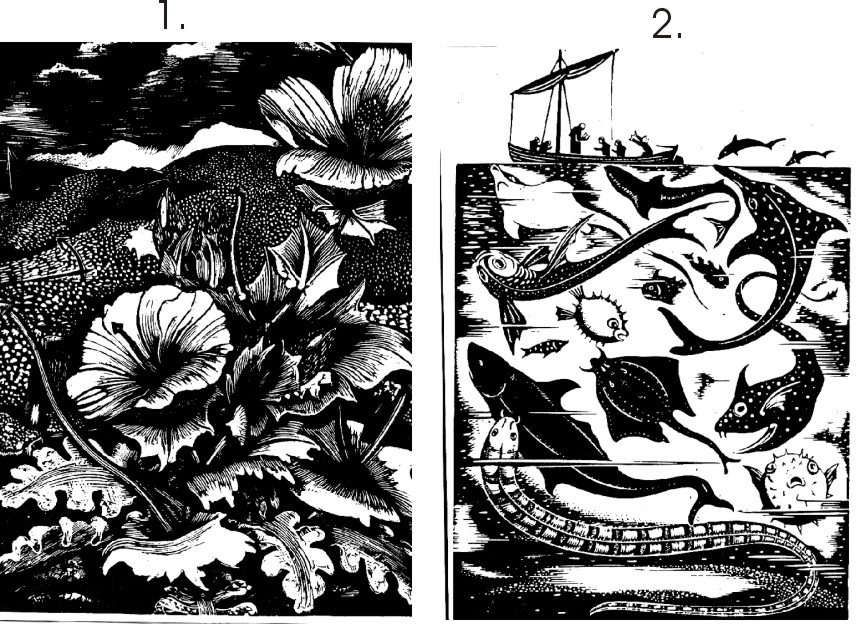
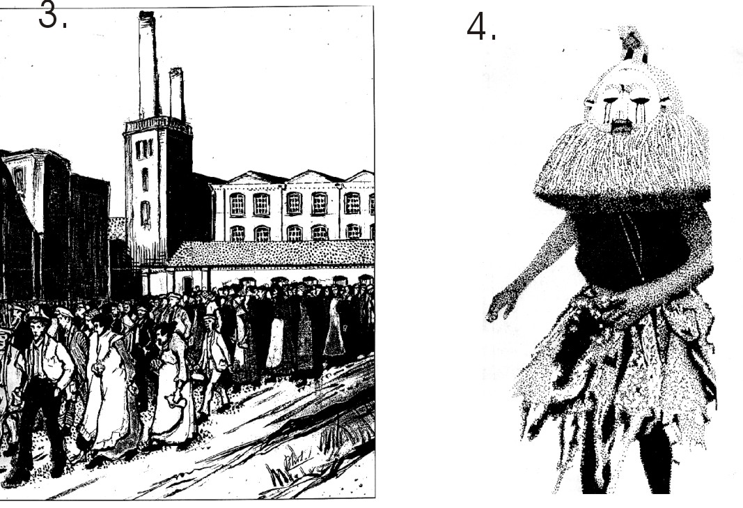
Figs 1. and 2. Show the technique used by engravers and in printmaking where simple black and white designs are required and texture almost becomes a pattern.
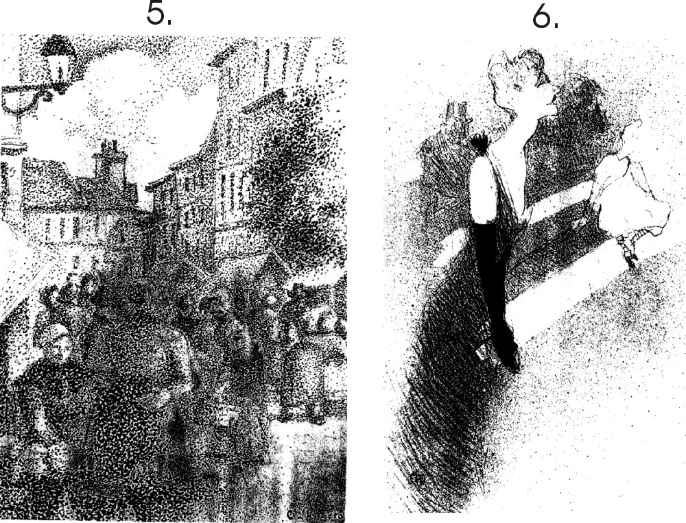
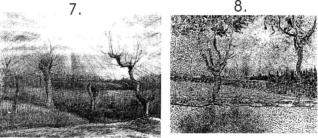
In figs.3. and 4. Dots have been used to shade, the more dots the darker the area.
In figs. 5. And 6. dots, splatter and texture have been used.
In the above fig. 7 a lot of cross hatching has been used for texture and tones, in fig.8. dots, lines and dashes only. Note the directional flow of the marks.
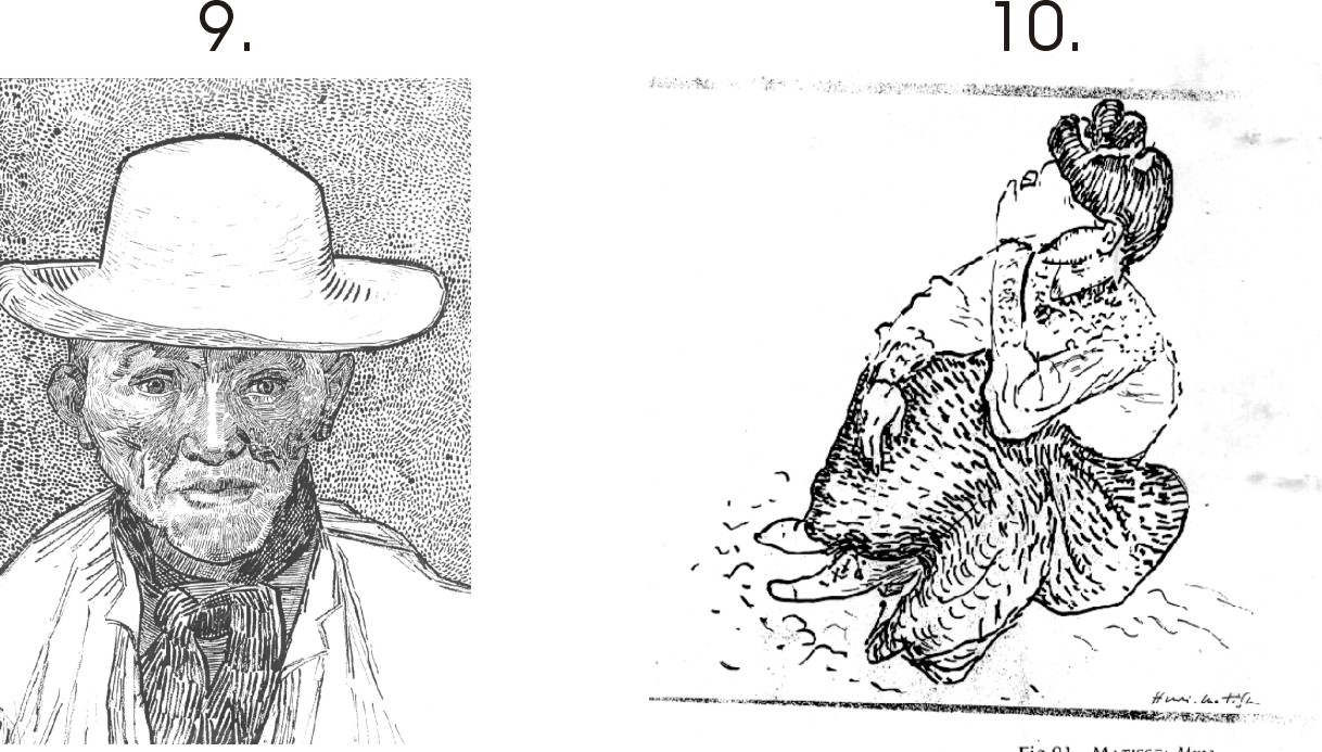
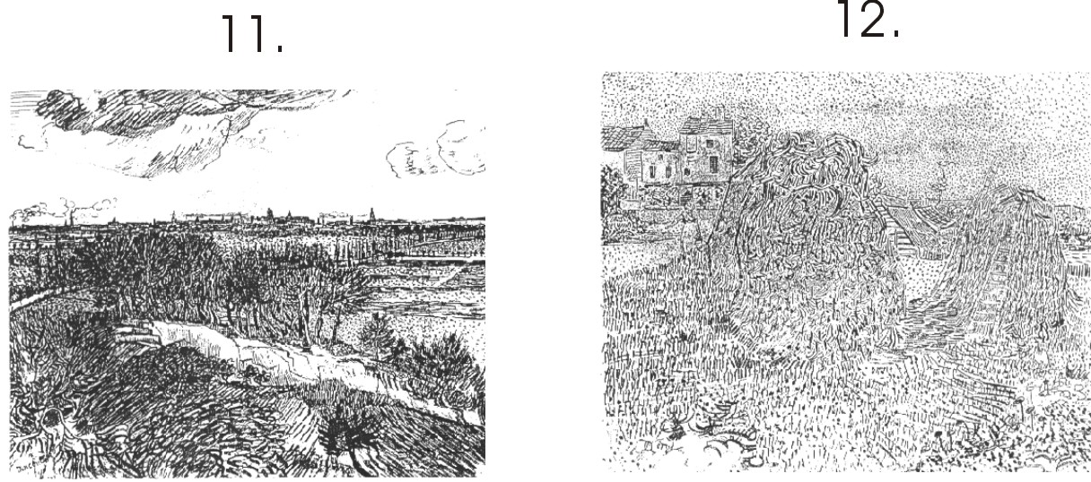
Again, the lively and directional texture in fig. 9. As compared to the clean simple and bold work in fig. 10.
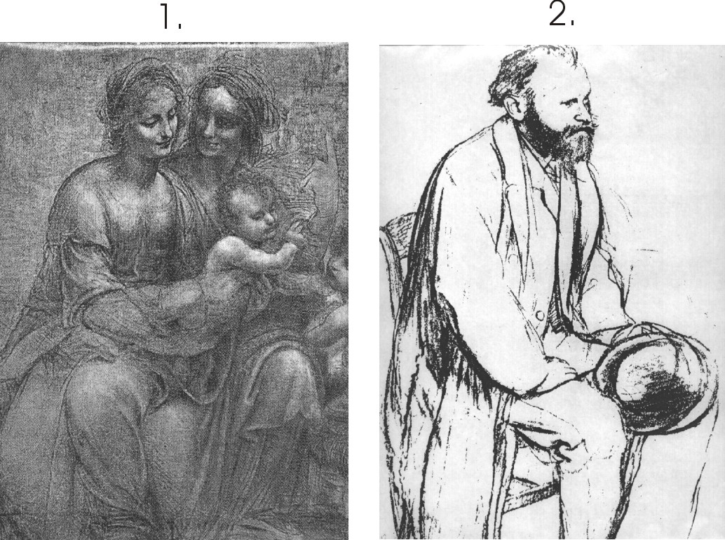
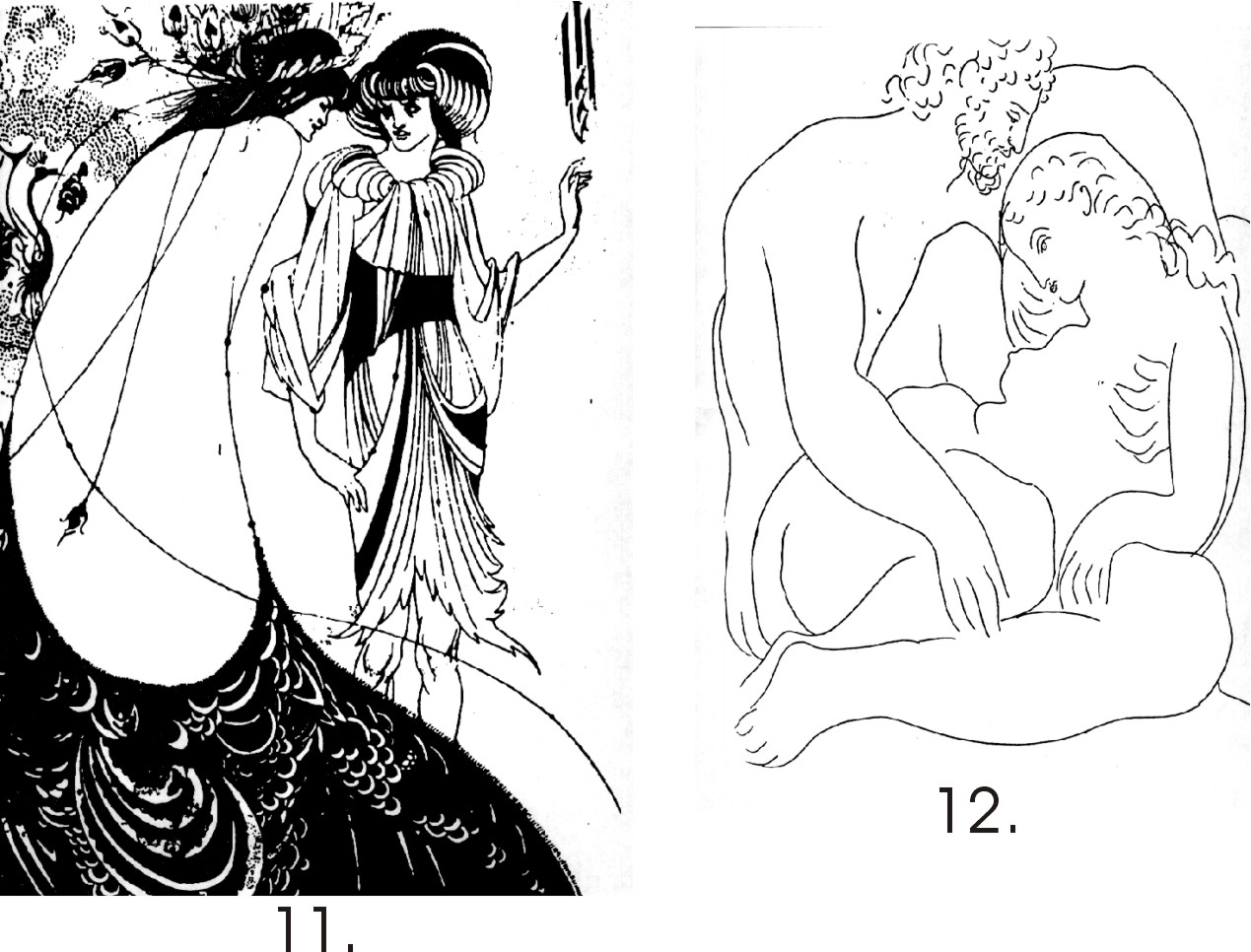
The use of heavier textural strokes in fig.11 as compared to those in fig.12.
Tone
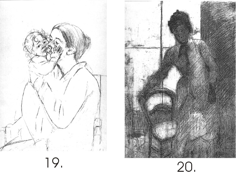
Leonardo and Degas showing different tonal styles.
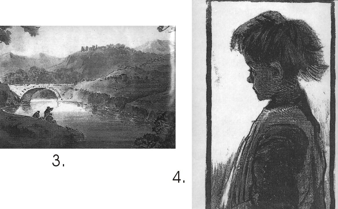
Fig.3. Is a tonal watercolour wash, but could equally have been done with ink and wash, the work in fig.4. shows the potential for linking charcoal and brush with ink.
Figs. 5. And 6. Are two beautiful and rich charcoal studies. Note the lovely modeling and subtle light in fig.5. using tone only.
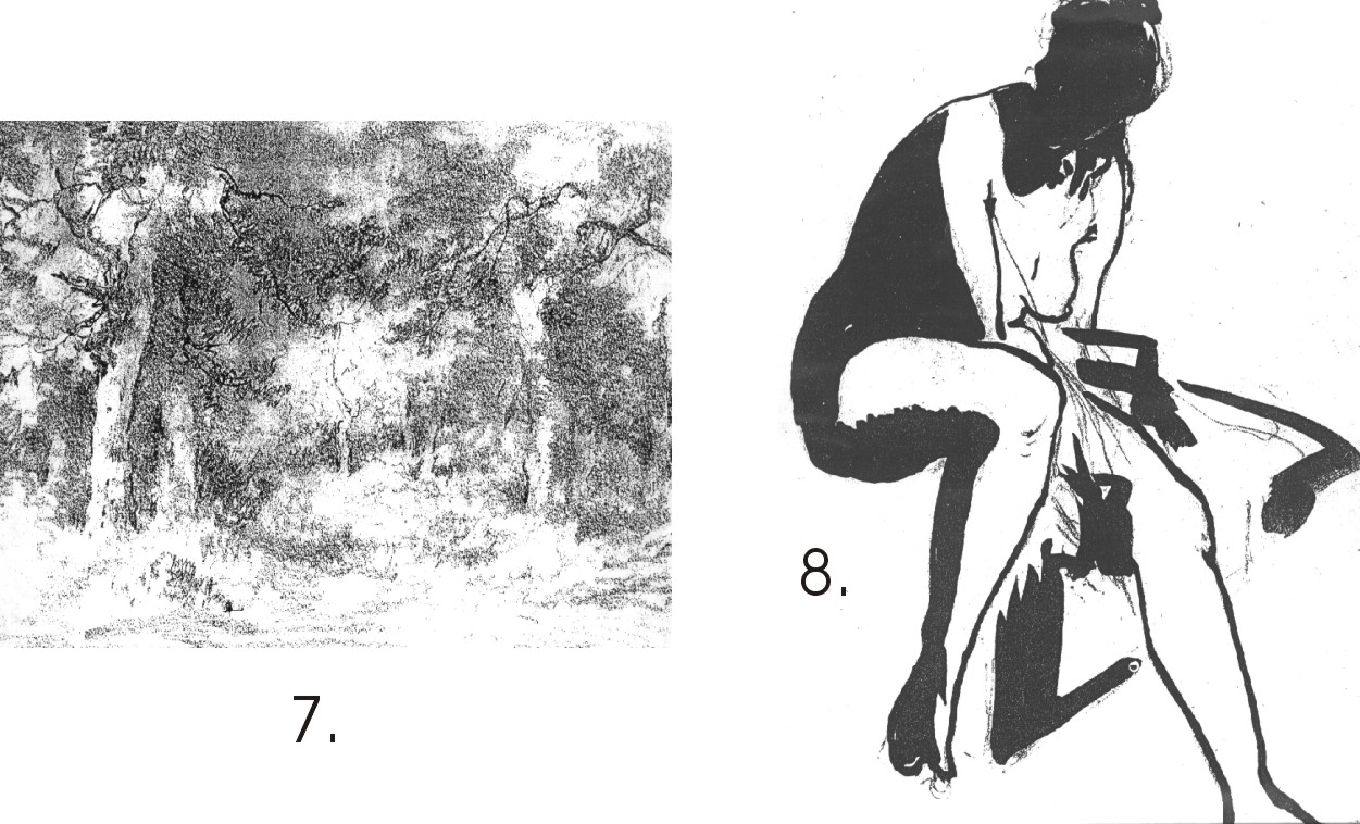
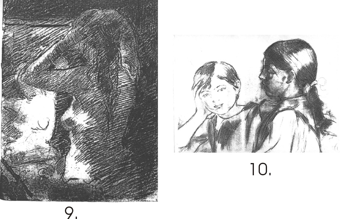
Fig.7. shows a delicately shaded woodland scene which is in total contrast to fig.8. using a lovely, bold approach to Brush and Indian Ink.
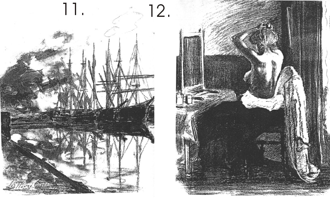
The heavy pencil hatching over softer tonal work in fig. 9. Gives this work depth and power. A more subtle approach in fig. 10.
Soft shading using the texture of the paper in fig.11., whilst a similar but darker technique is used for fig.12.
Line
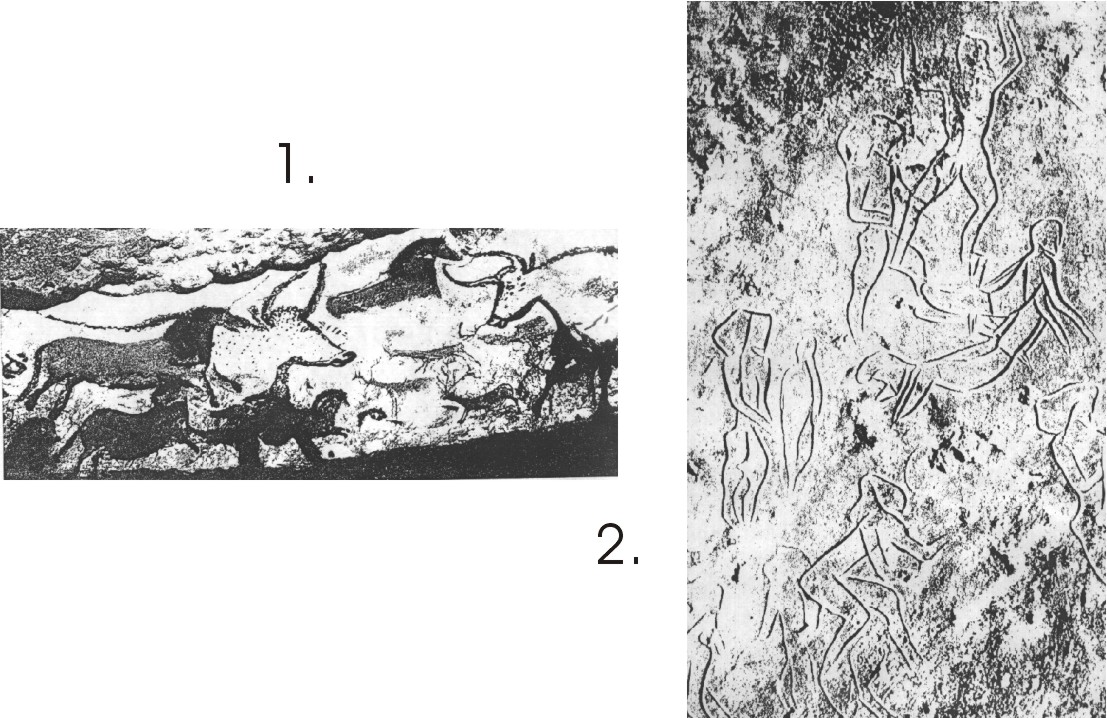
Figs 1. And 2. Line has been used since the stone age to draw with!
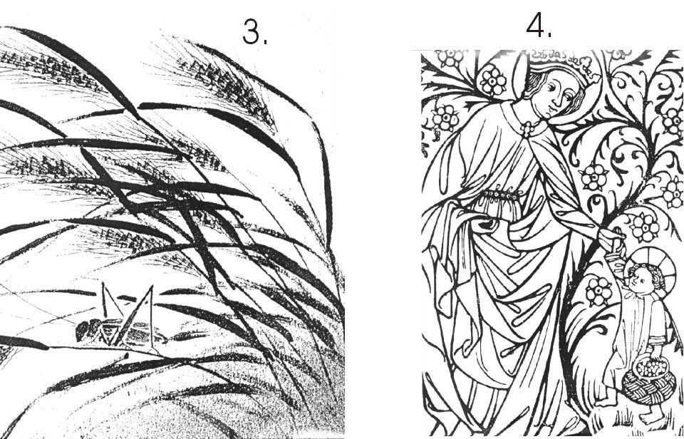
Fig. 3. A delicate Chinese brush drawing. Fig.4. Mediaeval religious line drawing.
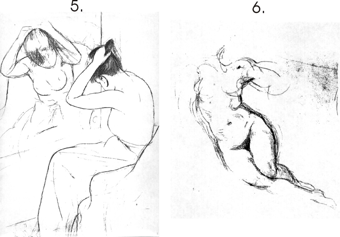
In Fig.5. the artist has used line succinctly and sparingly, in Fig.6. he “feels” his way around the form.
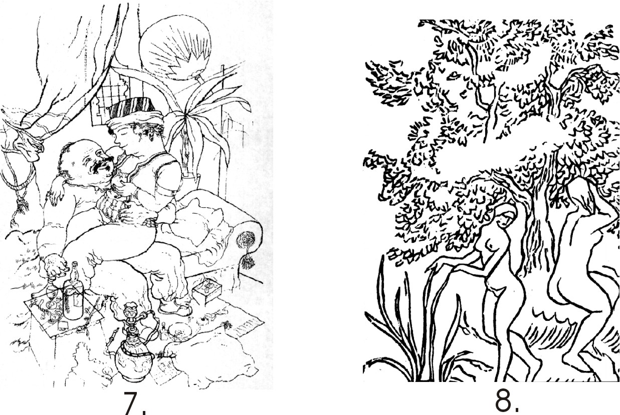
In these two Figs. 7. & 8. There is an interesting use of fine and heavy lines.
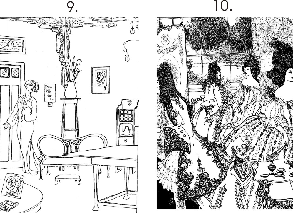
Figs. 9. & 10. Show the difference between a minimal way of working and a very ornate.
The sheer beauty and simplicity of design in these line drawings is to be admired
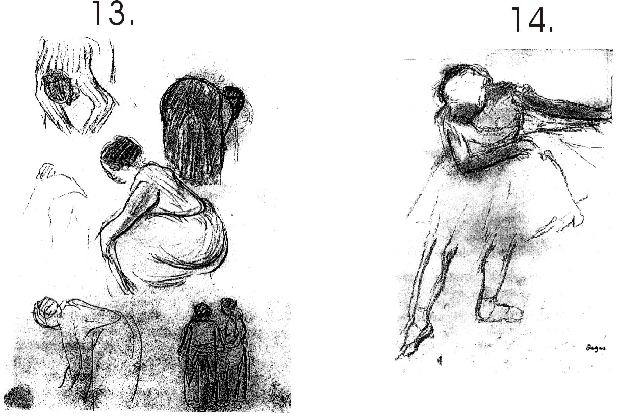
Figs. 13. & 14. Are sparing in their use of line and also only use a hint of tone.
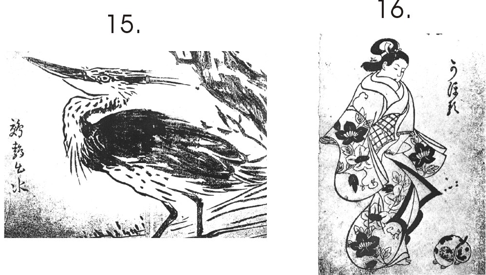
Figs. 15. & 16. Show the Japanese sense of simplicity and design.
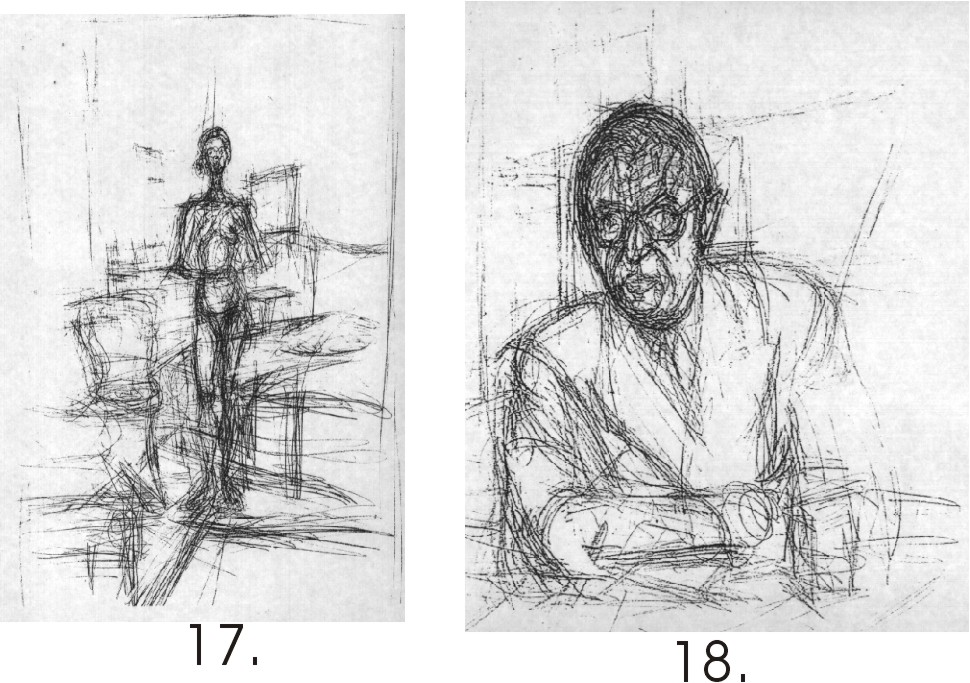
Giacometti uses lines like lengths of wire to construct his forms.
Ending with a delicate and sensitive pencil work and a moody tonal work built of lines.
http://factoidz.com/the-use-of-line-tone-texture-in-drawing-and-art/
No comments:
Post a Comment