


-

- olor Schemes


Tamara de Lempicka - Marquis Sommi - 1925

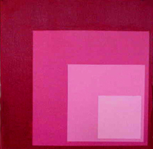
Katya - Katya 3 - 2002- Based on color theory of Josef Albers
Use values that are close together to give the design a calm appearance.
Use values of pure hues as well as those of tints and shades to create movement.
Use value contrasts to show texture and as an effective means of directing viewer attention in a composition.
Remember that value is the relationship of light to dark.
Neutral Colors
Neutral colors - contain equal parts of each of the three primary colors - black, white, gray, and sometimes brown are considered "neutral". When neutrals are added to a color only the value changes, however; if you try to make a color darker by adding a darker color to it the color (hue) changes.
Consider that black and white are thought of as neutrals because they do not change color.
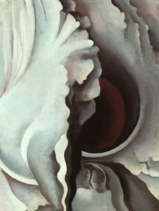
Georgia O'Keeffe - Black Iris III - 1926
Analogous Colors
colors that contain a common hue and are found next to each other on the color wheel, e.g., violet, red-violet, and red create a sense of harmony. Remember adjoining colors on the wheel are similar and tend to blend together.
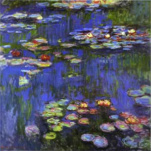
Claude Monet - Water-Lilies -1914
Warm Colors
Warm colors suggest warmth and seem to move toward the viewer and appear closer, e.g., red, orange, and yellow represent the colors of fire.

Henri de Toulouse-Lautrec - The Kiss - 1892
Cool Colors
Cool colors suggest coolness and seem to recede from a viewer and fall back, e.g., blue and green are the colors of sky, water, and trees).
Vincent Van Gogh - Starry Night - 1889
Know that the color wheel is simply a guide on how colors relate to one another, it is by no means a formula for making successful art.
Also keep in mind that mixing colors takes more effort than simply adding blue to red to get purple.
An artist can spend entire careers developing color pallettes.
Complementary Color


Henri Matisse - Woman with the Hat, Paris - 1904-5
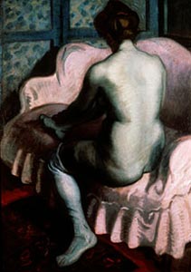
Raoul Dufy - Nude on a Pink Sofa - 1902
Intensity
Brightness or dullness of a color. A pure hue is a high-intensity color. A dulled hue, a color mixed with its complement is called a low-intensity color.Triad
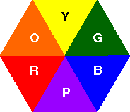
A color triad is composed of three colors spaced an equal distance apart on the color wheel. The contrast between triad colors is not as strong as that between complements.Primary
Red, yellow, and blue.

Piet Mondrian, Composition with Red, Yellow and Blue - 1921
Secondary
By mixing two primary colors, you create a secondary color: Red + yellow =orange; yellow + blue = green; and blue + red = purple (violet)

Ellsworth Kelly - Red Blue Green - 1963
Intermediate

Henri Matisse - Le bonheur de vivre (The Joy of Life) - 1905-06

Split Complements

Frederick Carl Frieseke - Through the Vines - 1908

Double Complementary

Two adjacent hues and their opposites. It uses four colors arranged into two complementary color pairs. This scheme is hard to harmonize; if all four colors are used in equal amounts, the scheme may look unbalanced, so you should choose a color to be dominant or subdue the colors.
Compositional Effects of Color

Claude Monet - Houses of Parliament, London, Sun Breaking Through Fog - 1904
When a color expands visually, it may also seem closer to the viewer than those that seem to contract, leading to the common statement that warm colors appear closer and cool colors fall back.
Artists can bring any color forward or push it back, depending on what other spatial tricks they use. In addition, a large shape or form appears to be heavier than a small shape. Several small shapes or forms can balance on large one.
An object with a complicated contour is more interesting and appears to be heavier, than one with a simple contour. A small complex object can balance a large, simple object.
Remember that saturation is the relative brilliance or vibrancy of a color. The more saturated a color, the less black it contains.
Balance and proportion
Use highly saturated or high-intensity colors (a pure hue with no other colors mixed in) or busily detailed areas to draw attention and therefore give the appearance of carrying more weight than less saturated, low-intensity or visually simpler areas.
Emphasis
An area in a work of art that attracts the viewers attention first. The element noticed first is called dominant; the elements noticed later are called subordinate.Unity
Allows the viewer to see a combination of elements, principles, and media as a whole. Unity is created by harmony, simplicity, repetition, proximity, and continuation. For example, you could use the repetition of a color scheme to unify a composition. Another way to unify a composition is to simplify the color scheme by allowing one color to dominate the work. This is called tonality. Tonality does not have to be monochromatic, however, the overall effect appears to be of one color.Movement
Color can create a sense of movement. When the values in a work jump quickly from very high-key to very low-key, a feeling of excitement and movement is created. When all of the values are close together the work seems much calmer. When you want to create movement with color remember to use values of pure hues as well as those of tints and shades. Movement creates the illusion of action or physical change in position.Rhythm
The use of repeated elements to create the illusion of movement. Visual rhythm is perceived through the eyes, and is created by repeated positive spaces separated by negative spaces. There are five types of rhythm: random, regular, alternating, flowing, and progressive.Uses and Psychological Effects
Physiological effects - mystics have long held we emanate a colored glow, or aura, which is thought to effect the state of a person's health and spirituality. Today, chromotherapy is used to heal with colors. This form of treatment dates back thousands of years to the ancient "color halls" of Egypt, China, and India. A more prominent use of color therapy occurs in environmental design (the effect of color on health and behavior).Color symbolism - our responses to color are not just biological. They are also influenced by color associations from our culture.
Personal color preferences - not only have we inherited cultural associations, but we also respond to colors in individual ways. Research has revealed some variables that help explain individual differences in color responses. One thing remains the same in color and that is our own color preferences are important to us.
Emotional effects - the actual emotional effect of a specific color in an artwork depends partly on its surroundings and partly on the ideas expressed by the work as a whole. To be surrounded by blue lighting in an installation is quite different from seeing a small area of blue in a larger color context. For many of us the emotional effects of art may be difficult to articulate.
Local and expressive color - there are two opposite ways of using color in representational art. At one extreme is the local color - the color that something appears from nearby when viewed under average lighting conditions. We think of the local color of a banana as yellow, for example. At the other end of the extreme is the expressionistic use of color, whereby artists use color to express an emotional rather than a visual truth.
| Any of various colors resembling the color of blood; the primary color at one extreme end of the visible spectrum, an effect of light with a wavelength between 610 and 780 nm. (Webster's, p.1614). Increases pulse rate and breathing and causes blood pressure to rise. Infants and children respond well to red. Red is for the amorous, outspoken, and optimistic. People who love red, love life. The food color. Ever notice that restaurants use red a lot? It makes you hungry by increasing your body's metabolism. Hot, passionate, urgent, danger, blood, devil, angry, enraged, amorous, outspoken, optimistic |
| Yellow | A color like that of egg yolk, ripe lemons, etc.; the primary color between green and orange in the visible spectrum, an effect of light with a wavelength between 570 and 590 nm. (Webster's, p.2201). The color of the sunny disposition, the idealist. Intellectuals love yellow. It takes more chemicals in the eye to see the color yellow. Yellow can have some negative effects -- babies cry more often and longer in yellow rooms; in convalescent homes it makes older people shake as it affects their minor motor movement. As you get older you tend to dislike yellow because it can make you feel anxious or angry. Yellow enhances concentration and speeds metabolism. Warm, cowardice, caution, fearful, bright |
| Blue | The pure color of a clear sky; the primary color between green and violet in the visible spectrum, an effect of light with a wavelength between 450 and 500 nm. (Webster's, p.228). The number one color choice of the introspective and educated. Blue causes the brain to send off 11 chemical tranquilizers and is a wonderful calming color. or Pumps people up. Proven to increase energy. Weight lifters should lift in a blue room. Production people will produce more in a blue room. Not a good color for hospitals. Responsibility, trustworthiness, compassion, those are the attributes of royal blue. Honest, integrity, righteous, puritantical, moral, severe, prudish, cool, melancholy, sad, glum, downcast, gloomy, unhappy, quality, first place |
| Orange | A color between yellow and red in the spectrum, an effect of light with a wavelength between 590 and 610 nm; reddish yellow. A secondary color that has been formed by the mixture of red and yellow pigments (Webster's, p.1361). Not a color that everyone loves, but those who do are generally social and fun loving. Confident, creative, adventurous, fun loving, sociable |
| Green | A color intermediate in the spectrum between yellow and blue, an effect of light with a wavelength between 500 and 570 nm.; found in nature as the color of most grasses and leaves while growing, of some fruits while ripening, and of the sea. A secondary color that has been formed by the mixture of blue and yellow pigments (Webster's, p.837). A good color for people in transition. Green is Mother Nature's color, lover's of green may be fickle. The money color--bound to influence. In Celtic myths the Green man was the God of fertility. Universal symbolism: Nature, freshness Contemporary symbolism: Ecologically beneficial Nature, health, regeneration, contentment, harmony, cheerful, lively, friendly, fresh, sickly, unripe, immature, simple, unsophisticated, gullible, new |
| Purple | Any color having components of both red and blue, such as lavender, esp. one deep in tone (Webster's, p.1569). The color of fantasy. Most men dislike purple. Royalty, intelligence, wealth, beauty, inspiration, sophistication, high rank, exalted, imperial, princely, excessively ornate rhetoric, profane, shocking |
| Gray | Of a color between white and black; having a neutral hue (Webster's, p.834). A good color for offices. It promotes productivity and stimulates creativity. Neutral, ambiguous, intermediate, apathetic, dull, drab, monotonous, mature, sober, somber, mousy, smoky |
| Black | Lacking hue and brightness; absorbing light without reflecting any of the rays composing it. The color at one extreme end of the scale of grays, opposite to white (Webster's, p.216). Produces a feeling of solidarity and formality. Black is a natural classic. The color of authority and power, yet also implies submission. Aloof, evil, death, unknown, fear, mystery, dark, night, sad, murky, sinful, inhuman, fiendish, devilish, infernal, monstrous, horrible, nefarious, treacherous, traitorous, villainous, depressing, somber, doleful, mournful, funereal, disastrous, calamitous, harmful, deliberate, pessimistic, dismal, hostile, threatening, wicked, disgrace, morbid, grotesque, undesirable, dangerous, false |
| White | A color without hue at one extreme end of the scale of grays, opposite to black. A white surface reflects light of all hues completely and diffusely. Most so-called whites are very light grays: fresh snow, for example, reflects about 80 percent of the incident light, but to be strictly white, snow would have to reflect 100 percent of the incident light. It is the ultimate limit of a series of shades of any color (Webster's, p.2167). Never underestimate the power of this super neutral. It works with any other color, in any context, anywhere. One color plus white equals an almost foolproof color scheme. White would be an inappropriate color for a wedding in China. It is the color of mourning. If a bride chooses a white wedding gown, her parents would probably not allow her to get married. Innocence, purity, virginal, sterility, fairness, snow, frost, milk, ghostly, ultraconservative, blank, empty, transparent, honorable, dependable, auspicious, fortunate, harmless |
| Pink | A color varying from light crimson to pale reddish purple (Webster's, p.1472). Makes one feel prosperous, a bit pampered. "Baker Miller" pink (deep shade of pink, similar to Pepto Bismol) is used in jail holding cells to calm prisoners. Pink is also used to treat patients suffering from headache disorders. Femininity, sweetness, prime, left-wing |
| Brown | A dark tertiary color with a yellowish or reddish hue (Webster's, p.267). Solid, reliable brown is the color of earth and is abundant in nature. Light brown implies genuineness while dark brown is similar to wood or leather. Brown can also be sad and wistful. Men are more apt to say brown is one of their favorite colors. Earth, nature, dirt, tanned, drab, coffee, solid, sad |
Printing and computer color

Remember that in printing, process colors: yellow, cyan (bright blue), magenta (blue red), and black make up all other colors.
If you select a color from a color swatch book and ask 1,000 printers to reproduce that color, you'll get 1,000 different colors.
The color of the paper affects the color of the ink. Know that on computer or television screens, red, green, and blue make up all other colors.

Colors viewed on monitors, computer or television will vary significantly unless calibrated.
Spot Color

Consider that spot color results from adding a specific second color to the single color normally used (black is the traditional single color).
Use spot color to direct the reader's eye to special sections or important information for fast identification.
Screen one, or both, of your colors, and achieve the effect of printing in multiple colors. Screening is the process by which you use a percentage (or lower value) of a full color, creating a lighter shade of the original. You can also add black to the color to make it darker.
Add a single color to black-and-white photographs (creating a duo tone) to bring depth and richness to the document. Look for examples of different duo tones in design books.
Substitute a different color for black in a two-color job as an effective way to increase the appeal and richness of the document.
Be smart, a well designed piece with two-colors and screens (tints of the two colors) will always be less expensive and probably better looking than a piece designed with mediocre four-color images.
Know that if you are designing a four-color piece, it will probably require a five, six, or more runs through the press. You will probably want a spot color (a special non-process color other than Cyan, Magenta, Yellow, and Black), a varnish (protective coating), and among other things a double hit (a second printing of a background color).
Color Study Chart
Create a chart to represent each of the items below. Use a one inch square for each set.Analogous color scheme (colors that contain a common hue and are found next to each other on the color wheel 1 set in red, red-orange, and red-violet)

1 set in Tones (color plus 30% gray)

Complementary
Complementary color scheme (two colors opposite one another on the color wheel)1 set your choice

1 set in Tints (color plus white)

1 set in Shades (color plus black)

Seven Warm/Aggressive Colors
In a combination of pure color, tints, tones, and shades.
Seven Cool/Receding Colors
In a combination of pure color, tints, tones, and shades.
Triad color scheme
Composed of three colors spaced an equal distance apart on the color wheel, e.g., the three primary colors - red, blue, and yellow.1 set in pure color.

Diad color scheme
Two colors that are two colors apart on the color wheel, e.g., red and orange.1 set in Tints (color plus white)

1 set in Tones (color plus 30% gray)

1 set in Shades (color plus black)

Split Complementary
Split complementary (one color and using the color on each side of its complement on the color wheel, e.g., red, yellow-green, and blue-green)1 set in pure color.

Double Complementary
Double complementary (two adjacent hues and their opposites, e.g., red and red-orange, green and blue-green).1 set in pure color.

Intensity
The brightness or dullness of a color. A pure color is a high-intensity color. A dulled hue (a color mixed with its complement is called a low-intensity color.Neutralize
Choose a high-intensity (bright) color and neutralizing (dulling it) by adding:Black, white, gray, and its complement

http://www.artgraphica.net/free-art-lessons/free-art-tutorials/color-design-rules.html
More on Using Your Camera
ALERT # I. Turn off your camera's flash ... The flash will "burn" the center of the picture or subject and have darkened areas to the outer edges of your image. When shooting reference photos, a flash creates an artificial "snapshot" looking image ...natural lighting (from the left or right or from above the subject, will reveal the form and cast shadows more realistically.
ALERT # II. Use "Auto Focus" ... that's where you hold the picture "take" button halfway down, which causes the camera to send an infra-red beam to the subject and back to the camera, which causes the camera to focus on the subject ...then you completely press the take button and you take a well focused image. If your digital camera does not have Auto Focus, I'd suggest you get a new camera with Auto Focus.
ALERT # III. When possible, send me ... BOTH the photos you yourself shoot or photos you get from magazines or such as reference for your drawings AND photos of the drawings or paintings you submit for all Lesson Assignments.
1. Why use a camera?
There are two reasons for the camera the Interactive Art School wants you to use if you sign up for the paid-for art course but even if you don't - few people understand how powerful and necessary the use of a camera is to artists and has been to some of the greatest artists who ever lived:
a. To send images of your assignment drawings or paintings to the school as e-mail attachments (this makes the entire process of teaching and learning totally WEBcentric) – no trips to a brick and mortar art class or the Post office, no time limits – send your assignment photos and view your critiques 24 hours a day, seven days a week. Learn in your pajamas, get your teacher’s opinion in India, England, Bosnia, Canada or Grenada. Classes are every day every where.
b. The camera as an art tool: Stand and watch a mountain or a street for ten minutes – they change. The light changes, the clouds move and darken or lighten areas, people move, the shadows lengthen or shorten. I don’t understand how anyone stands and paints a scene for four hours. What’s there at the beginning of the four hours ain’t there at the end of the four hours! Better to do some quick sketching and notes and take a bunch of photographs.
2. Isn’t using a camera cheating?
Leonardo DaVinci didn’t have a camera, so he took TWO easels and a large sheet of glass and placed the glass saddling the two easels and he TRACED the landscape to better understand the perspective.
Jan VerMeer used a "Camera Obscura" (click on the words Camera Obscura to see more about it). VerMeer may have TRACED the image produced as part of his painting process. The odd perspectives and the strange and characteristic highlight or "light pings" in his paintings are characteristic of the Camera Obscura. There also is substantial evidence that Vermeer may have use another optical device: the "Camera Lucida". See the books listed below and buy them or get them from your library to follow up this fascinating story about how these great painters used cameras and pre-camera used other optical and mechanical means to build great pictures.
The camera arrived just in time for Edgar Degas. He became an expert photographer and the camera influenced his vision in his paintings. Prior to Degas, the figures in paintings were essentially totally contained inside the picture rectangle – Degas CUT OFF the figure in imitation of the camera. Look at his work
A book on the use of the camera or camera obscura at Amazon.com:
Vermeer's Camera : Uncovering the Truth Behind the Masterpieces
by Philip Steadman
Vermeer's Camera : Uncovering the Truth Behind the Masterpieces
by Philip Steadman
For more on all then uses of the camera and other aids to painting; also at Amazon.com is: Secret Knowledge: Rediscovering the Lost Techniques of the Old Masters by David Hockney
 | 3. Registered students - some camera issues when taking photos of your assignment drawings or paintings: Parallax and distortions in your photos of your drawings or paintings |
| When you photograph your assignment drawing or painting, you may have a parallax issue. Parallax means that the image plane (the film plane and the drawing or painting are not parallel, you will have an "unsquare" image. Parallaxed image ----> |  |
 | Don't worry about it - I'll square up the images for your critique. <----------------------------- |
You just need to make the sharpest in-focus image you can.
Also - if your image is too dark or too light, but in focus, send it via e-mail and I should be able to correct those problems.

A little too dark, but sharp or a little light, but sharp - I will adjust at the school.
4. Again - registered students: E-mail attachments of your digital image of your assignment drawings or paintings.
Unless you have compression software (like "Stuffit" for the Mac or "WinZip" for PCs) you could try sending multiple images as attachments. If we have problems with that, send your images one at a time with multiple e-mails - just make sure you identify yourself and tell me how many images you are sending.
5. Again - registered students: Turn off your camera's flash!When you use the flash, you:
5a: "Burn" the center of the picture or subject and have darkened areas to the outer edges of your image.
5b: Create an artificial "snapshot" looking image ...natural lighting will reveal the form and cast shadows more realistically.http://www.interactiveartschool.com/lesson5Camera.html
| What is a camera obscura? |
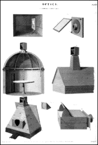 Camera Obscura illustrations in an 1817 encyclopedia from the Wilgus Collection Camera Obscura illustrations in an 1817 encyclopedia from the Wilgus Collection | Camera = Latin for “room”Go into a very dark room on a bright day. Make a small hole in a window cover and look at the opposite wall. What do you see? Magic! There in full color and movement will be the world outside the window — upside down! This magic is explained by a simple law of the physical world. Light travels in a straight line and when some of the rays reflected from a bright subject pass through a small hole in thin material they do not scatter but cross and reform as an upside down image on a flat surface held parallel to the hole. This law of optics was known in ancient times. |
No comments:
Post a Comment