What is Hue?
Hue is the easiest to understand: at its most basic, it’s artspeak for the actual color of a pigment or object. But the use of hue becomes more complicated when it comes to the names that paint manufacturers give their paint colors. This is because the term “hue” is used to indicate that a color is not made from the pigment(s) that were originally used for that paint, but modern equivalents that are either cheaper or more lightfast. Judging a hue is the first step in color mixing as it identifies what tube of paint to reach for.What is Value?
Value or tone is a measure of how light or dark a color is, without any consideration for its hue. Think of it as taking a black-and-white photo of a subject where you clearly see what’s in the photo but everything’s in grayscale.The problem with a color’s value or tone is that how light or dark is seems is also influenced by what’s going on around it. What appears light in one circumstance, can appear darker in another circumstance, for instance when it’s surrounded by even lighter tones. (See Tone is Relative to Other Tones for an illustration of this, and a longer explanation.)
What is Chroma?
The chroma or saturation of a color is a measure of how intense it is. Think of it as “pure, bright color”, compared to a color diluted with white, darkened by black or grey, or thinned by being a glaze. Variations in chroma can be achieved by adding different amounts of a neutral gray of the same value as the color you’re wanting to alter.But Aren’t Value and Chroma the Same Thing?
Color mixing would be easier if they were, but they’re not. With chroma you’re considering how pure or intense the hue is, whereas with value you’re not considering what the hue is at all, just how light or dark it is.Do I Need to Consider Hue, Value, and Chroma Every Time I Mix a Color?
As a beginner painter, yes you do. But the good news is that but with experience of color mixing it becomes easier and less of a systematic process. Initially it’s well worth taking the time to consider the hue, value, and chroma in a color you’re want to match, making a judgment or decision on each before you attempt to mix the color. You’ll waste less paint and not have as much frustration by mixing the “wrong” colors.http://painting.about.com/od/colourtheory/a/huevaluechroma.htm
Techniques of the Impressionists: What Colors are Shadows?
Once you start painting and closely looking at colors, you soon realize that simply reaching for a tube of black paint whenever you need to put in a shadow doesn’t work. The result isn’t subtle enough to capture a realistic shadow. The Impressionist Renoir is quoted as saying “No shadow is black. It always has a color. Nature knows only colors … white and black are not colors.” So if black was to be banished from their palettes, what did the Impressionists use for shadows?
The True Colors of Shadows
Working from the then-relatively new theory of complementary colors, the logical color to use was violet, being the complementary of yellow, the color of sunlight. Monet said: “Color owes its brightness to force of contrast rather than to its inherent qualities … primary colors look brightest when they are brought into contrast with their complementaries.” The Impressionists created violet by glazing cobalt blue or ultramarine with red, or by using new cobalt and manganese violet pigments that had become available to artists.
Monet painted his moody interiors of Saint-Lazare station, where the steam trains and glass roof created dramatic highlights and shadows, without earth pigments. He created his astoundingly rich array of browns and greys by combining new synthetic oil-paint colors (colors we today take for granted) such as cobalt blue, cerulean blue, synthetic ultramarine, emerald green, viridian, chrome yellow, vermilion, and crimson lake. He also used touches of lead white and a little ivory black. No shadow was considered as being without color, and the deepest shadows are tinged with green and purple.
Ogden Rood, the author of a book on color theory that greatly influenced the Impressionists, is reputed to have loathed their paintings, saying “If that is all I have done for art, I wish I had never written that book!” Well, I’m sure am glad he did.
Trying to Observe Color
Monet described his attempts to observe and capture the colors in nature thus: “I’m chasing the merest sliver of color. It’s my own fault, I want to grasp the intangible. It’s terrible how the light runs out, taking color with it. Color, any color, lasts a second, sometimes three or four minutes at a time. What to do, what to paint in three or four minutes. They’re gone, you have to stop. Ah, how I suffer, how painting makes me suffer! It tortures me.”
Monet also said: “It’s on the strength of observation and reflection that one finds a way. So we must dig and delve unceasingly.” “When you go out to paint, try to forget what objects you have before you, a tree, a house, a field or whatever. Merely think here is a little square of blue, here an oblong of pink, here a streak of yellow, and paint it just as it looks to you, the exact color and shape, until it gives you own naïve impression of the scene before you.” Doesn’t he make it seem easy?!
http://painting.about.com/od/colourtheory/a/shadows_Impress.htmThe True Colors of Shadows
Working from the then-relatively new theory of complementary colors, the logical color to use was violet, being the complementary of yellow, the color of sunlight. Monet said: “Color owes its brightness to force of contrast rather than to its inherent qualities … primary colors look brightest when they are brought into contrast with their complementaries.” The Impressionists created violet by glazing cobalt blue or ultramarine with red, or by using new cobalt and manganese violet pigments that had become available to artists.
Monet painted his moody interiors of Saint-Lazare station, where the steam trains and glass roof created dramatic highlights and shadows, without earth pigments. He created his astoundingly rich array of browns and greys by combining new synthetic oil-paint colors (colors we today take for granted) such as cobalt blue, cerulean blue, synthetic ultramarine, emerald green, viridian, chrome yellow, vermilion, and crimson lake. He also used touches of lead white and a little ivory black. No shadow was considered as being without color, and the deepest shadows are tinged with green and purple.
Ogden Rood, the author of a book on color theory that greatly influenced the Impressionists, is reputed to have loathed their paintings, saying “If that is all I have done for art, I wish I had never written that book!” Well, I’m sure am glad he did.
Trying to Observe Color
Monet described his attempts to observe and capture the colors in nature thus: “I’m chasing the merest sliver of color. It’s my own fault, I want to grasp the intangible. It’s terrible how the light runs out, taking color with it. Color, any color, lasts a second, sometimes three or four minutes at a time. What to do, what to paint in three or four minutes. They’re gone, you have to stop. Ah, how I suffer, how painting makes me suffer! It tortures me.”
Monet also said: “It’s on the strength of observation and reflection that one finds a way. So we must dig and delve unceasingly.” “When you go out to paint, try to forget what objects you have before you, a tree, a house, a field or whatever. Merely think here is a little square of blue, here an oblong of pink, here a streak of yellow, and paint it just as it looks to you, the exact color and shape, until it gives you own naïve impression of the scene before you.” Doesn’t he make it seem easy?!

The Basics of the Art of Lighting
Simple Principles of and Techniques for Creating Artful Lighting
Ultimately, lighting is about controlling and shaping light and shadows, reflections, refractions, and even color-whether you do it on a computer or on a film set. This kind of control requires an understanding of how light works, the aesthetic art of lighting, and techniques for lighting. This knowledge helps you develop your eye so that you can look with understanding at your image, clearly see it, and know what needs to be done. By looking and learning as much as you can about color and lighting, you can decide which information to use to create your lighting design-be it naturalistic or stylized in a myriad of ways.Though the tools may differ, the principles involved in creating good lighting for computer graphics are used on film sets, as well. This article, although primarily about digital lighting on a computer in a 3D package, refers to lighting in other environments, as well. When I refer to settings in a 3D package, I mean Autodesk* Maya*; however, most other 3D packages have settings for these same attributes, although their interfaces may be different.
Looking and Learning
When I was given my first storyboarding job on a feature film, I had no idea what to do, so I turned on my TV and started drawing the images as they went by. Not only was there information on how to put images together to tell a story, but there was also a wealth of information on lighting and lighting design and how lighting can help tell a story. For a computer graphics (CG) artist, understanding how light works in the natural world is important, because not only will you be called upon to produce naturalistic-looking imagery, but sometimes you will be asked to marry live-action footage and computer-generated imagery. Also, like a cartoonist who understands form and anatomy, if you want to stylize your lighting design, you need to understand which lighting attributes and qualities to work with. So, look at the world around you and study it (see Figure 1).Shadows
In lighting, darkness is just as important as light. This darkness can be caused by the absence of light (shade) or by an object blocking the light (shadow).Shadows and Composition
How the shadows fall in any scene you are lighting contributes to the composition as well as the mood. Most often, to create the shadow design composition, you want only the key light (that is, the primary light source) casting the shadows. But there will be times when, in the interest of true realism, you will want every CG light in a scene that represents a practical real light to cast a shadow. For example, you may want all of the CG lights representing table lamps in a living room to cast shadows so that as your character walks by them, the shadows change.
In Maya* and most 3D animation packages, it is easier to control shadows than it is on a film set. You can selectively turn the shadow casting off on a light or change the render setting on an object to make it such that it does not receive or cast shadows (see Figure 2). On a live set, to get rid of unwanted shadows from a light, you must employ techniques such as bounce cards and diffusion filters.
Shadows and Time of Day
Shadows are one big indicator of the time of day. Shadows late in the afternoon when the sun is low on the horizon are longer and softer versus the shadows at high noon, when the sun is directly overhead. At noon, shadows are shorter and sharper. That is one reason noon sunlight is referred to as hard, and late afternoon light is soft. Experiment with shadows by holding any light source lower, and then higher-directly over an object-and watch how the quality of the shadows changes.
Moving Shadows and Light Patterns
Moving shadows can help add to a sense of restlessness, danger, or suspense. Think of someone tossing in bed with shadows falling over him or her or shadows indicating an otherwise-unseen presence. You can break up the throw of a light using various devices. You've probably noticed the stripes of light coming in through Venetian blinds, for example. Walking at night, I often wonder at the dappled light and leaf shadows on the pavement caused by the street lamp light shining through the trees. Have you ever looked at beautiful cloud shadows traveling over mountains?
On a film set, you can place a gobo (also known as a cucoloris or cookies) in front of a light to reshape it. Gobos are usually wood cut into various shapes blocking the throw pattern of the light, sometimes to imitate broken-up light and shadows. In working with lighting in a computer 3D package such as Maya*, you do the same thing using what is known as mapping on the intensity or the color of the light-usually a spotlight.
Key Light
Outdoors, the main source of light is the sun. Its rays come down to earth from one direction. You can think of the sun as the key light, because it is the dominant light outdoors. You can think of any light that is the dominant light in a scene as a key light, although a key light is generally used to highlight and add dimension to the main subject in a scene. The key light is generally the first light you set up, and it is part of the commonly used three-point lighting set up. It is the light that really sets the mood of a scene.The key light in a scene can be animated, or it can constantly change as your character moves. Sometimes, you might want your character to be moving in and out of the light to add a sense of distance and depth or drama to your scene. Other times, you may want your character to be in the light at all times, so that nothing he or she is doing is lost. In a scene, the key light can be constantly changing, as for example when your character moves from under one street lamp to under another.
Reflected and Absorbed Light
Subjects can be lit by direct illumination from a light source as well as from reflected light. One of the most important things to understand about light is that some of it is reflected off of or absorbed by every surface it hits. In life, light can be reflected off one surface, then hit and bounce off of another surface again and again. Outdoors, the light from the sun creates a lot of bounce light.Besides adding to the general brightness and illumination of a scene, this reflected light creates highlights, spectral and diffuse light, as well as reflections such as you see when you look in the mirror. This reflected light also has a lot to do with the colors you see and color bleed.
Radiosity
Calculating every light bounce is a lot of information to retain in a computer's memory, so 3D packages have come up with less memory-intensive ways of emulating this process. Some of these systems are called Global Illumination (GI) or radiosity, but there are many even less memory-intensive ways to emulate light reflection. Cheats can be as simple as making a cluster of directional lights aimed in different directions (see Figure 4).
You may have heard the term ray tracing. A ray trace light on a computer gives you the calculation of one bounce back from a surface toward the camera. This one bounce is enough to give you a reflection.
A computer rendering/lighting system that just measures the direct illumination of a light is called ray casting. In ray casting, there is no reflecting or refracting of light. It used to be that this functionality was all rendering packages were capable of. Now, the ray casting is usually just the first calculation of light a renderer in a 3D package would make.
Light Quality
The quality of light-whether it is hard or soft-is important in lighting, contributing to the mood of a scene. It is easier to control whether a light is hard or soft on a computer than on a live set.Hard Light
The sun is obviously our largest light source, but because of its great distance away, by the time the light rays reach us on a clear, unclouded day, they are virtually parallel, making it a hard light source. Parallel rays (or close to parallel rays) are a characteristic of hard lighting.
Hard light creates crisp, dark, and harsh-edged shadows, emphasizing angles and edges. Hard light is good for showing contrast and giving dimension to a subject, a landscape, or an object. It's also good for showing form and volume. Hard lighting can show texture very well, as in leather or an engraving, and it's good for lighting night scenes, where you want dark, hard-edged shadows. On set, hard light can come from a point source, such as a naked light bulb or a focused spotlight or a small, focused source such as a Fresnel lens.
In a 3D program, a good hard light source might be a light that starts from a single point, such as a point light or a spotlight with the penumbra set to 0. Hard light has no soft falloff. A directional light, which is the closest light to the sun in most 3D programs, also provides a good hard light source. Like the sun, the directional light sends down parallel rays of light at the same angle over the entire scene (see Figure 5).
Figure 5. Notice the highlights caused by this focused hard light source. I have used only one spotlight as the key light, and there is no fill light to soften the lighting.
When light rays from the sun hit a heavy cloud bank, the clouds can act like a diffusion material, scattering the rays in different directions and creating a softer light. On a cloudy day, some things will be brightly lit and others not (see Figure 6).
Figure 6. I took this photo on a walk at lunch when I was working for DreamWorks Feature Animation in Glendale, California. The light in the valley could sometimes be extraordinary.
Soft Light
The term soft light refers to a light that wraps around objects and creates shadows with soft edges or (ideally) no shadows. The rays of a soft light are less parallel to the illuminated object than the rays of a hard light, illuminating an object from multiple directions, so a soft shadow or no shadow at all results. A soft light is a flattering light for a portrait, lessening the contrast of wrinkles on a face. It reduces texture and smoothes an object's surface. The danger of soft lighting is that it can leave the subject a bit dimensionless (see Figure 7).
In Maya, a good soft light is an area light. In an area light, the light is not emitting just from a single point but from many points, thus spreading the light out. Area lights come in many shapes, and you can change their sizes. A bigger area light will emit light from a larger area. You can even make a spotlight into a soft light by increasing its penumbra and turning off its shadows. You can also make lights softer by turning off their shadow casting. A global illumination system or radiosity can produce soft lighting (see Figure 8).
Fill Light
You've set up your key light, but now you decide that you want to add more light to the scene. The first light typically added is called the fill light. Fill light is generally a soft light that doesn't cast shadows.The fill light adds light to the scene, softening the light from the key light by lowering the contrast of the dark to light areas. Often, a fill light is set up lower than and opposite to the key light, on the other side of the camera axis, pointing toward the object to be illuminated. Fill lights are usually low, as they are often emulating the reflected light that would be coming off the floor. You can use bounce light to add to the fill light.
Generally, when you are lighting a realistic or naturalistic scene, you do not want any totally black areas in the scene. In life, there are rarely any areas of complete black: Some light has bounced in. Fill light can help provide this light. Even when I am lighting a night scene, I try to add some light so that no area is totally black.
Key to Fill
You may have heard the terms key-to-fill ratio or low key and high key lighting. A key-to-fill ratio is just a measure of the brightness of your key light to that of your fill light. If your key light is 3 times as bright as your fill light, that's a 3:1 ratio. The expression high key lighting or low key lighting refers to the amount of fill light in your scene.
Using Lights to Set Up Moods
In a bright and happy scene-a comedy, say-you would be well served by high key lighting. A brightly lit scene with low contrast can create a safe feeling, as nothing is completely hidden in shadow. The mood is calm and tranquil; no danger lurks. In contrast, a lot of cool florescent light can make a scene seem sterile. Cool-temperature high key lighting could be good for creating a scene in a drug store or laundromat, for example.
With high key lighting, because of the lessening of contrast, a scene can look a bit flatter. To give volume to an object or scene, you want that contrast of dark to light. A night scene is a good example of low key lighting. Low key lighting is also used in a film noir lighting style-a popular film genre and lighting/cinematography style developed in the 1940s and 1950s in American films. It speaks of danger and suspense with a touch of evil. In a film noir lighting style, darkness and shadows predominate: There would be very deep black shadows and light falling exactly where you want it to, with very little light spill. On the other end of the low key lighting spectrum, consider a romantic dinner scene: Soft, flickering candlelight can be sentimental or romantic. Candles would also work in a church scene.
Back Light
A third type of light commonly used in a three-point lighting setup is the back light, sometimes referred to as a rim light (see Figure 9). When the sun is lower in the sky, its rays can put rim lighting around people and objects out in the landscape, separating them from the background. Back lighting is a device you might want to try out in your lighting to help emphasize a figure or object. Often, you set up a back light to illuminate a subject this way. If there is already enough contrast between your character and the background, you might not want to use a backlight to rim and define your character's edges.Color and Light
Color and Light Are Inextricably Linked
A rainbow breaks sunlight into its color spectrum when sunlight is refracted in the small droplets of water that are in the air. The droplets of water act as a prism, bending the light. White light is the full spectrum of light. As it goes through a prism, the light is bent and sent in different directions, breaking the light ray into all of its colors, including the color groups of red, orange, yellow, indigo, and violet-the visible spectrum of light.Refraction of Light
Light goes through air in a straight line but changes speed and direction when it goes from one material to another, such as through air and then water, a lens, or a prism. This behavior is called refraction. There is an index of refraction, which is a measure of how much the speed of light is reduced inside a medium. A diamond refracts light, which gives it its beauty when the light bends as it travels through the diamond, and there is an index of refraction to measure that. A diamond has an index of refraction of 2.417, while the index of air is 1. You can use this number in a 3D program to help give a material its correct look, making it refract light properly. For example, in the Mental Ray renderer in Autodesk* Maya*, the dgs_material has an Index of Refraction attribute (see Figure 1).
Caustics also are caused by light being reflected off or through a curved surface. A rainbow is actually the result of multiple caustics caused by the water drops in the air. Caustics are best known as the patterns of light on the bottom of a swimming pool. Photon mapping is one of the best ways to simulate caustics.
Reflected Light and Color
Reflected light has everything to do with the colors we see. Light rays are either reflected or absorbed. The color of an object is determined by the light rays reflected off of it. An orange fruit absorbs all the light except the orange light it reflects back at us. A banana reflects back yellow. Shining a yellow light on a scene with a lot of blue in it will not make the scene look lighter (see Figure 2).
A purely black object reflects back no light but absorbs all the rays. Have you ever noticed how a black object in sunlight can be much hotter than the white object right next to it in the same sunlight? I live in Los Angeles, so I tend to lean toward buying light-colored cars for that reason. There is a relationship between the color of light and its temperature. Light, after all, is energy.
Color Helps Create Mood
The color palate of lights you choose can help set up the emotions of the story. Purple has always been associated with royalty, while yellow is considered cheerful and happy. White can stand for purity, pink is associated with femininity, and brown is earthy and practical, while black is formal and elegant. Grey can be oppressive and dreary-a good color for a prison or a story about someone who is depressed. A blue light can make something appear moody or sinister. Blue may be good lighting color for a nightclub. Color can also clue you in as to location. Certain locations in a film, for example, could be lit with one palate of light, and another location with a different palate. Such lighting can help with a story's theme.Although the altitude, angle, and color of light changes with your location, orientation, time of day, and season-an important element in telling a story-you don't have to get that scientific about it to convey such information. In general, at dawn, you may have noticed that the light is cooler, bluer, and it warms up as the day progresses so that by noon, the light is white. By sunset, the light appears much warmer, redder.
Certain computer programs have lighting systems for calculating the position of the sun for you based on a specific place in the world at a specific time. Coming in through windows, the light from the east is of course strongest in the morning, with strong, crisp shadows. Because the light is whiter, colors are rendered more accurately. Daylight from the west is strongest in late afternoon and early evening, so shadows from it are soft and long, and the light color is a warmer red to gold. Daylight from the south is more dominant from late morning to mid-afternoon.
Creating Depth with Light and Color
In computer-generated imagery, you usually want to give the illusion of depth and dimension. To do this, look at the clues you're given in the world around you, and then try to emulate them. The color, direction, quality and intensity of your lights, as well as the color of the object surfaces, and how they receive light all aid in creating depth and dimension. Atmospheric effects such as fog also aid in creating the illusion of depth and dimension. It is very easy in computer graphic imagery to create a scene that looks flat and dimensionless. One of the biggest causes of this is using a light source that is directionless, that evenly lights your scene from every direction. This is known as an ambient light and can be found in most 3d packages but does not exist in real life. Use it sparingly and carefully. Sometimes people will use it to add in just a touch more fill light to brighten the entire scene. Another important clue we are not discussing in this article is related to depth of field, which part of a scene is sharply in focus and which is not, but this article relates more to camera lenses, their focal length and the object distance from the camera.Color in Night Scenes
As a convention, blue light is often used to denote a night scene. At night, moonlight may be a cool light, but lights on a building can be warm or cool. Look around a street at night and notice the beautiful play of colors caused by the mix of warm and cool lights. Also note that specular highlights and reflections become even more noticeable and glaring at night.
Warm Colors Come Forward, Cool Colors Recede
In life, no color is exactly the same at different distances. For instance, that exact red you see in the foreground you will not see in the background. A good way to create depth in a scene is to contrast warm and cool light. Try lighting the foreground with a cool light and the middle ground with a warm light. I remember the teacher in my first water color class saying that if you paint warm tones in the foreground, paint cool tones in the middle ground, and this will create depth and separate the two areas.
Lighting Foreground, Middle Ground, and Background to Create Depth
Another way to give real sense of depth to a scene is to divide it up into imaginary horizontal planes that recede from the camera, and then light each plane differently (see Figure 3). Try making the foreground dark-dark trees, for example-then make the middle ground light and the far distant background more of a middle brightness. You can add a fog bank in the distance to further separate the background.
Pools of Light for Accents, Drama, and Depth
Another easy trick for creating depth is to set up pools of light that your character walks through as he or she moves away from the camera. Street lamps at night naturally set up such pools. Pools of light can add drama and focal points to your scene. I did some game lighting for over a year at EA, and a lot of our levels were illuminated with pools of light. Always remember that land is darker than sky-even at night-and that the horizon is the lightest part of the sky.
Light Changes on Every Surface
With a plane change, there is always a color change and a light intensity change (see Figure 4). For example, light strikes and reflects differently off each side of a cube, shifting color and light intensity on each side. As an experiment, hold up a small box and look how each side of it is lit differently. A give away that something is computer generated is that it is evenly lit on all sides.
Lighting on Flat Planes
Look at a flat wall and notice how much the light and color of the wall change, even when you think it is being evenly lit. You want to achieve all this subtlety with computer lighting: Large areas covered with the same flat lighting are a sure giveaway they were created on a computer.
Warm and Cool Colors
As light travels around an object away from the light source, the light color will go from warm to cool (see Figure 5). Painters and comic book artists are known for playing with this effect, sometimes exaggerating it. Look at a Cezanne painting-at the color of an apple, warm and bright on the well-lit side and blue or cooler as it recedes from the light. It is like a turn around the color wheel. Shadows and shade are a cooler color than areas in the bright light. You can also use or exaggerate these light color facts to give your lighting a stylized look.Aerial Perspective
Objects in the distance seem to get bluer the farther away from you they are. This phenomenon is known as aerial perspective. You can use this effect to create depth in your scene. The water in the atmosphere is picking up the light. Dust and water particles are invariably hanging in the air. Light traveling through these particles can create shafts of light. Smoke-filled rooms and foggy days are great mood setters.
Scale Is Important in Good Lighting
Light scale can also add to the visual depth cues (see Figure 6). To light a building at night, you want to use a lot of little lights. A building lit with one light will look like a miniature or give away that it was created on a computer.
Visual Effects and Light and Color
Light and color play important roles in creating dramatic visual effects.Light Color and Direction in Visual Effects
Light colors have everything to do with combining and compositing computer-generated objects into live-action film scenes-something that is done in most films. Think of a film like any of the Harry Potter series and how seamlessly all those fantasy computer graphics (CG)-created creatures fit into the live action. I worked on the first Spiderman film, and most of New York City Spiderman flew through was CG, as was Spiderman in some of those flying sequences.
Marrying the CG to the Live Action
You want to copy the light direction, angle, and color from the live-action scene to your CG object so that it will fit in seamlessly. If the light falls on your CG object in a different direction than everything else in the live-action scene, it will stand out like a sore thumb. The same applies to color. On a film set, there are techniques like shooting a white sphere in or near the place the CG object is supposed to go, and then giving that footage to the computer artist as reference. The artist can see the light direction and colors reflected onto the sphere. Other information, such as camera height, distance, lenses used, and where and what kind of lights were set up is also given.
Color Bleed
A white object near an intensely colored wall seems to pick up some of the color of the wall. This phenomenon is known as color bleed, and once again it has to do with reflected light (see Figure 7). Some of the light being reflected from, for example, an intense blue wall is hitting the white ball and making it a bit blue. Everything picks up some of the reflected colors from objects around it. If you aren't using a radiosity renderer in your 3D package, an easy way to emulate that intense blue bleed light coming off the wall is to set up some small blue point lights by the wall.http://software.intel.com/en-us/articles/the-basics-of-the-art-of-lighting-part-2-color-and-light
17 november and not traditional format for composition.
I started the second part of my course. Yesterday I tried to draw fruits in soft pastels and, when I finished, I started to believe that I am absolutely useless at pastels and never have a hope of drawing with them. To my surprise, my husband liked it and said that I have got better at it. So, with new confidence, I tried drawing flowers in a loose technique to do what I like to do, just for a minute, I forgot that I hate this media and, to my surprise, I think I enjoy doing it and, sort of, made my own style or some technique for drawing in this media. First, I do outlines in black pastel, then put light colours, as in watercolour, and then add more and more dark ones without blending them and, in the end getting white chalk or white pastel and go around all the paint what I want to blend. So the last one with a lobster and glass I drew from a photo .


I like the effects that are produced with this media, but now I like to study more techniques in pastel to understand this media more. I believe that I can draw fine details in this media as well, become very realistic even though it is not my style, still, it is very interesting to know how to do it.
I still haven't heard from my tutor. I am not sure what to do at the moment, maybe I am not a student at this university anymore for some obscure reason. It is very upsetting when people don't answer to your emails; just say "I am busy at the moment and will return to you later" or something, a negative answer is better than no answer at all.
For a few days I have not felt well at all, maybe I should agree with my doctor and become disabled like my husband, but I so much want to have some job and get out of this situation where you count every penny. At this moment, each morning I try to collect myself in the hours before I am able to do any job; even drawing hurts me. But life has no meaning without pain and, anyway, when winter has ended, I will be full of energy and life again and look more optimistically on life.
Yesterday I found out my bank has closed my bank account, I do not know reason, but now I have not got any bank account at all. I hate this stuff about France; they treat women as shit and not even hide it. If I am able to get a job in the future, I will seriously consider returning to England even though England hasn't got a good health service and it is very important to me in my condition.
A lot of thoughts at this moment, what to do and how to do it, but life goes on even though there is nothing important about life. More and more I think that there is no meaning to any life, or my life, at all, everything is meaningless.
Non traditional format for composition.
Rectangular or square canvas is traditional for paintings. It is very easy to put a lot of them on wall for collectors or decorators.
I would like to look at non traditional ones such as oval portrait or peisage .Usually they are used for stilllife.
Round, is a more complicate unstable format, because it is hard to put horizontal or vertical lines there. More suitable for sentimental scenes such as child portraits, or pet portraits or flowers.
Long rectangle suitable for one figure.
Unusual format for paintings usud by Anthony Green

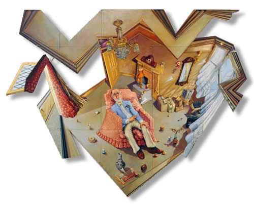 | ANTHONY GREEN |
| Souvenirs of the Confessional | |
| Paintings and Drawings 1980-2006 | |
No comments:
Post a Comment