From a first glance, I can say that he specialized in pop art or painted placards or clip art or wallpaper. I know plenty of textile designers who draw in the same style every day. Good for him that he became famous. But I would not mind having one of his placards on my wall. So there is nothing to say for me about his style; I am not able do it, not see the point in doing it and do not see how it can be relevant to negative space. Most of his drawings do not have any negative space, just flat colour.
But some have

Caulfield,_After_Lunch.jpg
 Patrick Caulfield Second Glass of Whisky 1992 Patrick Caulfield, all rights reserved. DACS 2008 Acrylic on canvas 61x76.5cm  Jug by Patrick Caulfield, 1974 Done drawing in similar style  |
"Pop art is an art movement that emerged in the mid 1950s in Britain and in the late 1950s in the United States. Pop art challenged tradition by asserting that an artist's use of the mass-produced visual commodities of popular culture is contiguous with the perspective of fine art. Pop removes the material from its context and isolates the object, or combines it with other objects, for contemplation. The concept of pop art refers not as much to the art itself as to the attitudes that led to it.[2]
Characterized by themes and techniques drawn from popular mass culture, such as advertising, comic books and mundane cultural objects, pop art is widely interpreted as a reaction to the then-dominant ideas of abstract expressionism, as well as an expansion upon them.[3] Pop art is aimed to employ images of popular as opposed to elitist culture in art, emphasizing the banal or kitschy elements of any given culture, most often through the use of irony.[2] It is also associated with the artists' use of mechanical means of reproduction or rendering techniques.
Much of pop art is considered incongruent, as the conceptual practices that are often used make it difficult for some to readily comprehend. Pop art and minimalism are considered to be art movements that precede postmodern art, or are some of the earliest examples of Postmodern Art themselves.[4]
Pop art often takes as its imagery that which is currently in use in advertising.Product labeling and logos figure prominently in the imagery chosen by pop artists, like in the Campbell's Soup Cans labels, by Andy Warhol. Even the labeling on the shipping carton containing retail items has been used as subject matter in pop art, for example in Warhol's Campbell's Tomato Juice Box 1964, (pictured below), or his Brillo Soap Box sculptures."
Wikipedia
http://en.wikipedia.org/wiki/Pop_art
Personally, myself, I would like have some in my house (only paintings, not sculpture or designs in pop art).
Sir Eduardo Paolozzi's "Sack-o-sauce ", David Hockney's "Large Interior Los Angeles", "Bigger Splash, "We Two Boys Together Clinging", Robert Rauschenberg's 'untitled "combine"', John McHale's "Head", Pauline Boty's "The Only Blonde in the World", "It's a Man's World II", Idelle Weber's "Heinecken", "Legacy", Peter Saul's just about everything, James Rosenquist's "Gift Wrapped Doll #37", Larry Rivers's"The Accident",Mel Ramos did a super advertisement like a lot of his placards, Hariton Pushwagner's"Vertigo 23" (no shadows at all), "Soft City", Sigmar Polke's "Linsenbilder", Peter Phillips' "Hybrid, Baby random", Richard Lindner's "Rock, Rock", 1966 Nicholas Krushenick's "Pumpkin", Kiki Kogelnik's "Female Robot", "kiki", Alex Katz's "the black", Richard Hamilton's "Fashion Plate", Red Grooms' "Dalí Salad", Erró's "Renault Scape", Patrick Caulfield's "After Lunch".
I assume Patrick Caulfield is a good example for people who need labels, who are not able to see negative or positive space or even cannot understand a word of art - I do not mean a philosophical point of view. He made the uninteresting details in pictures play a very important role. So, according to the language of art, if such a language exist, he made negative space play a very important role. I not will mention old masters who put some interesting messages in the language of art in all sorts of negative space, but this messages is not as obvious as the ones in Patrick Caulfield.
But, from all notable pop artists, my favorites will be Peter Saul, James Rosenquist, Larry Rivers, Hariton Pushwagner, Nicholas Krushenick, Kiki Kogelnik and Red Grooms.
15 September
After yesterday working all day, I will try to learn to do thumbnail sketches because I am going to Ukraine on Saturday and my husband ambitiously believes that I should do sketches of Ukraine. I think I have problems believing in myself. I always think next day that I never will be able to draw or paint again.
I tried to do structure of trees today and then sketches and I find that it is incredible easy do sketches – thanks to all the hard work that I have done in this period.
Another problem that I always had : if I did not paint an idea in the same day put it as a sketch I never will do it. Not because I am lazy, just the mood has gone and, as any person, I change each day and learn something new. I like to draw or paint straight away when the feelings are fresh; of course it requires a lot of concentration and hard work, but I do get satisfaction sometimes from my work.
MaybeI am a perfectionist?! I do not know.
But, anyway, I like how these trumnail drawings look in a book, even if I never will do anything with them – still, it is a nice decorative item, so nice to learn to do it.
Another thing: I am not sure if I would like to do writing in a sketch book. I know I should do it ,but, for different reason, learn to do all this bullshit around art, because very often or, if not, nearly always , it is more important to bullshit around art than art itself. So I think I will write my ideas, or at least what I think at this moment, in my blog
Everything I learned so far I will possibly never will use again, but I think it is very important to study technique, because, sooner or later, it will pop up somewhere where you not expect it at all. But as I go on to more study, I feel as though I have come to a huge ocean that I need to swim for long distance and will possibly never become good enough. Maybe it is more important to swim than just get distance, but then we become too ordinary. There are so many questions. What does the word ordinary really mean? Is it bad or good?
Very often I think I trade my art as the first americans sell beads for the gold of the natives. But, again, it is one part of the story; gold is important in our society, but look how beautiful the world or art created by the Maya.
Another thing is that I am a woman and, from history and my experience, the art world is for men. I do not know any famous women artist – I am not talking about such nonsense as Tracy Emmin – but I will do my research on the internet about it .
I looked at Constable and I think he is a very lucky man : he thought world is beautiful; he never sew ugly things around. For me it is a different story: I do not see beautiful people around, they are for me mostly just facial types; I see their souls or what is inside them and, mostly, what I see are selfish, greedy people; I do not say stupid, because sometimes stupidity without agression can be charming. Generally the world is really ugly around me. If I see woman with make up, I see a painted mask for a funeral what was practiced in the past; make the dead look good to face the new world of the dead. Make up is grotesque to me, especially noticeable when a nice person does it, as though she looses her nature and wants to joint the world of ugliness.
Part 1: Using Value
Design principles are based on the way the human brain processes visual information. Depending on your desired results, you can use these techniques to change how the viewer reacts to your work. It should be noted that most of the basics of design are based on human audiences, and will have different results when viewed by cats or extraterrestrials.
Shades, Value, and Gradations
A shade is a combination of white and black to produce a particular shade of gray. All of the shades of gray between white and black are values, and when used together are also called gradations. Computers have made using value easy, with straightforward and evenly mixed values presented on a nice gradation scale.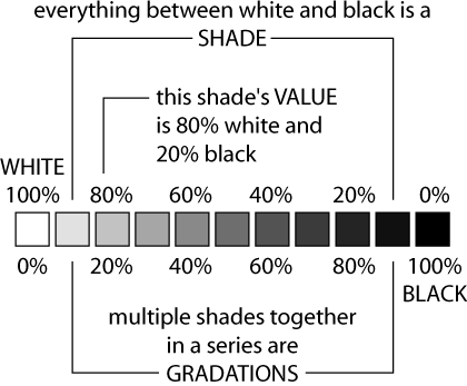
Contrast
Contrast describes the range of gradation between different values.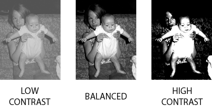
High contrast is often used for greater impact; lower contrast can quiet things down and even create harmony.
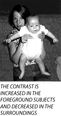
Increasing the contrast of objects in the foreground of an image, and decreasing the contrast of objects in the background, can create more spacial effects. In the image below, the contrast was increased on the people and decreased on the background, giving the image more spacial impact and emphasizing the subjects.
Suggesting Volume and Space
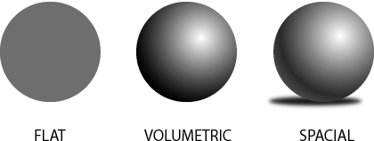
People naturally interpret that lighter values indicate a light source. By using shading our flat circle is instantly given volume, and becomes a sphere.
Shading and value can also be used to create shadows, further adding the suggestion of space and volume. Without shadows the sphere is floating in space. Lighter changes in value are also used at the far right edges of the sphere to suggest that light is being reflected back from a surface.
Why does the sphere with shading work to represent volume and space? The shadow matches the shape of the sphere and the shadow is off-centered to the left to match the direction of the “light source” which appears to be coming from the top-right. If the shadow were dead centered beneath the sphere, it wouldn’t match the lighting direction and would be less convincing.
Problems with drop-shadows or combining multiple photographs into one image are often caused by the light-source not matching the shading and shadow.
Using Value to Create Balance and Visual Interest
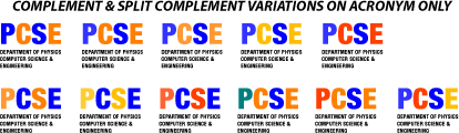
Here is a way to use value to spruce up a letterhead and even create an identity and logo by using value changes. The Department of Physics, Computer Science, and Engineering is often identified with the acronym PCSE.Using Helvetica Neue Bold Condensed, we created a the first line at 72 points and the trailing text at 14 points. These point sizes create a dramatic presentation and added visual balance by generally matching the width and height of PCSE to the following text.
The 72 point PCSE type is visually much heavier than the following text and feels somewhat top-heavy. Why not balance the top-heavy text by lightening the value? Instead of black text, we’ll make it mid-gray.
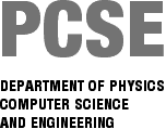
Leave the first letter 50% gray, but let’s change the rest. Make the C and E lighter and the S slightly darker.
Psychology and Value?
Value and contrast can also be used to change the mood of an image or design. A good example is old vampire movies and how the underexposed and dark scenes created a sense of danger. The next time you watch a horror movie or a sci-fi movie with a bleak subject, notice how the use of darker values and contrast are applied throughout the movie to affect mood. From the very beginning of the movie the titles will often use value as a technique to set the mood for the audience. It wouldn’t be a good idea to use that technique when trying to create an advertisement for laundry detergent.Another time to avoid using many darker values is when creating a presentation for a lecture, since excessive use can lead to a cranky and disinterested audience. An audience can actually be encouraged to pay more attention by slightly tweaking images to create higher contrast (just don’t go overboard).
On the flip side, value can be used to create a more soothing and relaxed effect. Look for this technique in television programming that is targeted to calming viewers. Some instructional, gardening, home-oriented, and “feel-good” shows tone down the contrast, especially the extreme lights and darks.
Value is just one of the basics for creating good design and modifying images. In Part 2 we’ll discuss color and simple ways to use color to help with your images and design.
Part 2: Using Color
Color is all around us, and it’s probably for that reason that most people don’t think much about it. Many people haven’t had to think about color since their days in grade school when they made projects out of colored construction paper and watercolor paintings to bring home to their parents.Fortunately for us, techniques for using color have been broken down almost into a science. Hundreds of years and generations of artists and designers have explored color and how it can be used to achieve a specific desired result. There are literally dozens of books about color and how to use it, and there are many ways to apply color technique.
Primary and Secondary Colors
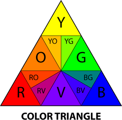
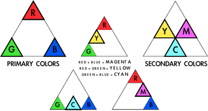
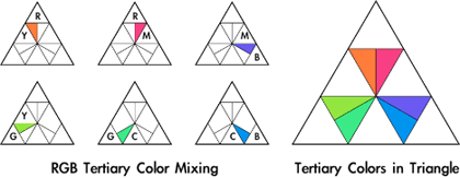
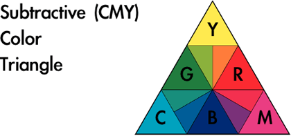
You may remember someone (probably in grade school) teaching you about color, and the concepts of primary and secondary colors. These are the basic colors just about everyone is familiar with.The primary colors are yellow, red, and blue. These are considered the foundation of color because when mixed together and in different combinations, all other colors can be created from using these three primaries. Notice that the primary colors are located on the corners of the color triangle. The primary colors are the “cornerstones” from which all color principles are based.

Any pure color is also referred to as a hue. Each color is a hue. Changing hue means changing the color itself.
Primary and secondary colors can be used in an image to attract attention and create energy, but be warned that overuse of these colors may give a design a simplistic, childish, or even amateurish look. Children’s toys often use primary colors to keep attention focused, but many people carry those associations into adulthood and don’t react positively to pure primary/secondary color usage.
It has been suggested on many occasions that an artist’s sophistication and career development can be observed through their use of color. The argument is that visually using mainly primary and secondary colors suggests that the responsible party has not had the time to experience, develop, and explore color and its infinite possibilities. That doesn’t mean these colors shouldn’t be used, but it is something to be aware of and to watch out for when designing for some audiences.
Tints and Shades
When white is added to a color, the color is diluted and produces a tint (also referred to as “pastels”). A shade is created when a color is mixed with black.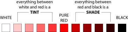
Whenever a color is “diluted” by mixing white or black into it, the color loses saturation. The color pink is created by mixing red with white. Technically the color pink can be described as “a tint of red” or “low-saturation red.”
The effect of tints and shades upon the observer varies based on how they are used, but both are visually weaker and have less energy than does pure color. Traditionally, products targeted to women include more tints, while products for men are often more saturated. Whether this is the development of social conditioning or is based on physical gender is difficult to tell, but it does appear to work when targeting a gender-based audience.

Analogous Colors
The term analogous means “like” or “similar.” Analogous color can be used to create subtle differences in an image or design. These subtle differences create a peaceful and more harmonious feeling from an image.
Using blue as a starting point, analogous tints and shades can be applied to create many different options. The result is that each variation creates a unified feel (some more than others). This is a particularly good method for applying color to designs which have limitations on reproduction. For example, the design may appear not only on paper but on T-shirts and coffee mugs. The cost of reproducing a design multiplies for every additional color used. If only blue and tints of blue are used in the design, only one ink needs to be used in printing the design on a T-shirt. Shades will require the use of two inks, both blue and black.


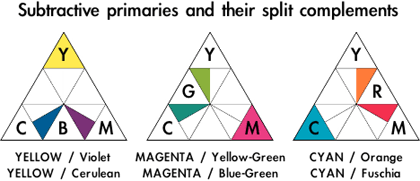
Complementary Colors
Find a primary color on the color triangle. Draw a line directly opposite the color and you have discovered the complementary color.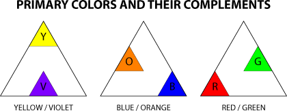

The next time you’re in an art museum, look closely at the gray on a painting and you may be surprised to find it is actually composed of colors rather than black and white. The common CMYK printing process (cyan, magenta, yellow, and black—the printing equivalents of the primary colors), while very versatile, just isn’t capable of completely reproducing all of the nuances of color. This is one of the reasons why reproductions (posters and prints in books) often lose some of the feeling and impact that can be seen in the original.


This is when color usage may become tricky. The Department of Physics, Computer Science & Engineering may enjoy the increased energy from the complementary color usage, but the results also resemble the logo designs from some sports teams. If the client wanted to suggest a greater excitement in their public image, these examples might be their preferred choice. These might also be suited for recruitment purposes by attracting attention and suggesting energy.
On the other hand, the Department of Physics, Computer Science & Engineering may not find the results appropriate for their public image and decide that the analogous color examples are more representative. When using color in design it is important to know the desired end result to use color most effectively.
Psychology of Color
There are theories as to why we react to color the way we do, many based on what color means in nature. Bright colors, like the yellow on a bee or a flower, attract attention but can suggest different meanings. For the bee, the yellow is there to warn others to pay attention or they’ll get stung. For the flower, the yellow is there to attract others so that the flower will be pollinated. Either way, yellow is a color that demands a reaction from earthly observers.One method for applying color is by dividing it into warm and cool colors. The primary color yellow is “hot,” red is “warm,” and blue is considered “cool.” The “warmth” of secondary colors can vary based on how close they are to yellow and red. Yellow-green is “warmer” than blue-green, and draws more attention from the observer.
The technique of using warm and cool colors can be used in an image to draw attention to a specific area or to suggest space. Warm colors advance, and cool colors recede.
Applying Color Theory to a Photograph
Many people are unaware that the professional photographic images they see on a daily basis have been modified to produce greater impact. With color theory it’s possible for anyone to “dress-up” their photos to create more dramatic results.With the photograph at hand, it often helps to take a look at the colors already present in the image before making changes. Working with the existing color will allow the modifications to fit more seamlessly within the image.
Many landscapes, either in print, television, or motion pictures, have been modified to create greater impact. The blues in the sky and/or water are often exaggerated, and other colors may be applied to further emphasize the changes. Because many landscapes contain blue from either the sky or from water, blue is a good base color to begin modifying a landscape. Cranking up the amount of blue is a simple modification that just by itself can create dramatic results.

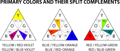
In our second example we have a photograph with a woman walking past an alley. There is already an abundance of yellow in the image, so yellow will be our staring point for the modifications. Blue-violet is a split-complement to yellow and presents contrast between the alley and the foreground’s already yellowish tones. Further contrast was created by slightly increasing the yellow in the foreground, but only by 15% so as not to make the woman look jaundiced.
The results in this example are obvious, but not necessarily negative. Most viewers will be able to notice the modifications, but that isn’t necessarily a problem if the modifications encourage the viewer take more interest in the image.

Interaction of Color
When is yellow not yellow? When does gray change and look more like a color? In our example there are four boxes. Depending on which box you look at, the colors can appear to change even though they are all the same.The gray box within the yellow square looks darker than the same gray box within the violet square. Stare at any of the examples and you may notice the gray doesn’t appear to be “just gray” anymore, but instead takes on some of the appearance of the complementary color of the color next to gray (the gray next to yellow can appear more violet).
Even though color is based on scientific principles, how our brains interpret color is an entirely different thing that can’t always be explained as easily.

Color Processes
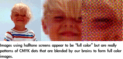
The discussion of color thus far has been based upon the principles of reflective color, meaning when light bounces and reflects off an object. Things change when the color is emanating from light. When light is used to create color, yellow is no longer a primary and is replaced by green. Instead of mixing yellow, red, and blue to create color, light uses red, green and blue (RGB). This is the same technique used in televisions, which is why if you look very closely at a CRT screen you can actually see the separate RGB pixels. The RGB color mixing process is the most common option available in computer software, primarily because most computers present information to users with CRT screens or LCD’s, both of which use RGB color mixing.Another color process that is widely used is CMYK (cyan, magenta, yellow, and black). This is the process used for most print reproduction, whether it is a color inkjet printer or large printing presses for books and magazines. CMYK color mixing is a common option in most computer graphics software.
RGB and CMYK are just different methods for creating color. All of the principles of color still apply. Many beginning users of computer graphics software are frustrated by the RGB and CMYK color mixing restrictions. Some software (Painter is one example) is targeted to users of traditional media, like oil painting or watercolor, and offers different color mixing tools that more closely resemble the color triangle presented here.
Even though this discussion has covered some of the basics of color theory, it’s important to remember that color, like all visual tools, is subjective. How people react to the same image differs greatly from person to person. By using some of the principles discussed, it is possible to use color to more consistently affect how viewers react to visual work and to communicate a specific message.
The next article will build on what has already been presented in a discussion of Perspective and the Illusion of Depth.
(The primary colors of light are red, green, and blue. If you have a white wall in a dark room, you can shine red, green, and blue lights onto the wall at various intensities to produce different colors. Shining all three colors onto the same spot at the same intensity produces a white spot.
The primary colors of pigment are cyan, magenta, and yellow. This is why inkjet printer ink comes in those colors. Mixing all three produces black. Magenta, yellow, and cyan are close enough to red, yellow, and blue .
Note that the primary colors of light are the secondary colors of pigment, and vice-versa. So the color wheel for light and the color wheel for pigment are complimentary.
Scientifically, additive color mixing is when red, green, and blue are mixed from light sources to create color. Red, green, and blue (RGB) are the primary colors of light. The secondary colors of light are yellow (green + red), cyan (green + blue), and magenta (red + blue). Subtractive color mixing is the color we see around us on a daily basis, the color reflected off of objects (described as reflective color in the article). The CMYK process, commonly used for printing and print reproduction, uses cyan, magenta, and yellow as the primary colors. CMYK is the color process used by color printers.
When applied to art and design, color usage is not as objective as the scientific principles. Human reaction to color is subjective and there are multiple methods for applying color principles. The article presents color not from the purely scientific viewpoint, but from the perspective of art foundation theory as has been taught and successfully used for many years. Color theory as applied to the visual arts is more than just how the cones in the human retina react to light. Artists and designers in traditional media have been using the information presented in this article for many generations and with great success and the color principles presented in this article are still taught to art and design students.
Art, design, and aesthetics in general cannot be taught or discussed purely from a scientific basis, nor from a viewpoint of “right and wrong.” Be assured that the upcoming presentation of color will include the science behind additive and subtractive color principles and how they are used in traditional technique, reproduction, and video.
Scientifically, reflected color is called subtractive color.The term Reflective Value applies to all color and describes the lightness or darkness. White has the highest reflective value and black has the lowest. Tints have a higher reflective value than shades. Different colors, in their pure form, also have different reflective values. Yellow is brighter than Red which is brighter than Blue.
The term Reflective Paint usually refers to paints that have fine metal or plastic particles mixed with the paint that reflect light back to the viewer. The paint used for marking lanes on highways is reflective.
There are also ways of printing transparent inks onto reflective surfaces that make an overall image reflective. These techniques are common in sign manufacturing and can be used with other forms of screen printing.
/Primary Colour.
The opponent process is a colour theory that states that the human visual system interprets information about colour by processing signals from cones and rods in an antagonistic manner. The three types of cones have some overlap in the wavelengths of light to which they respond, so it is more efficient for the visual system to record differences between the responses of cones, rather than each type of cone’s individual response. The opponent color theory suggests that there are three opponent channels: red versus green, blue versus yellow, and black versus white. Responses to one color of an opponent channel are antagonistic to those of the other color. The particular colors considered by an observer to be uniquely representative of the concepts red, yellow, green, blue, white, and black might be called “psychological primary colors”, because any other color can be described in terms of some combination of these.
http://en.wikipedia.org/wiki/Primary_color/
- Part 3: The Illusion of Depth
Perspective
There are two simple rules about representing depth. Size decreases with distance, meaning objects that are further away from the viewer appear to be smaller. Objects also overlap when one is in front of the other, hiding part or all of the farther object(s). These two observations are the basis for perspective.The easiest way to understand how perspective works is to imagine standing in the middle of train tracks (not recommended for safety reasons) and looking along the tracks into the distance. Visually follow the tracks to the horizon (where the earth meets the sky) and the tracks appear to meet at a point in the distance. This converging point is called the vanishing point.
Now imagine that as you look at the train tracks converge into the distance, you are holding a piece of rectangular glass directly in front of you. If you traced what you saw onto the glass with a marker, you would be drawing onto the picture plane. Perspective is a method for representing what is seen through the picture plane on another two-dimensional surface.
The train tracks are an example of one-point perspective, the easiest of the perspective methods. This method is useful when representing landscapes, city streets, and other environments in which things are aligned and converge to one central point.
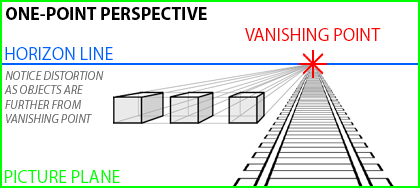
The boxes to the left to the tracks in the one-point perspective example have one face perfectly aligned parallel to the picture plane. This is a limitation of one point perspective. Another problem with this technique is that objects become more distorted the further they are from the vanishing point, as can be seen with the far left box in the example.
The real world is rarely so organized as to align objects facing the viewer, nor are we often standing in the correct position to observe objects so directly. Because we view most objects from an angle, and not directly from the front or sides, two-point perspective allows us to represent our world more realistically by orienting two faces of an object obliquely to the picture plane.
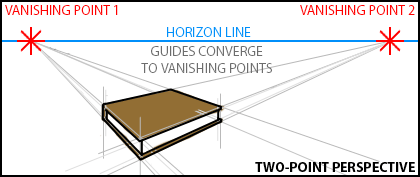
The horizon line in the book image is higher in the two-point example than the horizon in the one-point perspective image. The higher horizon suggests a viewpoint from a higher position, such as looking down upon a book on a table. The position of the horizon line represents the viewer’s eye level and affects how the viewer interprets the image. A lower horizon suggests that the scene is either from greater distance or that the viewer is lower to the “ground.” A higher horizon could also be used to suggest the viewer was looking out a window from a tall building. Horizon line placement is similar to using a “bird’s eye view” or a “bug’s eye view” in photography. These extremes are useful for creating more dramatic visual results. Look for this technique in comic books, where horizon placement and exaggerated perspective are used to suggest action and create more visual interest.
One-point and two-point perspective techniques can be used in the same image if needed to represent different objects. Determine if an object’s face (one-point) or edge (two-point) is closest to the viewer and then use the appropriate method. Each object may also have its own vanishing points, since only aligned objects will share them.
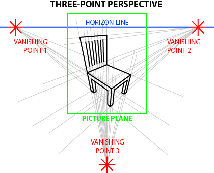
Notice that in the chair illustration the picture plane does not contain the vanishing points. It is not necessary for the vanishing points to be within the picture plane for perspective to work. When creating smaller images using two or three-point perspective, the results will often appear more natural if no more than one vanishing point is in the picture plane at any given time.
Perspective in a Logo
Logos should easily communicate the identity of the business and its product in a unique and recognizable way. In this example the logo is intended for a custom handmade cabinetmaking shop. The logo needs to work for print, but will also need to be easily transferred to paint stamp and branding irons so that the business can use the image to “sign” their pieces. Fine detail will not show up on stamps or irons, so it should be avoided for this project.The chair used in the three-point illustration is a good starting point for creating this logo. The acronym “MH” was added to represent the shop’s name and distorted to match the perspective used to create the chair. The clean, even lines make results from different reproduction methods more consistent and help the “readability” of the image.
A potential problem with the lines of the white chair is how they transfer to stencils, stamps and irons. Inverting the chair to black with white lines made the image more suited for the other methods of reproduction.
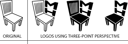
Logos should easily communicate identity and brand to the observer. There is no doubt the business has MH in the name and something to do with furniture as well. While this example illustrates applying perspective to a logo, it also demonstrates effective logo design.
Using Line Thickness to Suggest Depth
Variations in line thickness can be used to suggest depth. In the example for one-point perspective, the lines of the train tracks get thinner as they “fade into the distance.” Bolder lines can be used when illustrating the same object to bring it to the foreground and demand more attention, with thinner lines receding and creating the opposite effect. Using line variation to suggest depth is another useful technique in illustration, and as with exaggerated horizons and perspective is also frequently seen in comic books.Shading and Shadow
Shading adds depth to an object by suggesting volume, and shadows place an object in an environment. Both are also used together to indicate light sources in an image and help represent three dimensions in two-dimensional media. Read Part One: Using Value for more information and examples.Atmospheric Perspective
Objects in the distance become obscured by our atmosphere, including humidity and particulate (dust, pollen, smoke, and pollution). This effect is called atmospheric perspective. Distant objects viewed through clean air will take on a blue or blue-gray color. Humidity and fog shift the color more to gray. Brown, violet, or orange can be used to mimic pollution and smoke.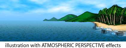
simple atmospheric perspective

Another effect from the atmosphere upon distant objects is a change in contrast. Objects viewed from a distance will have less detail and lower contrast with fewer lights and darks. Shadows, highlights, and reflections are less extreme or not present at all when viewed from a distance. Use more contrast in foreground objects and less in the background to suggest depth and focus attention. More information about contrast can be found in Part One: Using Value.
Anyone who has played with photography understands that when the camera is focused on a close object, the background may appear blurred. Blurring the background in an image simulates this effect while also decreasing contrast and detail.

Applications
Most of the techniques covered in this article are used by 3D software to create images in perfect perspective with atmospheric perspective effects. With such tools available, why anyone needs to know the information in this article is a question often asked. Knowing how to simulate depth helps to create better images, even using 3D software to do most of the work. It helps to know what to look for in order to make the software do it.Many images created with 3D software must be combined with photography or illustration to create the finished product. Star Wars: Attack of the Clones is a good example. Most visuals in the movie, minus the actors, were created using 3D software. The live footage with people was combined with the computer generated images, but the finished images had to work together to be convincing. If the actors were in different perspective from the setting, it wouldn’t matter how great the 3D images were because the two wouldn’t match and people wouldn’t like the movie.
Knowing how things work is a large part of what is required to make things work. In that respect, art and design are no different from science and invention.
Problems can occur when combining multiple images together, not only with mixing photographs but also when using illustration and clip art. Each image may be perfect by itself, but put together with other images things don’t look right. Even if the problem isn’t obvious, you can often find inconsistencies by checking perspective, line variation, shading and shadow (direction of light sources), color, contrast, detail, and focus. The problem may be one thing or a combination, but corrections are easier when you know what to look for.
Part 4: Line
Line is one of the oldest and most fundamental tools in the visual arts. The use of line is found in cave paintings and rock carvings dating back well over 20,000 years, making it one of the most ancient documented artistic techniques.
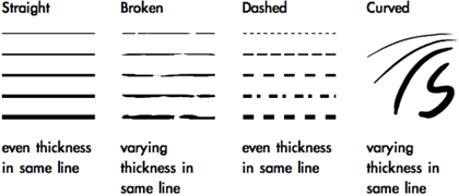
In geometry, a line is described as the shortest distance between two points, but that only describes a straight line when talking about visual art. In art and design, the definition of line is not so limiting. The aesthetic definition of line is the visual connection of two points. A stroke is one continuous mark. Line can be made up of many different strokes, with even or varying thickness in the same stroke.
 When using natural media or a computer drawing tablet, line can be changed by the tightness of grip, position of the fingers, position of the wrist and arm, pressure, and speed of the stroke.
Contour with line is the outline of a shape or object. A contour drawing is only made up of outlines, and depending on the application the drawing may be composed of one unbroken line to create the entire image.
The quality of line has many applications, depending on the desired reactions from the viewer.
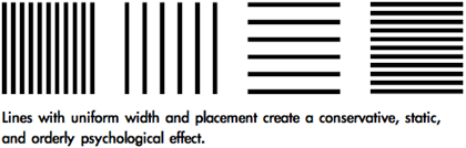
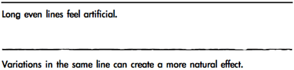 Technical drawings use thin lines of equal width, because even line is less distracting and allows the viewer to focus on the content of the drawing. Thin even lines also give a more precise point for measurements, allowing technical drawings to be used as blueprints for construction. Delicate, broken, tenuous line can suggest nervousness.
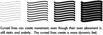
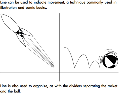 Line is also used to abstractly describe the separation between areas of change, when objects are aligned, or when the repetition of objects creates “line” and visual movement. Instead of being a mark between two points, line is used to describe a visual connection.
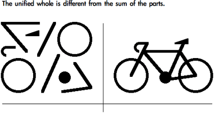 Gestalt Theory is a set of rules for describing how the various ingredients of visual art come together to form the whole. Gestalt is the German word for “form, shape, pattern, or configuration.” “Good gestalt” is when elements work together to create a unified aesthetic. Gestalt Theory helps explain many of the abstract principles used in the visual arts.

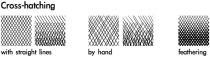
 Hatching is the technique of using parallel lines to create value. Feathering is a variation of hatching in which the thickness and placement of the lines change to create value gradations.
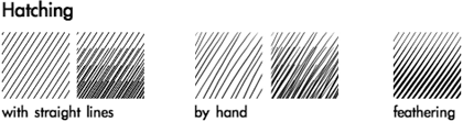 The direction of line can also be changed. When sets of parallel lines are used together crossing in different directions, the technique is called cross-hatching. Feathering can also be used in cross-hatching.
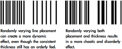
Varying frequency, line thickness, direction, and stroke length within the same image can create a sketchier quality with richer depth of tone.
 More about value and its uses can be found in Part 1: Using Value.
The next article will discuss shape (simple, complex, geometric, natural, and abstract) and more Gestalt Theory. Copyright © 2003 Andrew Kator, akator@atpm.com.
EXAMPLE 1- THE SPHERE


EXAMPLE 2 -


The head is basically a sphere as are the top muscles of the
shoulders. The arms and legs are basically cylinders. Note how the
light and shade define the form. Study the cast shadows affecting
the form from one basic form onto another basic form.
www.Interactiveartschool.com/free-art-lessons
In geometry, a line is described as the shortest distance between two points, but that only describes a straight line when talking about visual art. In art and design, the definition of line is not so limiting. The aesthetic definition of line is the visual connection of two points. A stroke is one continuous mark. Line can be made up of many different strokes, with even or varying thickness in the same stroke.
Contour with line is the outline of a shape or object. A contour drawing is only made up of outlines, and depending on the application the drawing may be composed of one unbroken line to create the entire image.
The quality of line has many applications, depending on the desired reactions from the viewer.
Gestalt Theory
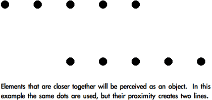
An easy way to understand Gestalt Theory is by imagining that we are baking a cake. The ingredients for the cake are arranged on a counter, but individual ingredients cannot begin to describe the cake. For example, an egg might be a cake ingredient. If we examine the egg, it tells us about the egg, but not how it will be used to create a cake. It is only when assembled that the ingredients form the completed product. The whole cannot be seen by looking only at the individual elements.Gestalt: Proximity
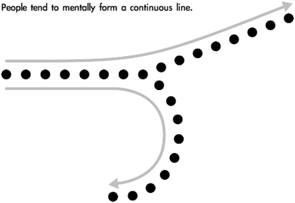
Proximity is the first Gestalt principle discussed because it relates directly to line. The Gestalt Law of Proximity states that elements that are closer together will be seen as a coherent object. As objects become closer they are seen as more unified. Proximity explains why broken or dashed lines and separate shapes can be interpreted as line.Gestalt: Continuity
People tend to interpret line and contours whenever the visual elements of an image establish a direction. This explains “movement” in an image, since the eye continues in the direction that has been established. The viewer follows a larger uninterrupted form composed of smaller separate forms.Value With Line
Changing line frequency and thickness are the most fundamental techniques to suggest value using line. Interpretation of line as value is an application of both Proximity and Similarity Gestalt principles. Line frequency and thickness can be used separately, or together for a more natural effect.Varying frequency, line thickness, direction, and stroke length within the same image can create a sketchier quality with richer depth of tone.
The next article will discuss shape (simple, complex, geometric, natural, and abstract) and more Gestalt Theory.
An Art Lesson from Interactive Art School. This and the other Art
Lessons are for your enjoyment and a hint of what you will receive in the for-profit
6 Lesson/10 Textbook/ 6 Personal Critique Full Art Course
Lessons are for your enjoyment and a hint of what you will receive in the for-profit
6 Lesson/10 Textbook/ 6 Personal Critique Full Art Course
FORM is the underlying structure of things that we can understand and use to
create realistic objects in our paintings and drawings.
create realistic objects in our paintings and drawings.
This page a sample of the Interactive Art Schools ON-THE-WEB teaching. One
of the school’s tools is it’s unique use of WEB animation which can make principles
clearer than a flat printed textbook or sketches in chalk on a blackboard. So
we supplement the course text books with on-the-web lessons and lesson supplements
like this (All registered students get 10 text books in their Sign Up Kit).
EXAMPLE 1- THE SPHERE
 | The sphere animation to the left is small so as to not strain your patience or modem, but makes the point – things have form and are revealed by light and shade, shadows and reflections. Form is the basis of ALL visual objects as the lesson below will show. Study the sphere animation. Make your own at home with a ball and a flashlight or table lamp you can “walk around” the ball. |
As the lights on the sphere turn, note how the shadows and how the light and shade on the sphere change to reveal the form. In this lesson, we will see how this effect is applied to real-life things . . . see how changing the sphere to red and modifying it’s shape a little makes an apple! |  |
The animations above show that a sphere is the underlying structure of an apple
- we will look at various forms (cubes, cylinders, etc.) that are the underlying
structure of all visual things.
- we will look at various forms (cubes, cylinders, etc.) that are the underlying
structure of all visual things.
Let’s analyze the “anatomy” of the apple closer -below is an another
image of the apple, generated as a 3d computer graphic model for our study.
Below that the same image has some notes on the same image showing the visual
structure of an apple. Later – we will use the basic form models of various
forms to show the underlying structure of all things and creatures.
image of the apple, generated as a 3d computer graphic model for our study.
Below that the same image has some notes on the same image showing the visual
structure of an apple. Later – we will use the basic form models of various
forms to show the underlying structure of all things and creatures.
All the above is done in 3d Computer Graphics (also called CGI or Solid Modeling)
- both the animated demonstrations and the still images showing the basic principles
of form. How does that relate to your painting an apple you might be saying
right now? Here’s how:
- both the animated demonstrations and the still images showing the basic principles
of form. How does that relate to your painting an apple you might be saying
right now? Here’s how:
 | Note how all the concepts of reflected light. highlights, shadows, color reflected from the tabletop into the cast shadow from the apple on the tabletop are PAINTED into the oil painting of the apple |
The painted apple uses the principles demonstrated in the 3d model apple:
- Light source causing highlighted whitish area
- Hot red light struck side
- Transitional reds as apple turns from direct light to bottom of apple
- Transition from hot, bright lit area into darker deeper, cooler transitional
red as to dark shadow side of apple - Reflected light from blue tabletop turns dark shadow side of apple lighter
and more crimson red (cooler) - Added to the painted apple is the “local color” – the variations
in the skin of the apple in yellower areas, striping gives apple even more
realistic look.
EXAMPLE 2 -
Some Basic forms:
All objects in a picture are based on
form …some more complex than others (like clouds and water, etc.).
form …some more complex than others (like clouds and water, etc.).
Let’s start using these forms by seeing
how they underly a figure. The painting below left is my copy of a
painting by
Theophile Gericault in the Metropolitan Museum of Art in New
York City. To its right is my analysis of the underlying forms of
that figure. The muscles and surface colors are then added to the
underlying form to create a real/solid figure.
The head is basically a sphere as are the top muscles of the
shoulders. The arms and legs are basically cylinders. Note how the
light and shade define the form. Study the cast shadows affecting
the form from one basic form onto another basic form.
www.Interactiveartschool.com/free-art-lessons
Image: ©2007 Marion Boddy-Evans. Licensed to About.com, Inc.

Part 5: Shape
In visual art, shape can be defined as simple or complex, geometric or natural, and abstract. A shape may combine different qualities, for example one shape can be both simple and natural, and another shape can be simple, geometric, and abstract.
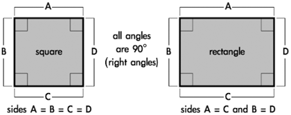
 Squares and rectangles are the most common shapes in man-made objects. From architecture to the arrangement of text on a page to the shape of the page itself, most of what people encounter on a daily basis is composed of squares and rectangles. Because so much of the man-made world is composed of these shapes, squares and rectangles are familiar, safe, and comfortable, but their uniformity can also create a conservative or rigid effect. They can be used to suggest stability and truth. Squares are considered to be one of the most honest shapes, even more than other types of rectangles, because of their mathematical and visual simplicity.
Triangles suggest action because of movement from the corners “pointing” in a direction. Equilateral triangles are the most stable of the triangle shapes because all sides and angles are the same. Triangles can suggest growth or “reaching the top.”
Circles suggest infinity, completion, softness, and security. Many ancient cultures considered the circle to be a perfect and even a sacred form. Circles are useful for focusing attention because of the closure of the shape, and because they are less common in man-made objects than shapes with straight lines. Ellipses share the psychology of circles, but to a lesser extent depending on the how close they are to a true circle.
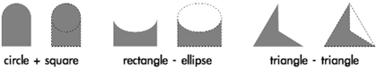 The effects of complex shapes can be predicted by how many overall similarities they have to the basic shapes. An easy way to visually simplify a complex shape is to squint and/or get some distance. As the complex shape becomes more blurred, the details “disappear” and the overall effect will be easier to see.
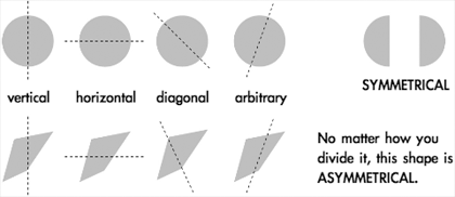 The direction of the cut is the axis of symmetry, and it can be horizontal, vertical, diagonal, or arbitrary. A circle is the most symmetrical of all objects, meaning no matter how you cut it in half the two pieces will always be exactly the same. Squares are also highly symmetrical, exhibiting vertical, horizontal, and diagonal symmetry. Ellipses and rectangles are horizontally and vertically symmetrical, but lack diagonal symmetry.
Another method used to view symmetry is reflection. Imagine holding a mirror down the middle of an object. If the reflection in the mirror completes the shape, the object is symmetrical along the axis with which the mirror is aligned.
Shapes like circles and squares gain some of their positive visual emotional reactions, like completion and honesty, from their symmetry.
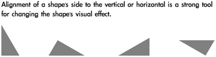
 People naturally tend to align objects to the horizontal and vertical. This is based upon instinctive interpretations of the world around us, where gravity holds objects “flat” to the earth’s surface. The horizon, where the earth meets the sky, is a long horizontal line when seen from a standing position with a clear view into the distance. These instinctive visual interpretations make horizontal alignment the strongest method of visually arranging objects. Vertical alignment (90° from horizontal) is also a strong method, but not as strong as horizontal.
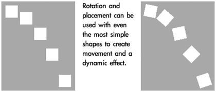
 Because of their straight lines, symmetry, and comfort, rotating squares and rectangles from horizontal/vertical alignment can create dynamic effects. The visual reaction to the object changes based on the amount of rotation and whether the angle is arbitrary or more rigid 30° and 45° increments. Shapes of all kinds with right angles (90°) share visual stability, but that can be changed with rotation.
Being simple or geometric doesn’t mean a shape isn’t a powerful tool. Placement, scale, and rotation of simple and geometric shapes can alter the stability and predictability of the original shapes and thus increase their complexity. Even the circular effects of ellipses can change when rotated.
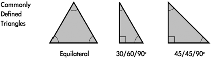
 Triangles can be of any shape or size, but there are three three specific types of triangles that are geometrically defined and used most often. Equilateral triangles are visually the most “complete” triangle, because all sides are the same length and all angles are 60°. This gives equilateral triangles some of the same simplicity and “honesty” that is interpreted from squares.
The two other commonly used triangles are a 30/60/90° and a 45/45/90°, both named from the angles used to construct the shape. The 30/60/90° is one-half of an equilateral triangle, and the 45/45/90° is one-half of a square, cut diagonally.
 Parallelograms combine some of the psychological stability of squares and rectangles with the same dynamic effects and movement seen in triangles. Increasing the “slant” or “shear” of the parallelogram makes the dynamic effects more triangular, while lowering distance of the “shift” can create effects similar to rotating squares and rectangles.
The effects of all other geometric shapes, including other polygons, can be predicted by how they resemble the basic shapes. Use the same techniques for predicting reactions to complex shapes for interpreting polygons. For example, an octagon shares many elements with rectangles but also creates a circular effect.
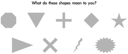
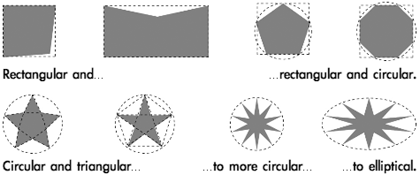 Notice the “painful” feel to the two right stars. As the multiple “triangles” in the polygon become thinner, they suggest a pointy or cutting edge. It is important to be aware of the emotional reactions evoked by shape.
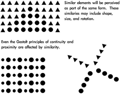
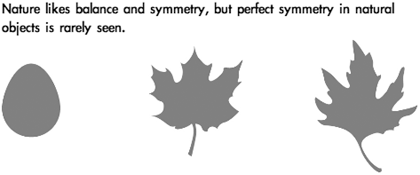 Perfect symmetry can create an unnatural, conservative or even stagnant appearance. Even slightly asymmetrical shapes can create more visual interest by allowing the viewer to subconsciously discover symmetry instead of having it perfectly defined. This can make natural asymmetrical shapes feel more dynamic and spontaneous.
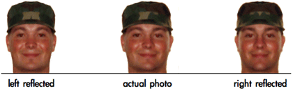 A good example of natural variation of symmetry can be found in the human face. Even with many facial features balanced in pairs, there is variation between the placement and shape of the features. In some cases, one half of a person’s face reflected to create a symmetrical whole will become an entirely different and unrecognizable person.
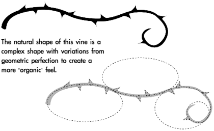 Tearing a piece of paper instead of cutting it results in an irregular edge with many variations, even if the overall rip is straight. Simple and geometric shapes can be made more natural, visually complex, and less monotonous by changing the outline of the shape. The same techniques used with line for a more natural effect can be used with shape. Adding breaks in the shape, randomness and variations, or “notches” to their outlines can all make shapes more natural and “organic.”
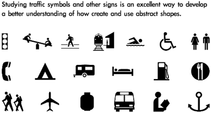
Abstract shapes are often silhouetted and exaggerated to focus on recognizable shape rather than being realistic. The silhouettes and lack of detail make them easily understood from a distance and by people with different cultural backgrounds. Because most abstract shapes are used to communicate, they must command attention, convey a clear and simple meaning, and command respect. When abstract shapes are used for signs, they must also give adequate time for proper response.
The interpretation of many shapes is cultural. Octagons mean stop, especially when combined with the color red, but that same meaning doesn’t apply in countries where stop signs are not shaped as octagons. Stars and star-bursts are used to emphasize and identify “new and improved,” but this is another cultural meaning through repeated use in mass communication and advertising.
 The most universal symbols are based upon nature and easily recognizable human shapes and tools. Most people, regardless of background, can recognize a stick figure as a person or the silhouette of a wave or a bird because these are abstractions of natural shapes they have experienced in the world around them.
 One of the most basic abstract shapes that is taken for granted is the arrow. Combining the effects of triangles and line, arrows are used to illustrate and indicate movement. Because of this universal visual interpretation, arrows are used worldwide to control movement of people and their vehicles.
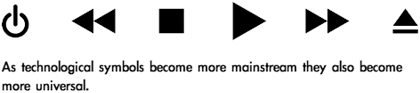
 Cultural symbols can evolve to become universal symbols once their use saturates a majority of societies through the world. One hundred years ago the shape of a car or bicycle might not be recognized by most people, but since these forms of technology have influenced people across the world they are now more universal.
Because of their widespread use in electronics, triangles can mean play, action, and next. Triangles are also used to represent stability, a cultural reference to the pyramids. They are also used for beacons, arrows, and pendants, and can symbolize the Christian principles of the Holy Trinity and the unifying concept of three.
 The “power/on/off” symbol is a combination of the 0 and 1 logic expressions of true of false. This symbol is not yet universal, but it is possible to watch it change from something only recognized by the computer-literate to mainstream use. This icon is now used on many computers and electronics, and many people are already unaware of the logic expressions in the symbol and accept it as an abstract shape representing the power switch.
Abstract shapes are often used in logos by marketing and advertising to create brand identity. People in every country recognize certain shapes with products, the best examples being the logos for Coca-Cola and Pepsi. Regardless of the language, almost anyone can pick out one of these products. Effective logo design often uses abstract shape to create a universal product identity that transcends language and other cultural barriers.
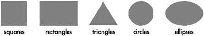
Simple
The simple shapes are the square, rectangle, circle, ellipse, and triangle. These are the basic forms that are used as the foundation for all other shapes.Triangles suggest action because of movement from the corners “pointing” in a direction. Equilateral triangles are the most stable of the triangle shapes because all sides and angles are the same. Triangles can suggest growth or “reaching the top.”
Circles suggest infinity, completion, softness, and security. Many ancient cultures considered the circle to be a perfect and even a sacred form. Circles are useful for focusing attention because of the closure of the shape, and because they are less common in man-made objects than shapes with straight lines. Ellipses share the psychology of circles, but to a lesser extent depending on the how close they are to a true circle.
Complex
Complex shapes combine parts or all of the simple shapes. These include polygons or less “definable” shapes that may include parts of circles, squares, triangles, ellipses, and rectangles.Symmetry
The easiest way to explain symmetry is by cutting an object in half through the middle. If the two pieces are the same, an object is symmetrical. Asymmetry is when the two halves are not the same.Another method used to view symmetry is reflection. Imagine holding a mirror down the middle of an object. If the reflection in the mirror completes the shape, the object is symmetrical along the axis with which the mirror is aligned.
Shapes like circles and squares gain some of their positive visual emotional reactions, like completion and honesty, from their symmetry.
Geometry
Geometry, in mathematics, is the study of shapes and their relationships, but the definition of geometric shape in visual art is more flexible. Geometric shapes are structured, often symmetrical, and often contain straight lines. The simple shapes squares, rectangles, circles, ellipses, triangles, are all geometric. While knowing all of geometry isn’t necessary to create visual art, understanding some of the principles helps to explain human responses.Being simple or geometric doesn’t mean a shape isn’t a powerful tool. Placement, scale, and rotation of simple and geometric shapes can alter the stability and predictability of the original shapes and thus increase their complexity. Even the circular effects of ellipses can change when rotated.
The two other commonly used triangles are a 30/60/90° and a 45/45/90°, both named from the angles used to construct the shape. The 30/60/90° is one-half of an equilateral triangle, and the 45/45/90° is one-half of a square, cut diagonally.
The effects of all other geometric shapes, including other polygons, can be predicted by how they resemble the basic shapes. Use the same techniques for predicting reactions to complex shapes for interpreting polygons. For example, an octagon shares many elements with rectangles but also creates a circular effect.
Gestalt: Similarity
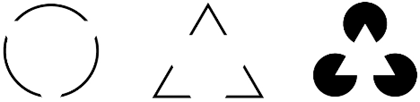
Gestalt: Closure
Humans tend to visually close a space by completing a contour and ignoring gaps in the figure. When something is left to the imagination, people tend to find visual images more interesting than when the entire image is “complete.” People naturally fill in the missing information.Natural
Natural shapes are usually complex and most often represent real world objects. Because the real world is rarely perfect, natural shapes are more irregular, asymmetrical, or random than geometric shapes.Abstract
Abstract shapes are images used to convey concise meaning or identity without the use of written language. Abstract shapes may be universal to all people or culturally based, and are often stylized natural shapes. Many signs, icons, and logos use abstract shapes.Abstract shapes are often silhouetted and exaggerated to focus on recognizable shape rather than being realistic. The silhouettes and lack of detail make them easily understood from a distance and by people with different cultural backgrounds. Because most abstract shapes are used to communicate, they must command attention, convey a clear and simple meaning, and command respect. When abstract shapes are used for signs, they must also give adequate time for proper response.
The interpretation of many shapes is cultural. Octagons mean stop, especially when combined with the color red, but that same meaning doesn’t apply in countries where stop signs are not shaped as octagons. Stars and star-bursts are used to emphasize and identify “new and improved,” but this is another cultural meaning through repeated use in mass communication and advertising.
Because of their widespread use in electronics, triangles can mean play, action, and next. Triangles are also used to represent stability, a cultural reference to the pyramids. They are also used for beacons, arrows, and pendants, and can symbolize the Christian principles of the Holy Trinity and the unifying concept of three.
Abstract shapes are often used in logos by marketing and advertising to create brand identity. People in every country recognize certain shapes with products, the best examples being the logos for Coca-Cola and Pepsi. Regardless of the language, almost anyone can pick out one of these products. Effective logo design often uses abstract shape to create a universal product identity that transcends language and other cultural barriers.
Copyright © 2003 Andrew Kator, akator@atpm.com.
http://www.atpm.com/
Part 6: Color Science
As art and science progressed, techniques for using color were developed into reliable systems. Color wheels, based on the colors red, yellow, and blue, were created by Newton in 1666, Mayer in 1755, and Harris and Gainsborough in 1788. By the 19th century, advancements in chemistry and chemical processes developed into manufacturing improvements for color pigments, which led to greater availability and consistency of paint color and more precise discussions about color. In 1839 Chevreul, a chemist and carpet dyer, combined art and his science background to create the completed traditional color wheel discussed in part two of this series, Using Color.There are differences between color theory and color science. Color theory uses generalizations that can used throughout different media to create aesthetically pleasing results. What science has accomplished, using traditional color theory in the arts as a starting point, is a more objective and exact description of color that can be used for consistent reproduction and color mixing. Scientific color principles are very important because they are the basis for how visual art and design can be reproduced for mass communication.
The science of color (and some other scientific discoveries as well) developed from art, and eventually surpassed the limitations of artistic color descriptions. Unfortunately science continued using art terms and adapted the definitions to fit the science, all while some artists continued with traditional methods. This co-development has lead to a great deal of confusion and debate.
Understanding how to apply both traditional color theory and the science of color equips the visual artist with more tools to create and communicate. The traditional color theories still work very well when actually creating visual art instead of just reproducing it, but it is also important to know color science. Color science is what is used by computers for viewing, creating, and printing images, as well as the mass reproduction of visual imagery in print and video.
There are two types of color, additive and subtractive. Additive color is emitted from a light source, such as the sun, a light bulb, or a television set. Subtractive color is reflected light, the color of an object like the green of grass.
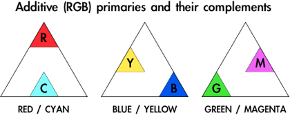
Additive Color and the RGB Process
The 20th century brought readily available electric power and abundant artificial lighting. These technologies were necessary for advances in the scientific understanding of color. Additive color is how light is mixed to create color. Every time additive color is mentioned, think of the world “light.” The most common method used to explain additive color mixing is the flashlight model.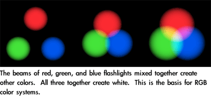
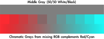
Mixing equal amounts of all three RGB primaries together will create grays or white depending on how much light is added. Black results from the absence of all light.
Of all of the color mixing methods, RGB is the most accurate and most versatile. The color seen is a product of light and is coming straight from the source. Additive color doesn’t rely upon the reflection of light off of objects to reach the eye and isn’t affected by the reflective surface as with subtractive color. Additive color is not changed by glossiness, scratches, dirt, or other material textures because it is coming from the light source into the viewer’s eye without interference.
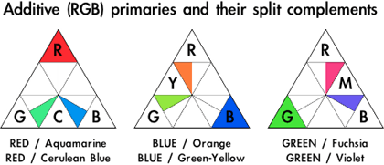
The terms Additive Color, RGB, and Light are often used interchangeably. For example “Light Complements,” “RGB Complements,” and “Additive Color Complements” all refer to the same thing.

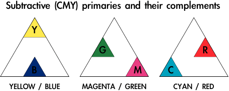
Subtractive Color and the CMY(K) Process
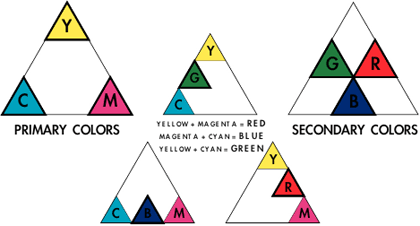
A problem with traditional color theory is that while RYB (the traditional red-yellow-blue primary colors) color mixing creates aesthetically pleasing results, it will not create every color necessary for mechanical reproduction of photographs and other “full color” images. This is because red, yellow, and blue are not the true primaries of color. Traditional color theory is effective for art, but it is subjective and not well suited for the science and technology needed for mass media.While the understanding of additive color was growing, many people worked on methods for efficient and consistent color image reproduction. This eventually lead to the defined cyan, magenta, and yellow (CMY) color process, used today in most color reproduction from large printing presses to inkjet printers.
The science of subtractive color can be a little confusing. When we say that grass is green, it really isn’t. When white light hits the grass, all of the other colors of light are absorbed by the grass but the green light reflects. We see green grass because that is the only color of light left to bounce off the grass and into our eyes. Even though we say grass is green, in reality grass is every other color but green. This is why the color of objects is called subtractive.

Color Debates
There is an ongoing battle in art about color principles, with the majority of modern color disagreements divided by those who use traditional color theory versus the scientific approach. Heated debate about color principles and color usage is documented well before the Renaissance, so it’s no surprise that color continues to evoke conflict.Science has proven that the CMY color system is better than RYB for creating the greatest range of color, but there are some reasons for still using RYB. Traditional color theory is an old standby that can create satisfying results by hand. The same reasons red, yellow, and blue may have been originally chosen, because they create a satisfying visual reaction, still apply to RYB even though we have the scientific color mixing system. The traditional color system provides working methods for the aesthetic and emotional application of color, whereas the modern color system does not include human reaction within the scientific principles.
Because CMY is a better system than RYB for the creation and exact reproduction of the widest range of reflective colors, there are those who claim the RYB system is useless, that it doesn’t work, or that it never worked. The logic behind those conclusions is faulty because (1) RYB color mixing can be done, right now, with decent quality traditional materials and media, and (2) if it could not be done thousands of oil paintings and artworks in museums would not exist because the artists could not have used the techniques to mix color, and (3) those artists would not have taught their apprentices and students the concepts, who then effectively used the principles and passed the process to others for over 500 years. As with most aesthetic principles, traditional color systems are not science. Treating them as such is making the faulty assumption that art and design are science.
The cause for most of the current debate is that science is sharing traditional art terminology that is similar enough in meaning to cause confusion. The scientific principles are exact; traditional color theory is not. People get upset when they get confused. Unaware of the history, sources, and reasoning for these aesthetic principles, the misinformed assumption is that the traditional color theory system is wrong because it doesn’t match the modern, scientifically modified definitions of color terminology.
Scientifically, a primary color is a color that cannot be created by combining any other two colors. That ability and restriction is not part of the traditional definiton for primary colors, but added when science adapted the artistic terms to fit scientific principles.
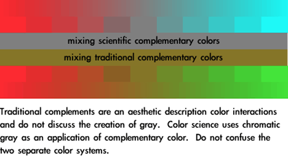
Unfortunate attempts to blend the traditional system with the science use the traditional color wheel but with cyan renamed blue and magenta renamed red. This leads to the principles of both systems being compromised and even more confusion. It is best to leave the traditional and scientific systems as separate methodologies for color use.
A solution to minimize confusion is to pick the methodology that will create the desired aesthetic results and stick to that system until it is comfortable before experimenting with another. It doesn’t matter whether traditional or scientific color mixing methods are chosen; if the user isn’t familiar with how the system works it won’t be effective.
In many cases there is no choice for which method is used to create color, but that doesn’t restrict creativity to what methodology will be used to make color choices. Video uses RGB for color, so obviously the RGB system must be used for creating the colors used in a video. The RGB system must be used for actually creating the work, but the traditional methodology for color can be applied when making aesthetic decisions.
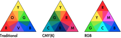
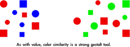
Color Matching
One of the problems with color creation technology is the number of variables that can affect results. RGB is the most accurate and most versatile, but even RGB devices cannot consistently create the same images. Devices from difference manufacturers using different technologies all change the way they display the exact same color. Even two computer monitors from the same company may display color shift.When producing video on a computer, it is important to view the project on a television monitor before distribution. Even though LCDs and computer CRT monitors are RGB devices, they use different methods than NTSC and PAL televisions for displaying video signals. The best method for video proofing is to view the work on a professional studio monitor. Unlike standard televisions, studio monitors are made to stricter standards with better calibration. CRT displays of every type will change alignment depending on environmental conditions and how long the CRT has been running. Studio monitors are less susceptible to these changes, but also allow for easy user compensation and recalibration. If a professional studio monitor isn’t available, viewing the video on a consumer television will give a more accurate idea of how most people will see the images. This allows for some color adjustments before the product is reproduced and distributed.
CMYK printing devices share similar problems, based on differences in inks, printing media, and software.
The color matching problem grows when images created using RGB devices are reproduced on CMYK devices, such as creating an image on a computer and printing it on paper. There is no possible way for a printed image to display the full color of an RGB image. It is impossible for subtractive color to look the same as additive, no matter how good the printer is. That’s a problem with creating images on an additive color RGB device that are destined for reproduction with subtractive color.
The current solutions to the descrepencies between RGB and CMYK devices are color calibration and color matching. Before images are created, the RGB screen to be used is adjusted to match a color standard. Any variations from that standard are stored in color matching software, along with the information for print reproduction devices. When the finished product is printed, the software will attempt to use the RGB and CMYK information to make the results appear as close to the RGB screen image as possible.
Apple’s ColorSync is one such technology. Pantone is an example of yet another color matching system, intended for reproducing color with inks. Color matching was a problem long before most art and design were created on computers. One solution is to have physical swatches of Pantone colors available when creating images. Picking the Pantone color from the swatch and specifying that ink will guarantee (almost) that when the image is reproduced by the printing house, the printer will use the same ink and it will match the color chosen by the designer. This gives the designer more control over color matching.
The same process is used with graphics software when a designer picks the swatch color, specifies that color in the computer image, and the ink color information is sent to the printer instead of the color that appears on the computer screen. The way the colors appear on the RGB screen is only an approximation, and no longer as important to maintain consistent reproduction.
Part 8: Pattern
Pattern is a repeating visual element that can be created by duplicating size, shape, position, symmetry, frequency, value, and color. Patterns are usually stronger when combining two or more repeating elements. Most often, people associate size, shape, and position of visual objects with pattern, but value and color are also strong pattern tools.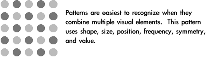
When a unit is used for building a larger object, patterns are created. When the shape of the units is similar, the pattern becomes more pronounced. Media such as textiles, ceramics, jewelry, and masonry use repeated smaller elements for the construction of a larger work. Because of their methods of fabrication, these media are naturally suited for the creation of decorative patterns.

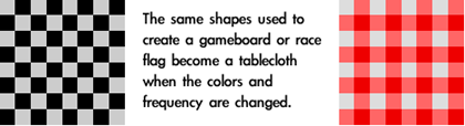
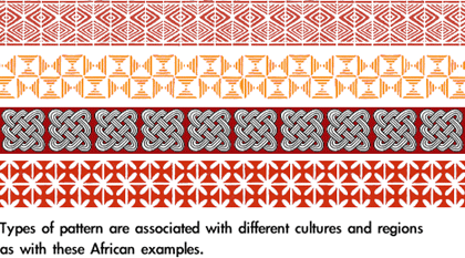
Many cultures share patterns, even such “unrelated” cultures as Native Americans and aboriginal Australians which were physically separated from European, Asian, and African cultural influences for millennia. In some cases the only major differences to the casual observer among these cultural patterns is the color usage. Color in pattern can be extremely important in dictating cultural meanings.
There are many excellent and specific books available about cultural patterns, most offering usable examples. A search on the Web for “Celtic pattern”—or any other culture/region—will usually return a myriad of books containing thousands of patterns, for a good desk reference for anyone using pattern in design.

The Golden Mean (Phi)
The Fibonacci sequence is a series of numbers which appear throughout nature. This sequence can be used to calculate the golden mean (or the golden section) which is represented by the Greek letter Phi. The Fibonacci sequence and Phi can be found visually in plants and seashells, and in the reproductive family trees of animals.
Phi, also known as the golden mean, is the ratio between two sequential numbers in the Fibonacci sequence. When 1597 is divided by 987 the result is 1.618034447821682, which rounds to 1.618. The higher the numbers used to create the ratio, the more exact the calculation becomes.
Self-similarity
There is a special kind of pattern that is self-similar, meaning the building unit contained in the pattern is the same as the overall completed shape. Cultural patterns often use self-similarity to suggest infinity and visually express other philosophical and existential concepts.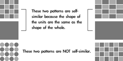

Fractals
A fractal is a shape that is self-similar and has a fractional dimension. Self-similarity is a required element in fractals, but all self-similar shapes are not fractals. With fractals, an infinite number of self-similar shapes can be found inside a larger shape, or the shape used as the pattern’s building unit can be “grown” into infinite detail by using itself as the blueprint. Each of these stages with smaller divisions is called an iteration.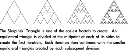
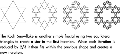
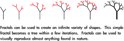
Applying Pattern
Pattern is an extremely powerful method to focus viewer attention. The repetition easily seen in most patterns uses all of the Gestalt principles discussed in previous articles. For that reason, pattern is often used in design as a tool for organization, especially when used with text. Common methods for pattern-based organization include:- Bullets and other shapes to list, outline, and highlight
- Alternating row colors to make individual items stand out, yet still be part of a whole
- Grid-based layout where similar shapes create a common theme, even if the content within the shapes is dissimilar (for example, different photos that are all cropped to the same size and shape and arranged in a grid pattern)
- Color-coding
Tiled backgrounds can become distracting and make the other content more difficult to follow because the viewer is naturally drawn to the repetition of the pattern.
Patterns that use grids face another problem. An optical illusion can be created by high contrast areas. This is due to the way the human retina works, and the only true method for avoiding this problem is to change the pattern itself.
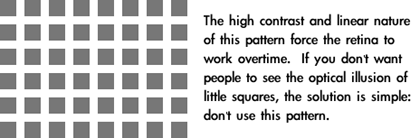
The solution for Moiré patterns in video is simple: don’t wear fine stripes or fine checkered patterns when you’re going to appear on television.
• • •
Use of pattern can add interest as well as visual information to your project. Patterns can be used to enhance many purely figurative designs, as well as decoratively to complement text. Pattern is a strong visual tool that should not be overlooked.Cheap Joe’s Artist Tip #1
Understanding How Reflected Light Works
 By Christopher Schink Adapted from The Palette Magazine
Download a printable version of this article as a PDF
If,in
order to create three-dimensionality, you paint the shaded side of an
object dark, cool, and neutral and you paint the illuminated side
light, warm, and bright, you’ll produce something that looks fairly
round; and that’s the effect you want. But there are other things you
can do to make the color more convincing and vibrant. By subtly
modifying the color of the shaded area, you suggest the effects of
reflected light-the colored light that bounces back into a shaded area
and modifies its color. With practice, you will be able to observe
these subtle color changes and reproduce (or even exaggerate) them to
create a more believable and vibrant image. Let’s look at how reflected
light affects a shadow.
How reflected light works
To get a better understanding of how reflected light affects shadowsand shaded areas (although we’re accustomed to describing all areas not
struck directly by light as being in shadow, the formal terms are
shaded and in shadow. Thus, the right sides of the buildings above are
shaded and the buildings cast a shadow on the ground), let’s look at
three examples.
 Skylight and sunlight
In the first illustration you can see how the color in a white buildingsitting on a fairly neutral surface is affected by sunlight and
skylight. Sunlight is warm and will make any surface it hits appear
slightly yellowish. This same warm light will reflect into the shaded
area of an object. Skylight is cool and will affect any surface not hit
by direct light and facing upward (the roof and shadow in this
illustration).
 Surface reflections
In the second illustration the white house sits on a bright green lawn.Light bounces off this surface and gives the shaded area a green cast.
Reflected light will have no effect on a surface that is illuminated by
direct sunlight. Although this building sits on a bright green lawn, no
green is seen in the sunlit front of the building.
A colored object on a colored surface
Theeffect in the third illustration looks more complicated, but it isn’t.
The blue building sits on a magenta and green plane. The magenta color
is reflected into the shaded area of the building; the green is
reflected into the shadow under the front eave.
 Where you can see this
You don’t have to spend hours hunting for a sunlit white buildingsitting on a green lawn to observe the effects of reflected light. You
can set up a brightly lit still-life with shiny green apples on a red
tablecloth. And you’ll find it easy to detect reflected light in the
shaded areas of any smooth object-a wet rock, a smooth tree trunk or a
polished wood table.
 No bounce light
When the level of illumination on an object is very low, you see littleor no reflected light in the shade areas. The shadows and shade appear
dense and uniform in color. This is especially true at night, when
there is no secondary illumination from the sky or other light sources.
Nighttime shadows and shade are a solid and dense middle dark. In the
example below the shaded area is dark, neutral, and uniform in color.
 Light bouncing off colored objects
If you are a landscape painter, you’ve probably observed how lightbouncing off a bright green lawn will affect the color of the shaded
side of a house. Any colored object that is illuminated and close to
the shaded area of an adjoining object will alter the color of the
shaded area. For example, the shaded area on a figure standing close to
a piece of blue wall (left) will take on a decided blue cast. If the
subject is wearing a magenta shirt, strong sunlight will reflect that
color into the shaded area of the figure (below right). Note on the
next page how Dale Snyder captures the reflected light from the green
awnings in the shade area above them.

Seeing color
For an inexperienced painter with a less practiced eye, all shadows andshade appear to be cold, dark, and neutral-something you could paint
with Payne’s gray. But with practice your eye gets better and you begin
to detect the subtle color changes that occur in shadows. Understanding
why and where these color changes occur will give you confidence in
inserting them in your painting. You can learn to exaggerate these
color additions, dropping in reds and greens and yellows to make your
painting more vibrant and give it an extra bounce.
 Putting these ideas into practice
You understand the illustrations of little white houses with thearrows, explanations, and footnotes, but how do you apply this
understanding to your own painting? Here are two examples of artists
using reflected light to enhance their paintings. (Without the colorful
bounce light, Skip’s painting-see below-seems weak and cold.)

When you have a subject that emphasizes a strong shadow pattern, look
for the effects of reflected light. If you observe a little red or
green or yellow in the shaded area of your subject, boldly add it to
your painting. It will make your work more vibrant and convincing.

A closer look
In the six details to the right you can see how many different colors Snyder has used to capture the effect ofreflected light in the shaded areas of the building.
In this handsome painting, Washington state artist Dale Snyder relies on an active shadow shape and
colorful variations of reflected light to enliven her painting. Note
the variety of hues she employs.
No comments:
Post a Comment