So far I really started as a beginner. I learn how keep a pencil in the hand, learned how to do shadows, learned how to feel comfortable with a pencil and the object that I paint. Unfortunately even though I start to draw better, I do not feel I connected with graphite pencils at all.


What I found out from experience already is that there is no need to bother start doing anything in the course until you have some skills in drawing. As with any master-craft, art needs one to learn skills first and then move on to more complicate learning. You will find it is much more easy .
By the way I watch mastercraft on TV another day. It is was on using green wood to make things and I think I learned a lot from it: you can have an artistic nature and even have your own skills, but if you want progress in some direction with new materials you must be open for new skills and techniques and build them fast. You should be well organized and push yourself to limit. I do not see the point of using an axe or a hammer by yourself; better, first, to learn how to keep it in your hands and then it will do work for you.
I think it is good to learn, but you first need put the right tools in the hand of the artist and teach them how to use it correctly.
Today, I will try learn how to do shiny objects, even though my little girl is at home today. Maybe I will spend some time teaching her to hold a pencil in her hand. She is very creative and, maybe one day, she will be a better artist than I am.
I got all the materials to finish the door for our house in Paziols. I want to make the door look like number 10. It is very funny, but buying the right materials in France is incredibly hard; all the doors in France are painted in mat and you never know if a door is painted one hundred years back or an hour ago; they try to make it look like rustic charm, but, for me, it looks like poor materials.
I have the same feelings about art materials: so far as I progress in pencils, I found out that not all of my buys were good. Some graphite pencils are not exactly what is written on them. I put away a great many of them for one reason or another; some have big pieces of grafity in their texture and anothers have written on them, for example, 2B but hardly reach the level of H. I wonder if any producer is consistent with his pencils or it will vary from time to time; my guess is that it will.
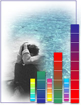
Colour Psychology
Color PsychologyDo different colors affect your mood?by David Johnson
Like death and taxes, there is no escaping color. It is ubiquitous. Yet what does it all mean? Why are people more relaxed in green rooms? Why do weightlifters do their best in blue gyms? Colors often have different meanings in various cultures. And even in Western societies, the meanings of various colors have changed over the years. But today in the U.S., researchers have generally found the following to be accurate.
Black is the color of authority and power. It is popular in fashion |
| how does color affect us? |
| COLOR PSYCHOLOGY Our personal and cultural associations affect our experience of color. Colors are seen as warm or cool mainly because of long-held (and often universal) associations. Yellow, orange and red are associated with the heat of sun and fire; blue, green and violet with the coolness of leaves, sea and the sky. Warm colors seem closer to the viewer than cool colors, but vivid cool colors can overwhelm light and subtle warm colors. Using warm colors for foreground and cool colors for background enhances the perception of depth. Although red, yellow and orange are in general considered high-arousal colors and blue, green and most violets are low-arousal hues, the brilliance, darkness and lightness of a color can alter the psychological message. While a light blue-green appears to be tranquil, wet and cool, a brilliant turquoise, often associated with a lush tropical ocean setting, will be more exciting to the eye. The psychological association of a color is often more meaningful than the visual experience. Colors act upon the body as well as the mind. Red has been shown to stimulate the senses and raise the blood pressure, while blue has the opposite effect and calms the mind. People will actually gamble more and make riskier bets when seated under a red light as opposed to a blue light. That's why Las Vegas is the city of red neon. For most people, one of the first decisions of the day concerns color harmony. What am I going to wear? This question is answered not only by choosing a style and fabric appropriate to the season, but by making the right color choices. And it goes on from there. Whether you're designing a new kitchen, wrapping a present or creating a bar chart, the colors you choose greatly affect your final results. How often have you caught your breath at the sight of a flowerbed in full bloom? Most likely the gardener has arranged the flowers according to their color for extra vibrancy. Have you ever seen a movie in which a coordinated color scheme helps the film create a world unto itself? With a little knowledge of good color relationships, you can make colors work better for you in your business graphics and other applications. Color is light and light is energy. Scientists have found that actual physiological changes take place in human beings when they are exposed to certain colors. Colors can stimulate, excite, depress, tranquilize, increase appetite and create a feeling of warmth or coolness. This is known as chromodynamics.  An executive for a paint company received complaints from workers in a blue office that the office was too cold. When the offices were painted a warm peach, the sweaters came off even though the temperature had not changed. An executive for a paint company received complaints from workers in a blue office that the office was too cold. When the offices were painted a warm peach, the sweaters came off even though the temperature had not changed.The illusions discussed below will show you that sometimes combinations of colors can deceive the viewer, sometimes in ways that work to your advantage. They can also cause unfortunate effects in your graphics, so be sure to watch out for these little traps. Sometimes colors affect each other in unexpected ways. For example, most colors, when placed next to their complements, produce vibrating, electric effects. Other colors, in the right combinations, seem quite different from what you'd expect. The most striking color illusions are those where identical colors, when surrounded by different backgrounds, appear to be different from each other. In a related effect, different colors can appear to be the same color when surrounded by certain backgrounds. When you look at a colored object, your brain determines its color in the context of the surrounding colors.  In this picture, the two bows are the same color, but because the surrounding areas are strikingly different in contrast, it seems to our eyes that they are different. Keep this effect in mind when creating graphics where color matching is critical. If you attempt to match your corporation's official colors, you may find that even if you achieve an exact match, it may look wrong in context. In this picture, the two bows are the same color, but because the surrounding areas are strikingly different in contrast, it seems to our eyes that they are different. Keep this effect in mind when creating graphics where color matching is critical. If you attempt to match your corporation's official colors, you may find that even if you achieve an exact match, it may look wrong in context.In the same way that one color can appear different in different surroundings, two similar colors may appear to be identical under some conditions. Even though the two symbols are actually slightly different tones, the contrasting backgrounds cause our brains to think that they are the same color. This effect is harder to control, but be aware of it because it can affect your graphics in hidden ways. The feeling you get when looking at bright complementary colors next to each other is a vibrating or pulsing effect. It seems that the colors are pulling away from each other. It's caused by an effect called color fatiguing. When one color strikes a portion of the retina long enough, the optic nerve begins sending confused signals to the brain. This confusion is intensified by the complementaries. Mixing brilliant complementary colors gets attention, but it should be used with restraint. The effect is disconcerting and can make your eyes feel like they've been shaken around.  If you want to use complementary colors without causing discomfort, you can outline each of the colors with a thin neutral white, gray or black line. The outlines separate the two colors, which helps your brain keep them separated. If you want to use complementary colors without causing discomfort, you can outline each of the colors with a thin neutral white, gray or black line. The outlines separate the two colors, which helps your brain keep them separated.When two very similar colors touch in an image, both colors appear to wash out and become indistinct. This is because the borders between the colors are difficult to distinguish and your brain blurs the colors together.  If you outline each of the colors with a thin neutral white, gray or black line, the colors become easier to distinguish. This is called the stained glass technique and is a way to reduce this blurring of the colors. If you outline each of the colors with a thin neutral white, gray or black line, the colors become easier to distinguish. This is called the stained glass technique and is a way to reduce this blurring of the colors.http://www.pantone.com/pages/pantone/Pantone.aspx?pg=19382&ca=29 |
Colors of the Flag
In the U.S. flag,white stands for purity and innocence. Red represents valor and
hardiness, while blue signifies justice, perseverance, and vigilance.
The stars represent the heavens and all the good that people strive
for, while the stripes emulate the sun's rays.
Food for Thought
While blue is one of the most popular colors it is one of the leastappetizing. Blue food is rare in nature. Food researchers say that when
humans searched for food, they learned to avoid toxic or spoiled
objects, which were often blue, black, or purple. When food dyed blue
is served to study subjects, they lose appetite.
Green, brown, and red are the most popular food colors. Red is often
used in restaurant decorating schemes because it is an appetite
stimulant.
http://www.infoplease.com/spot/colors1.html
Symbolic Uses of Color
Color has long been used
to represent affiliations and loyalties (e.g., school or regimental
colors) and as a symbol of various moods (e.g., red with rage) and
qualities (e.g., worthy of a blue ribbon). A well-known use of the
symbolism of color is in the liturgical colors of the Western Church,
according to which the color of the vestments varies through the
ecclesiastical calendar; e.g., purple (i.e., violet) is the color of
Advent and Lent; white, of Easter; and red, of the feasts of the
martyrs
Apparent Color of Objects
Color is a property
of light that depends on wavelength. When light falls on an object,
some of it is absorbed and some is reflected. The apparent color of an
opaque object depends on the wavelength of the light that it reflects;
e.g., a red object observed in daylight appears red because it reflects
only the waves producing red light. The color of a transparent object
is determined by the wavelength of the light transmitted by it. An
opaque object that reflects all wavelengths appears white; one that
absorbs all wavelengths appears black. Black and white are not
generally considered true colors; black is said to result from the
absence of color, and white from the presence of all colors mixed
together.
Additive Colors
Colors whose beams
of light in various combinations can produce any of the color
sensations are called primary, or spectral, colors. The process of
combining these colors is said to be “additive”; i.e., the sensations
produced by different wavelengths of light are added together. The
additive primaries are red, green, and blue-violet. White can be
produced by combining all three primary colors. Any two colors whose
light together produces white are called complementary colors, e.g.,
yellow and blue-violet, or red and blue-green.
Subtractive Colors
When
pigments are mixed, the resulting sensations differ from those of the
transmitted primary colors. The process in this case is “subtractive,”
since the pigments subtract or absorb some of the wavelengths of light.
Magenta (red-violet), yellow, and cyan (blue-green) are called
subtractive primaries, or primary pigments. A mixture of blue and
yellow pigments yields green, the only color not absorbed by one
pigment or the other. A mixture of the three primary pigments produces
black.
Color Meanings Symbolism of Color and Colors That Go Together
Color Psychology in Marketing
What
colors have you chosen for your marketing materials? What were your
reasons for making that particular choice? Was it because you liked
those particular colors, or did you have a particular marketing message
in mind? While visual appeal is an important consideration, your color
choices could be sending a specific message to the people who view
them. Are you sure you know what that message is?
You'd be wise to consider the psychology of color when designing
your marketing materials. Be it business card, brochure, web site,
posters or other material, you'll be making color choices. Colors not
only enhance the appearance of the item -- they also influence our
behavior. You will do well to consider the impact that the colors you
use will have on your target audience.
For instance, have you noticed that most fast food restaurants are
decorated with vivid reds and oranges? It's no accident that these
colors show up so frequently. Studies have shown that reds and oranges
encourage diners to eat quickly and leave -- and that's exactly what
fast food outlets want you to do.
It's also no accident that you see a lot of reds and blacks on adult
web sites. These colors are thought to have sexual connotations.
Ever notice that toys, books and children's web sites usually
contain large blocks of bright, primary colors? Young children prefer
these colors and respond more positively than they do to to pastels or
muted blends.
Market researchers have had a field day identifying the colors and the likely effect they have upon us.
However, the effects of color differ among different cultures, so the
attitudes and preferences of your target audience should be a
consideration when you plan your design of any promotional materials.
For example, white is the color of death in Chinese culture, but purple
represents death in Brazil. Yellow is sacred to the Chinese, but
signified sadness in Greece and jealousy in France. In North America,
green is typically associated with jealousy. People from tropical
countries respond most favorably to warm colors; people from northern
climates prefer the cooler colors.
In North American mainstream culture, the following colors are associated with certain qualities or emotions:
Red --excitement, strength, sex, passion, speed, danger.
Blue --(listed as the most popular color) trust, reliability, belonging, coolness.
Yellow --warmth, sunshine, cheer, happiness
Orange -- playfulness, warmth, vibrant
Green -- nature, fresh, cool, growth, abundance
Purple --royal, spirituality, dignity
Pink -- soft, sweet, nurture, security
White --pure, virginal, clean, youthful, mild.
Black --sophistication, elegant, seductive, mystery
Gold -- prestige, expensive
Silver -- prestige, cold, scientific
Market researchers have also determined that color affects shopping
habits. Impulse shoppers respond best to red-orange, black and royal
blue. Shoppers who plan and stick to budgets respond best to pink,
teal, light blue and navy. Traditionalists respond to pastels - pink,
rose, sky blue.
Want to test some of this out? Check out web sites belonging to
companies with marketing budgets that allow for extensive research into
what sells best.
Jaguar - A luxury car with a luxury web site.
There's a predominance of black (sophistication) and silver (prestige).
Jaguar markets to people with high incomes who view themselves as
sophisticated and look for a prestigious vehicle.
So how can you put this information to use?
First, think about your target market. Let's say that you are selling
books for young children, but you are marketing to grandparents. You'd
probably design the books in bright, primary colors (reds, blues,
yellows) to appeal to the children who will use them. However, the
marketing materials (web site, brochures, etc.) would be designed with
grandparents in mind. You might decide to go with blues (trust,
reliability), pinks (nurture, sweet, security) and yellow (happy,
playful).
Of course, you would test your ads and colors on a small market segment before rolling out a large scale campaign.
Give some thoughts to the message you want to send and to the psychology of the recipient. Then choose your colors accordingly.
Courtesy of June Campbell
Sponsored By: Brand Aid
COLOR THEORY
Color theory encompasses a multitude of definitions, concepts and design applications. All the information would fill several encyclopedias. As an introduction, here are a few basic concepts.
The Color Wheel

A color circle, based on red, yellow and blue, is traditional in the field of art. Sir Isaac Newton developed the first circular diagram of colors in 1666. Since then scientists and artists have studied and designed numerous variations of this concept. Differences of opinion about the validity of one format over another continue to provoke debate. In reality, any color circle or color wheel which presents a logically arranged sequence of pure hues has merit.

PRIMARY COLORS
Red, yellow and blue
In traditional color theory, these are the 3 pigment colors that can not be mixed or formed by any combination of other colors. All other colors are derived from these 3 hues

SECONDARY COLORS
Green, orange and purple
These are the colors formed by mixing the primary colors.

TERTIARY COLORS
Yellow-orange, red-orange, red-purple, blue-purple, blue-green and yellow-green.
These are the colors formed by mixing a primary and a secondary color. That's why the hue is a two word name, such as blue-green, red-violet, and yellow-orange.
COLOR HARMONY
Harmony can be defined as a pleasing arrangement of parts, whether it be music, poetry, color, or even an ice cream sundae.
In visual experiences, harmony is something that is pleasing to the eye. It engages the viewer and it creates an inner sense of order, a balance in the visual experience. When something is not harmonious, it's either boring or chaotic. At one extreme is a visual experience that is so bland that the viewer is not engaged. The human brain will reject under-stimulating information. At the other extreme is a visual experience that is so overdone, so chaotic that the viewer can't stand to look at it. The human brain rejects what it can not organize, what it can not understand. The visual task requires that we present a logical structure. Color harmony delivers visual interest and a sense of order.
In summary, extreme unity leads to under-stimulation, extreme complexity leads to over-stimulation. Harmony is a dynamic equilibrium.
Some Formulas for Color Harmony
There are many theories for harmony. The following illustrations and descriptions present some basic formulas .
A color scheme based on analogous colors

Analogous colors are any three colors which are side by side on a 12 part color wheel, such as yellow-green, yellow, and yellow-orange. Usually one of the three colors predominates.
A color scheme based on complementary colors

Complementary colors are any two colors which are directly opposite each other, such as red and green and red-purple and yellow-green. In the illustration above, there are several variations of yellow-green in the leaves and several variations of red-purple in the orchid. These opposing colors create maximum contrast and maximum stability.
A color scheme based on nature
Nature provides a perfect departure point for color harmony. In the illustration above, red yellow and green create a harmonious design, regardless of whether this combination fits into a technical formula for color harmony.
Color Context
How color behaves in relation to other colors and shapes is a complex area of color theory. Compare the contrast effects of different color backgrounds for the same red square.

©Color Voodoo Publications
Red appears more brilliant against a black background and somewhat duller against the white background. In contrast with orange, the red appears lifeless; in contrast with blue-green, it exhibits brilliance. Notice that the red square appears larger on black than on other background colors.
Different readings of the same color
©Color Voodoo Publications
If your computer has sufficient color stability and gamma correction (link to Color Blind Computers) you will see that the small purple rectangle on the left appears to have a red-purple tinge when compared to the small purple rectangle on the right. They are both the same color as seen in the illustration below. This demonstrates how three colors can be perceived as four colors.
Observing the effects colors have on each other is the starting point for understanding the relativity of color. The relationship of values, saturations and the warmth or coolness of respective hues can cause noticeable differences in our perception of color.
http://www.colormatters.com/colortheory.html
Colors, like features, follow the changes of the emotions. - Pablo Picasso

What Is Color?
In 1666, English scientist Sir Isaac Newton discovered that when pure white light passes through a prism, it separates into all of the visible colors. Newton also found that each color is made up of a single wavelength and cannot be separated any further into other colors.Further experiments demonstrated that light could be combined to form other colors. For example, red light mixed with yellow light creates an orange color. A color resulting from a mix of two other colors is known as a metamer. Some colors, such as yellow and purple, cancel each other out when mixed and result in a white light. These competing colors are known as complements.
Color Psychology - The Psychological Effects of Color
While perceptions of color are somewhat subjective, there are some color effects that have universal meaning. Colors in the red area of the color spectrum are known as warm colors and include red, orange and yellow. These warm colors evoke emotions ranging from feelings of warmth and comfort to feelings of anger and hostility.Colors on the blue side of the spectrum are known as cool colors and include blue, purple and green. These colors are often described as calm, but can also call to mind feelings of sadness or indifference.
Color Psychology as Therapy
Several ancient cultures, including the Egyptians and Chinese, practiced chromotherapy, or using colors to heal. Chromotherapy is sometimes referred to as light therapy or colourology and is still used today as a holistic or alternative treatment.In this treatment:
- Red was used to stimulate the body and mind and to increase circulation.
- Yellow was thought to stimulate the nerves and purify the body.
- Orange was used to heal the lungs and to increase energy levels.
- Blue was believed to soothe illnesses and treat pain.
- Indigo shades were thought to alleviate skin problems.
Color Meanings Symbolism of Color and Colors That Go Together
By Jacci Howard Bear, About.com Guide
Physical and Cultural Color Reactions
Sometimes colors create a physical reaction (red has been shown to raise blood pressure) and at other times it is a cultural reaction (in the U.S. white is for weddings, in some Eastern cultures, white is the color for mourning and funerals). Colors follow trends as well. Avocado, a shade of green, is synomous with the 60s and 70s in the minds of some consumers.
Color Relationships
In addition to understanding color meanings, it helps with mixing and matching colors to know the relationship of adjacent, harmonizing, contrasting, and complementary colors. The subject is more fully explained in this Color Basics article. But below is a brief synopis:
- Adjacent or harmonizing colors appear next to each other on the color wheel. Harmonizing colors often work well together but if too close in value they can appear washed out or not have enough contrast. A harmonizing trio could be something like blue, light blue, and cyan or perhaps red, orange, and yellow.
- Contrasting colors are separated from each other by other colors -- they come from different segments of the color wheel. The further apart, the more the contrast. Red (from the warm half of the color wheel) contrasts with green and blue (from the cool half of the color wheel). Shades of purple contrast with shades of green. Contrasting colors that are directly opposite each other on the color wheel may be described as clashing colors -- see the description for complementary. Despite the name, colors that clash are not always a bad combination if used carefully. They provide great contrast and high visibility.
- Complementary colors are on opposite sides of the color wheel -- they are each half of a pair of contrasting colors. For example, blue is a complementary color to yellow. Green is complementary to purple and magenta. A pair of complementary colors printed side by side can sometimes cause visual vibration (clash) making them a less than desirable combination. However, separate them on the page with other colors and they can work together. Note the spelling. These are not complimentary colors. They don't always flatter (compliment) one another but they do complete (complement) each other.

Use the color wheel as a starting point for mixing and matching colors.
J. Bear- Cool Color Meanings (calming): Blue, Green, Turquoise, Silver
- Warm Color Meanings (exciting): Red, Pink, Yellow, Gold, Orange
- Mixed Cool/Warm Color Meanings: Purple, Lavender, Green, Turquoise
- Neutral Color Meanings (unifying): Brown, Beige, Ivory, Gray, Black, White
Colour psychology and meaning green and blue
Green
Green, which is Nature's colour, is restful, soothing, cheerful, and health-giving. - Paul Brunton
The Color Psychology of Green
- Green is a cool color that symbolizes nature and the natural world.
- Green also represents tranquility, good luck, health, and jealousy.
- Researchers have also found that green can improve reading ability. Some students may find that laying a transparent sheet of green paper over reading material increases reading speed and comprehension.
- Green has long been a symbol of fertility and was once the preferred color choice for wedding gowns in the 15th-century. Even today, green M & M's (an American chocolate candy) are said to send a sexual message.
- Green is often used in decorating for its calming effect. For example, guests waiting to appear on television programs often wait in a “green room” to relax.
- Green is thought to relieve stress and help heal. Those who have a green work environment experience fewer stomachaches.
- Consider how green is used in language: green thumb, green with envy, greenhorn.
Life and Renewal:
Green is life. Abundant in nature, green signifies growth, renewal, health, and environment. On the flip side, green is jealousy or envy (green-eyed monster) and inexperience.
Nature of Green:
Green is a restful color with some of the same calming attributes of blue. Like blue, time moves faster in a green room.
Culture of Green:
Green is the national color of Ireland and is strongly associated with that country. Green also has close associations with Islam. Because of all the green in nature the color is reminiscent of Spring. Coupled with red it's a Christmas color.
Using Green:
With both a warming and cooling effect, the color green denotes balance, harmony, and stability. Use several shades of green for a fresh, Springtime feel. Olive green, also called olive drab, is a not so drab summery green that may have military overtones for some people.
Using Green with Other Colors:
Green with blue produces echoes of nature - water and forest and can denote new beginnings and growth. Green with brown, tan, or beige says organic or recycled and can be a good color combination for packaging of those type of products. Tri-color combinations of green with yellow and black or white are sporty, outdoorsy colors. Purple with green can be high contrast, lively. Lime green with orange and yellow is a fresh and fruity palette.
Green Color Palettes:
These green color palettes feature shades of green combined with gray, yellow, black, purple, lavender, and brown for some earthy, retro, and conservative looks.

C100Y100K50 | K40 | C10M25Y80 | C40K100 | White
The harmonizing colors of green and yellow are accompanied by black and white.

C65Y100 | C40K100 | White
A grassy green with nothing but black and white.

C65Y100 | C40K100 | White
A pale green with nothing but black and white.

C100M70Y90 | C80M30Y50 | C60M10Y50
Three shades of teal form this monochromatic palette.

C23M20Y25 | M53 | C35M85 | C50Y90 | C60M100K10
Relive the sixties with these pretty pinks and a yellowish green.

C70M5Y100 | M100Y100 | C53M100 | White
Red and green isn't just for Christmas. Make it an orangy red and throw in a dash of purple and white for a vibrating sixties color scheme.

C25M80Y90Y25 | C65M3Y65K15 | C5M85Y90 | C5M55Y85 | M20Y40 | C40K100
An earthy palette of brown, green, and orange.

C40M75Y80 | M10Y35 | C40Y70K10 | C100Y50
Shades of brown and tan are enlivened with a bright teal.
- Shades of Green from COLOURlovers with HEX and RGB Codes
- Green Color Palettes from COLOURlovers
Using Green in Other Design Fields:
Language of Green:
The use of green in familiar phrases can help a designer see how their color of choice might be perceived by others, both the positive and negative aspects.Good green
- Green light - go, permission to proceed (with a task)
- The green room - in theater or televisions it is the room where performers and guests go to relax
- Green thumb - good with plants
- Greenback - US dollar bill, money
- Greener pastures - something newer or better (or perceived to be better), such as a new job
- Green-eyed monster - jealosy
- Green with envy - jealous or envious
- Green - inexperienced, untested, untrained
- Greenhorn - novice, trainee, beginner
- Green around the gills - pale, sickly
Emerald, sea green, seafoam, olive, olive drab, pea green, grass green, apple, mint, forest, lawn green, lime, spring green, leaf green, aquamarine, beryl, chartreuse, fir, kelly green, pine, moss, jade, sage, sap, viridian.
Blue
The Color Psychology of Blue
- Blue is described as a favorite color by many people and is the color most preferred by men.
- Blue calls to mind feelings of calmness or serenity. It is often described as peaceful, tranquil, secure, and orderly.
- Blue can also create feelings of sadness or aloofness.
- Blue is often used to decorate offices because research has shown that people are more productive in blue rooms.
- Blue is one of the most popular colors, but it is one of the least appetizing. Some weight loss plans even recommend eating your food off of a blue plate. Blue rarely occurs naturally in food aside from blueberries and some plums. Also, humans are geared to avoid foods that are poisonous and blue coloring in food is often a sign of spoilage or poison.
- Blue can also lower the pulse rate and body temperature.
- Consider how blue is used in language: blue moon, blue Monday, blue blood, the blues, and blue ribbon.
Calm and Cool :
Blue is calming. It can be strong and steadfast or light and friendly. Almost everyone likes some shade of the color blue.Pantone has selected the color Blue Iris (PANTONE 18-3943) as the 2008 Color of the Year telling us: "Combining the stable and calming aspects of blue with the mystical and spiritual qualities of purple, Blue Iris satisfies the need for reassurance in a complex world, while adding a hint of mystery and excitement."
Nature of Blue:
A natural color, from the blue of the sky, blue is a universal color. The cool, calming effect of blue makes time pass more quickly and it can help you sleep. Blue is a good color for bedrooms. However, too much blue could dampen spirits.
Culture of Blue:
In many diverse cultures blue is significant in religious beliefs, brings peace, or is believed to keep the bad spirits away.Blue conveys importance and confidence without being somber or sinister, hence the blue power suit of the corporate world and the blue uniforms of police officers. Long considered a corporate color, blue, especially darker blue, is associated with intelligence, stability, unity, and conservatism. Explore more Dark Blue Color Meanings.
Just as seeing red alludes to the strong emotions invoked by the color red, feeling blue or getting the blues represents the extremes of the calm feelings associated with blue, i.e. sadness or depression, lack of strong (violent) emotion. Dark blue is sometimes seen as staid or stodgy — old-fashioned.
In Iran, blue is the color of mourning while in the West the something blue bridal tradition represents love.
People describe How the color blue makes them feel
In Iran, blue is the color of mourning while in the West the something blue bridal tradition represents love.
People describe How the color blue makes them feel
Using Blue:
A deep royal blue or azure conveys richness and perhaps even a touch of superiority. Navy blue is almost black and is a bit warmer than lighter blues. Combine a light and dark blue to convey trust and truthfulness — banker's colors. Although blue is a year-round color, pastel blues, especially along with pinks and pale yellows suggest Springtime while deep blue is a colder weather color. Create a conservative but sophisticated look with subtle contrast by combining light and dark shades of blue.
Using Blue with Other Colors:
Mix the color of blue with green for a natural, watery palette. Add gray for understated elegance.Sky blue and robin's egg blue, especially when combined with neutral light brown, tans, or beige are environmentally friendly color combinations. Throw in a dash of blue to cool down a hot red or orange scheme. Grab attention with the contrast of blue and yellow.
Dark blue with white is fresh, crisp, and nautical. Red, white, and blue is a patriotic color trio for many countries, including the United States.Use dark blue with metallic silver accents for an elegantly rich appearance.
Blue Color Palettes:
These blue color palettes feature shades of blue combined with gray, orange, peach, purple, and earthy browns as well as palettes with multiple blues.

C90M50K30 | C70K25 | C10K40 | C100K40 | C100M90Y90
These blues and gray create a dark, conservative look.

C100M75 | C80M5Y10 | C65M3Y10 | C15Y5 | M40Y75 | C100M50 | C40K100 | White
Brighten this combo of shades of blues with a dash of orange.

C100M40 | M47Y100 | C10M95Y5
Shades of the sixties with blue, orange, and pink.

M50Y100 | C100M37K15 | C25M10K4 | White
Vary the look here by using orange as the accent or the medium blue as the accent.

C60M20Y5K10 | M75Y80 | White
It's still orange and blue but with a more subdued look. A dash of bright white keeps it from being too subdued.

M9Y45K5 | C95M80Y30K15 | C45M40Y10K5 | M80Y100
More attraction between yellow and blue (both a light and a darker blue) with a dash of orange thrown in.

C60M100 | C30M50 | C15M25 | C70M50Y25K10 | C100M85Y35K15 | C40M20Y10K5
Show your passion for purple and your bias toward blue with this cool color palette.

C35Y7K3 | C55Y10K5 | C80Y15K7 | C100Y20K20 | Y100 | M40Y35 | C40K100
Accent these blues with a dash of yellow and pink.
This selection of Dark Blue Color Palettes feature 2, 3, 4, and 5 color combinations centered around dark shades of blue such as Navy, Dark Slate Blue, and Dark Cyan.
- Shades of Blue from COLOURlovers with HEX and RGB Codes
- Blue Color Palettes from COLOURlovers
Using Blue in Other Design Fields:
Language of Blue:
The use of blue in familiar phrases can help a designer see how their color of choice might be perceived by others, both the positive and negative aspects.Good blue
- True blue - someone loyal and faithful
- Out of the blue - unexpected (could be positive or negative)
- Blue ribbon - first rate, top prize
- Blueblood - person of noble birth, royalty
- Bluestocking - well-read or scholarly woman
- Bluebook - register of socially prominent people
- The Blues (capitalized) - popular style of music sometimes characterized by melancholy melodies and words
- Baby blues - Blue eyes (also see Bad blue words)
- Feeling blue - feeling sad or depressed
- Blue devils - feelings of depression
- The blues (not capitalized) - depression, state of sadness
- Blue Monday - feeling sad
- Baby blues - post-partum depression
- Singing the blues - bemoaning one's circumstances
- Blue laws - laws originally intended to enforce certain moral standards
- Blue language - profanity
- Bluenose - puritanical individual
- Into the blue - entering the unknown or escape to parts unknown
- Out of the blue - unexpected (could be positive or negative)
Sapphire, azure, beryl, cerulean, cobalt, indigo, navy, royal, sky blue, baby blue, robin's egg blue, cyan, cornflower blue, midnight blue, slate, steel blue, Prussian blue.
2 Color: If Opposites Attract, Then Dark Blue Goes Well With Orange Colors

Navy Blue with Orange
© J. JamesBlue is a cool color while orange is a warm color. To avoid unpleasant vibrations, avoid using in equal amounts. Enliven your dark blue with a splash of orange (or calm your orange with a dash of blue).
Dark shades of blue symbolize importance, confidence, power, intelligence, stability, unity, and conservatism. By adding some orange to your predominantly dark blue palette you introduce some warmth and energy that can keep your palette from being too stilted or overpowering.
2 Color: A Purplish Blue Goes Well With a Golden Orange

Dark Slate Blue with a Golden Orange
© J. JamesDark Slate Blue carries the blue symbolism of importance and confidence and is a predominantly cool color. Add some warmth with gold or orange tones.
2 Color: Dark Cyan Reaches Out for a Darker Reddish-Brown Orange

Dark Cyan with Brownish Orange
© J. James3-Color: Blue, Red, and Yellow

Navy, Red, and Yellow
© J. JamesDarker shades of blue denote importance, confidence, power, authority, intelligence, stability, unity, and conservatism. Red is another power color but it grabs attention more than blue. Yellow adds some brightness and joy. Using equal amounts of each color would make it a more childlike (think primary colors) palette but if only small doses of the red and yellow are used with a mostly dark blue color sheme, it's quite suitable for adult projects that you don't want to appear too serious.
3-Color: Dark Cyan, Reddish Purple, and Gold

Dark Cyan, Reddish Purple, Gold
© J. James4-Color: Blue with Red, Orange, Green

Navy Blue with Red, Orange, Green
© J. JamesNavy carries the blue symbolism of importance, confidence, power, and authority. Darker blue, like navy, is associated with intelligence, stability, unity, and conservatism. To keep this dark blue from being too calm to the point of depression, give it an energetic kick with some red and orange. Although green is a cool color like blue, green with blue produces echoes of nature - water and forest and can denote new beginnings and growth.
4-Color: Dark Cyan Blue with Purplish Red, Orange, and Green

Dark Cyan, Red, Orange, Green
© J. James5-Color: Navy, Red, Orange, Yellow, and Green

Navy, Red, Orange, Yellow, Green
© J. JamesThe orange, yellow, green also lend the palette a fresh, citrusy flavor.
5-Color: Dark Slate Blue with Purplish-Red, Orange, Yellow, Green

Dark Slate Blue, Red, Orange, Yellow, Green
© J. James5-Color: Dark Cyan with Red, Orange, Yellow, Purple

Dark Cyan, Red, Orange, Yellow, Purple
© J. Jameshttp://desktoppub.about.com/od/colorpalettes/ss/darkbluepalette_10.htm
psychology of colour black and white
Black is real sensation, even if it is produced by entire absence of light. The sensation of black is distinctly different from the lack of all sensation. -Hermann von Helmholz
The Color Psychology of Black
- Black absorbs all light in the color spectrum.
- Black is often used as a symbol of menace or evil, but it is also popular as an indicator of power. It is used to represent treacherous characters such as Dracula and is often associated with witchcraft.
- Black is associated with death and mourning in many cultures. It is also associated with unhappiness, sexuality, formality, and sophistication.
- In ancient Egypt, black represented life and rebirth.
- Black is often used in fashion because of its slimming quality.
- Consider how black is used in language: Black Death, blackout, black cat, black list, black market, black tie, black belt.
Ultimate Dark:
Considered the negation of color, black is conservative, goes well with almost any color except the very dark. It also has conflicting connotations. It can be serious and conventional. The color black can also be mysterious, sexy, and sophisticated.
Nature of Black:
Black is the absence of color. In clothing, black is visually slimming. Black, like other dark colors, can make a room appear to shrink in size and even a well-lit room looks dark with a lot of black. Black can make other colors appear brighter.
Culture of Black:
In most Western countries black is the color of mourning. Among young people, black is often seen as a color of rebellion. Black is both positive and negative. It is the color for little boys in China. Black, especially combined with orange is the color of Halloween. In early Westerns the good guy wore white while the bad guy wore black. But later on good guys wore black to lend an air of mystery to themselves.
Using Black:
Use the color black to convey elegance, sophistication, or perhaps a touch of mystery. Dark charcoal gray and very dark brown can sometimes stand in for black.
Using Black with Other Colors:
Be careful using black with very dark colors. It can work, but if the colors are too similiar they blend together. Black works well with bright, jewel-toned shades of red, blue, and green. Black is the ultimate dark color and makes lighter colors such as yellow really pop out. Photographs often look brighter against a black background. Black and gray is a conservative combo as is medium or light blue and black.
Black Color Palettes:
These color palettes feature black with other colors.
Using Black in Other Design Fields:
Language of Black:
The use of black in familiar phrases can help a designer see how their color of choice might be perceived by others, both the positive and negative aspects.Good black
- Black tie - formal (as in formal party attire)
- Black belt - expert (especially in martial arts)
- Blackwash - bring things out in the open In the black - having money, doing well in business
- Men in black - government agents
- Black box - equipment or apparatus
- Pitch black - dark as night, very black
- Black out - Loss of consciouness or the act of erasing something
- Blackout - loss of electricity or turning out the lights
- Black eye - damage such as damage to one's reputation, slander, unpopular
- Black-hearted - evil
- Blackguard - a scoundrel
- Black sheep - an outcast from a family or from society
- Black market - illegal trade (goods or money)
- Blackmail - obtaining something by threat
- Blacklist - list of people or organizations to boycott, avoid, or punish
Ebony, jet, ink, lampblack, coal, soot, charcoal, raven, midnight, obsidian, onyx, sable.
White...is not a mere absence of colour; it is a shining and affirmative thing, as fierce as red, as definite as black...God paints in many colours; but He never paints so gorgeously, I had almost said so gaudily, as when He paints in white. - G. K. Chesterton
The Color Psychology of White
- White represents purity or innocence.
- White is bright and can create a sense of space or add highlights.
- White is also described as cold, bland, and sterile. Rooms painted completely white can seem spacious, but empty and unfriendly. Hospitals and hospital workers use white to create a sense of sterility.
Ultimate Light:
White is purity, cleanliness, and innocence. Like black, white goes well with almost any color.
Nature of White:
To the human eye, white is a brilliant color that can cause headaches for some. Too much bright white can be blinding.
Culture of White:
In most Western countries white is the color for brides. In the East, it's the color for mourning and funerals. White is often associated with hospitals, especially doctors, nurses, and dentists. Some cultures viewed white as the color of royalty or of dieties. Angels are typically depicted as wearing white. In early Westerns the good guy wore white while the bad guy wore black.
Using White:
In most cases white is seen as a neutral background color and other colors, even when used in smaller proportion, are the colors that convey the most meaning in a design. Use white to signify cleanliness or purity or softness. Some neutral beige, ivory, and creams carry the same attributes as white but are more subdued, less brilliant than plain white. Use lots of white for a summery look. Use small amounts of white to soften a wintery palette or suggest snow.
Using White with Other Colors:
Used with light or pastel tones, white is soft and Spring-like and helps to make the pastel palette more lively. White can make dark or light reds, blues, and greens look brighter, more prominent. Red, white, and blue makes a patriotic palette.
White Color Palettes:
These color palettes feature black and white with other colors.
Using the Color White in Other Design Fields:
Language of White:
The use of white in familiar phrases can help a designer see how their color of choice might be perceived by others, both the positive and negative aspects.Good white
- White as the driven snow - pure, clean, innocent
- White elephant - rare, valuable but perhaps unwanted
- White knight - someone who comes to another person's rescue, someone perceived as being good, noble
- White list - list of good or acceptable items
- White sale - sale of sheets, towels, other linens
- Pearly white - teeth, especially very white teeth
- Whitewash - cover up, conceal
- Whiteout - zero visibility
- White flag - surrender
- White lightning - moonshine, illegal whiskey
- White elephant - rare, valuable but perhaps unwanted
- White knuckle - something that is fast, exciting, or frightening
Snow, pearl, antique white, ivory, chalk, milk white, lily, smoke, seashell, old lace, cream, linen, ghost white, beige, cornsilk, alabaster, paper, whitewash.
Black and White Color Combinations
Color Palettes with CMYK Formulas
These color palettes feature black and white and almost-black and almost-white shades. Although I've made a few suggestions here and there about the 'amount' of each color to use, experiment. For best results don't use even amounts of each color in the palette. Choose one or two dominant colors and use the rest for accents. Keep in mind that due to the differences between color in print and on the Web that these colors may not appear the same on paper as they appear here on the screen.
These aren't just random color combinations. Each of these are based on actual historic and modern formulas used in posters, packaging, ads, and other design work over the past century. For a much more comprehensive selection of color combinations refer to The Designer's Guide to Color Combinations by Leslie Cabarga.

Y70 | C5M20Y100 | C40K100
It's no mellow yellow when you add black. Put it between the two yellows to make them each stand out.

M45Y100 | C40K100 | M3Y15
A charcoal black and a pale yellow, almost ivory shade team up with orange.

C65Y100 | White | C40K100
Team black and white with just about any color, such as this grassy green. And don't just relegate black to accent - try a black background with several doses of green then touches of white as highlights.

C12M95Y60 | C75M6Y20 | C4M5Y2 | C40K100
The palest pink stands in for white in this palette with a 50s flavor.

M40Y10 | C50Y10 | C40K100
Another red/blue/black look uses light red (pink) and light blue as highlights and accents with lots of black.

M75Y100 | C22M30Y55K5 | C15M70Y75K20 | White | C40K100
Black with brown and earthy orange? Sure! And don't just relegate black to small doses either.

M65Y25 | M30Y10 | C65M10 | M50Y45 | White | C40K100
Your pastels won't be washed out with a judicial dose of black to make those pinks pop.

M30Y30K90 | M20Y20K75 | M10Y10K40 | M5Y5K20 | White
You could call this monochromatic palette shades of gray or tints of black. All with a dash of white to brighten.

Black and white with pink and red in a Sixties-inspired color palette. [See more Sixties era color palettes]
Sixties Color Combinations
Color Palettes with CMYK Formulas
While Peter Max posters and the psychedelic movement typifies the sixties color for most of us, there are also some tamer color combos to consider from the earlier part of that wild decade including soft pastels like baby blue and poodle pink

C23M20Y25 | M53 | C35M85 | C50Y90 | C60M100K10
Relive the sixties with these pretty pinky purples and yellowish green.

A rather tame mix of colors (compared to other color combos of the time).

C100M40 | M47Y100 | C10M95Y5
Shades of the sixties with blue, orange, and pink.

C70M5Y100 | M100Y100 | C53M100 | White
Throw a reddish orange in the middle of green and purple.

Y100 | M100 | C100 | C50Y100 | C70M70
Here's a psychedelic look for you: pure yellow, magenta, cyan, green, and purple.
M65Y25 | M30Y10 | C65M10 | M50Y45 | White | C40K100
From the softer side of the sixties, the early years of cool pinks, baby blue, and a dose of warm tangerine too.

Y100 | M100 | C30M100K13 | C100M100
No shrinking violets here along with pure yellow.
Black and white with pink and red.
http://psychology.about.com/od/sensationandperception/a/colorpsych.htm
psychology of colour red and yellow
Red
Red has guts .... deep, strong, dramatic. A geranium red. A Goya red ... to be used like gold for furnishing a house ... for clothes, it is strong, like black or white. - Valentino Red * Red is a bright, warm color that evokes strong emotions. * Red is associated with love, warmth, and comfort. * Red is also considered an intense, or even angry, color that creates feelings of excitement or intensity. * Consider how red is used in language: redneck, red-hot, red-handed, paint the town red, seeing red
Love and War:
Red is hot. It's a strong color that conjures up a range of seemingly conflicting emotions from passionate love to violence and warfare. Red is Cupid and the Devil.
Nature of Red:
A stimulant, red is the hottest of the warm colors. Studies show that red can have a physical effect, increasing the rate of respiration and raising blood pressure.The expression seeing red indicates anger and may stem not only from the stimulus of the color but from the natural flush (redness) of the cheeks, a physical reaction to anger, increased blood pressure, or physical exertion.
Culture of Red:
Red is power, hence the red power tie for business people and the red carpet for celebrities and VIPs (very important people).Flashing red lights denote danger or emergency. Stop signs and stop lights are red to get the drivers' attention and alert them to the dangers of the intersection. In some cultures, red denotes purity, joy, and celebration. Red is the color of happiness and prosperity in China and may be used to attract good luck.
Red is often the color worn by brides in the East while it is the color of mourning in South Africa. In Russia the Bolsheviks used a red flag when they overthrew the Tsar, thus red became associated with communism. Many national flags use red. The red Ruby is the traditional Fortieth Wedding Anniversary gift.
Using Red:
Use the color red to grab attention and to get people to take action. Use red when you don't want to sink into the background. Use red to suggest speed combined with confidence and perhaps even a dash of danger. A little bit of red goes a long way. Small doses can often be more effective than large amounts of this strong color. Multiple shades of red and even pink or orange can combine for a cheerful palette.Look at the use of the Color Red on the Web to find which of the named colors in the red family are the most attention-grabbing, mysterious, friendly, sophisticated, or mentally stimulating.
Using Red with Other Colors:
Although not normally considered an ideal coupling, in combination with green, red is a Christmas color — a joyful season.Cool blues provide contrast and tone down the heat of red. Light pinks and yellows are harmonizing colors that can work well with red if not too close in value such as dark red with a pale or golden yellow. Be careful using purple. It can be an elegant combination but too much could be overpowering.
Add a dash of red to a soft but sophisticated pink and gray combo. For some countries, including the US, red, white, and blue is a very patriotic trio even if the shades of red and blue differ from those used in the flag.
Red Color Palettes:
These color palettes feature shades of red used with a variety of yellows, blues, greens, and neutrals.
Using Red in Other Design Fields:
Language of Red:
The use of red in familiar phrases can help a designer see how their color of choice might be perceived by others — both the positive and negative aspects.Good red
- Red letter day - important or significant occasion
- Red carpet treatment - make someone feel special, treat them as if they are a celebrity
- Roll out the red carpet - same as above
- Red sky in the morning, sailor's warning; red sky at night, sailor's delight - pay attention to good and bad warning signs
- Paint the town red - celebrate, go out partying
- Red eye - an overnight flight
- Seeing red - to be angry
- Red herring - something that deceives or distracts attention from the truth
- In the red - being overdrawn at the bank or losing money
- Red flag - denotes danger, warning, or an impending battle
Scarlet, crimson, vermillion, carmine, maroon, burgundy, ruby, rose, madder, rouge, brick, blood red, blush, fire engine red, cinnabar, russet, rust, Venetian red, flame, Indian red, tomato.
Red Color Combinations
Color Palettes with CMYK Formulas
These color palettes feature shades of red. Although I've made a few suggestions here and there about the 'amount' of each color to use, experiment. For best results don't use even amounts of each color in the palette. Choose one or two dominant colors and use the rest for accents. Keep in mind that due to the differences between color in print and on the Web that these colors may not appear the same on paper as they appear here on the screen.
These aren't just random color combinations. Each of these are based on actual historic and modern formulas used in posters, packaging, ads, and other design work over the past century. For a much more comprehensive selection of color combinations refer to The Designer's Guide to Color Combinations by Leslie Cabarga.

C10Y100K15 | C50Y100K20 | C10M100Y80 | C40K100 | White
This isn't a Christmas red and green.

C10M100Y100 | C100M5Y100 | M10Y100 | C40K100
Another red and green combo. Use lots of black and a bit of yellow to create an eye-popping look.

C100M40K30 | C85Y70K45 | M15Y70 | M70Y65 | C30M100Y70K30
Rich maroon, teal, and green team up for this palette.
M65Y25 | M30Y10 | C65M10 | M50Y45 | White | C40K100
Your pastels won't be washed out with a judicial dose of black to make those pinks pop.

C13Y12 | M15Y100K11 | M50Y10K25 | C15M100Y30 | C40K100 | White
Medium and dark pinks with a mustard yellow, with a little bit of black and white.

C4M65Y100 | C80M10Y40 | M90Y50 | C30M100Y80K20 | C20M40Y85K5 | C45
Shades of pink with a burst of orange. Placing the blue between the orange and pink helps avoid visual vibrations.

C10M15Y25K2 | C30M20Y40K13 | C8M90Y100K3 | C40K100
Using the gray and beige colors in place of white with black and red softens this color scheme. (Ummm... I mixed that black wrong, it should be black not the gray it appears on screen)

M100Y100 | M20Y100 | C40K100 | White
Use the yellow sparingly against red or use a touch of red against a background of yellow for two entirely different eye-popping looks. (same as above, that should be black not dark gray)

Keep it simple with just two colors plus white - in this case a deep maroon red and a peachy pink
| Limited Color Combinations | |
|

Sometimes cost considerations limit our color choices. These limited color palettes come to the rescue and show you just how much can be done with only a few colors. Although presented with CMKY formulas, you'll probably want to convert these to PMS equivalents for spot-color printing.

M45Y100 | C40K100 | M3Y15
A charcoal black and a pale yellow, almost ivory shade team up with orange.
M50Y100 | C100M37K15 | C25M10K4 | White
Vary the look here by using orange as the accent or the medium blue as the accent.
C65Y100 | C40K100 | White
A grassy green with nothing but black and white.

Keep it simple with just two colors plus white.
C65Y100 | C40K100 | White
A pale green with nothing but black and white.
C100M70Y90 | C80M30Y50 | C60M10Y50
Three shades of teal form this monochromatic palette.
M9Y45K5 | C95M80Y30K15 | C45M40Y10K5 | M80Y100
Two shades of blue with orange and light yellow.

Y70 | C5M20Y100 | C40K100
It's no mellow yellow when you add black. Put it between the two yellows to make them each stand out.

M30Y30K90 | M20Y20K75 | M10Y10K40 | M5Y5K20 | White
You could call this monochromatic palette shades of gray or tints of black. All with a dash of white to brighten.
C60M100 | C30M50 | C15M25 | C70M50Y25K10 | C100M85Y35K15 | C40M20Y10K5
Show your passion for purple and your bias toward blue with this cool palette. One purple stands in for many but just using tints of the darker purple.

C80M75K10 | M35Y85 | M15Y35 | White
Golden yellows pops when placed on a background of purple. (Yes, it looks bluer on the Web but it really is purple in print.)

C80M50Y15K15 | C25M15Y5Y5 | White
A grayish blue with a bluish gray on a background of white.
C60M20Y5K10 | M75Y80 | White
Dark tangerine orange and blue with a dash of bright white to keep it from being too subdued.
Warm Colors The Colors of Excitement
By Jacci Howard Bear, About.com Guide

Orange is an exciting color.
In nature, warm colors represent change as in the changing of the seasons or the eruption of a volcano. Tone down the strong emotions of a warm palette with some soothing cool or neutral colors or by using the lighter side of the warm palette such as pinks, pale yellows, and peach.
Warm colors appear larger than cool colors so red can visually overpower blue even if used in equal amounts. Warm colors appear closer while their cool counterparts visually recede on the page.
The profiles for each of these warm colors include descriptions of their nature, cultural color meanings, how to use each color in design work, and which colors work best together.
Yellow
The Color Psychology of Yellow
- Yellow is a bright that is often described as cheery and warm.
- Yellow is also the most fatiguing to the eye due to the high amount of light that is reflected. Using yellow as a background on paper or computer monitors can lead to eyestrain or vision loss in extreme cases.
- Yellow can also create feelings of frustration and anger. While it is considered a cheerful color, people are more likely to lose their tempers in yellow rooms and babies tend to cry more in yellow rooms.
- Yellow can also increase the metabolism.
- Since yellow is the most visible color, it is also the most attention-getting color. Yellow can be used in small amount to draw notice, such as on traffic sign or advertisements.
Hope and Happiness:
Yellow is sunshine. It is a warm color that, like red, has conflicting symbolism. On the one hand it denotes happiness and joy but on the other hand yellow is the color of cowardice and deceit.
Nature of Yellow:
Yellow is one of the warm colors. Because of the high visibility of bright yellow, it is often used for hazard signs and some emergency vehicles. Yellow is cheerful.
Culture of Yellow:
For years yellow ribbons were worn as a sign of hope as women waited from their men to come marching home from war. Today, they are still used to welcome home loved ones. Its use for hazard signs creates an association between yellow and danger, although not quite as dangerous as red.If someone is yellow it means they are a coward so yellow can have a negative meaning in some cultures.
Yellow is for mourning in Egypt and actors of the Middle Ages wore yellow to signify the dead. Yet yellow has also represented courage (Japan), merchants (India), and peace.
Using Yellow:
Although it can work as the primary color, yellow often works best as a companion to other colors. Use bright yellow to create excitement when red or orange may be too strong or too dark. Yellow can be perky.
Using Yellow with Other Colors:
Use yellow to perk up a more subdued cool palette of blues and grays. Use lemon yellow with orange to carry out a healthy, summery, citrus theme. Very pale yellows can work as neutrals alongside darker or richer colors. Yellow and blue are a high contrast, eye-popping combination. Mix yellow with neutral gray and a dash of black for a high-tech look.Try a hot, exciting mix of red and yellow.
For an earthy palette, especially for fall, mix yellow, olive green, and brown. While yellows and bright or light greens can be part of a natural, fruity color palette, be careful not to use colors too close in value or they will appear washed out.
Yellow Color Palettes:
These color palettes feature shades of yellow mixing it up with reds, blues, greens, browns, and other neutrals for earthy, sophisticated, and psychedelic looks.
Using Yellow in Other Design Fields:
Language of Yellow:
The use of yellow in familiar phrases can help a designer see how their color of choice might be perceived by others, both the positive and negative aspects.Good yellow
- Yellow ribbon - hope, support, remembrance
- Mellow yellow - laid back, relaxation
- Yellow or Yellow streak or Yellow-bellied - cowardice or coward
- Yellow journalism - irresponsible reporting
Lemon, yellow ocher, golden, saffron, cream, topaz, mellow yellow.
Yellow Color Combinations
Color Palettes with CMYK Formulas
These color palettes feature shades of yellow. Although I've made a few suggestions here and there about the 'amount' of each color to use, experiment. For best results don't use even amounts of each color in the palette. Choose one or two dominant colors and use the rest for accents. Keep in mind that due to the differences between color in print and on the Web that these colors may not appear the same on paper as they appear here on the screen.
These aren't just random color combinations. Each of these are based on actual historic and modern formulas used in posters, packaging, ads, and other design work over the past century. For a much more comprehensive selection of color combinations refer to The Designer's Guide to Color Combinations by Leslie Cabarga.
M100Y100 | M20Y100 | C40K100 | White
Use the yellow sparingly against red or use a touch of red against a background of yellow for two entirely different eye-popping looks.

C80M100Y100K15 | M60Y80K10 | M35Y100 | M15Y35K25 | C40K100
A mellow, earthy yellow blends nicely with dark brown and orange.

C65Y35K15 | M90Y100 | M35Y100 | Y70 | C10K35 | C40K100
The orange and yellows of sunflowers with light green are the centerpiece of this palette.
Y100 | M100 | C100 | C50Y100 | C70M70
Here's a psychedelic look for you: pure yellow, magenta, cyan, green, and purple.

C100Y100K50 | K40 | C10M25Y80 | C40K100 | White
The harmonizing colors of green and yellow are accompanied by black and white.

M27Y100K6 | C100M43K18 | White
Opposites attract - blue and yellow - while white adds light to this slightly dark palette.

M9Y45K5 | C95M80Y30K15 | C45M40Y10K5 | M80Y100
More attraction between yellow and blue (both a light and a darker blue) with a dash of orange thrown in.

Y65 | C10M45Y45 | C40M30Y30 | White
Pastel gone bad? This washed out combo of pale yellow, pale pink, gray, and white just might work for you.

Seven colors in shades of yellow, brown, and green combine for this Victorian era color scheme. [See more Victorian Color Palettes]
A rather tame mix of colors for the 1960s (compared to other color combos of the time) it does have a nice bright yellow.
http://psychology.about.com/od/sensationandperception/a/colorpsych.htm
psychology of colour brown and purple
Purple
The Color Psychology of Purple
- Purple is the symbol of royalty and wealth.
- Purple also represents wisdom and spirituality.
- Purple does not often occur in nature, it can sometimes appear exotic or artificial.
Royalty and Spirituality:
Purple is royalty. A mysterious color, purple is associated with both nobility and spirituality. The opposites of hot red and cool blue combine to create this intriguing color.Pantone has selected the color Blue Iris (PANTONE 18-3943) as the 2008 Color of the Year telling us: "Combining the stable and calming aspects of blue with the mystical and spiritual qualities of purple, Blue Iris satisfies the need for reassurance in a complex world, while adding a hint of mystery and excitement."
Nature of Purple:
Purple has a special, almost sacred place in nature: lavender, orchid, lilac, and violet flowers are often delicate and considered precious. Because purple is derived from the mixing of a strong warm and strong cool color it has both warm and cool properties. A purple room can boost a child's imagination or an artist's creativity. Too much purple, like blue, could result in moodiness.
Culture of Purple:
The color of mourning for widows in Thailand, purple was the favorite color of Egypt's Cleopatra. It has been traditionally associated with royalty in many cultures. Purple robes were worn by royalty and people of authority or high rank. The Purple Heart is a U.S. Military decoration given to soldiers wounded in battle.
Using Purple:
Deep or bright purples suggest riches while lighter purples are more romantic and delicate. Use redder purples for a warmer color scheme or the bluer purples to cool down.
Using Purple with Other Colors:
A deep eggplant purple with neutral tans or beige is an earthy, conservative color combination with a touch of the mystery that purple provides. Green and purple can be a striking combination in deep or bright jewel tones or use lighter shades for a cheerful, springlike feel. Pink and purple has feminine appeal.
Purple Color Palettes:
These color palettes feature shades of purple combined with shades of green, orange, blue, and yellow.
Using Purple in Other Design Fields:
Language of Purple:
The use of purple in familiar phrases can help a designer see how their color of choice might be perceived by others, both the positive and negative aspects.Good purple
- Purple cow - something remarkable, eye-catching, unusual
- Purple prose - exaggeration, highly imaginative writing (also has negative connotations)
- Purple speech - profanity, raunchy language
- Purple prose - exaggeration, colorful lies
- Purple haze - state of confusion or euphoria, possibly drug-induced, specific type of potent cannabis (marijuana), specific type of LSD
Violet, plum, lavender, lilac, puce, thistle, orchid, mauve, magenta, royal, amethyst, wine, pomegranate, eggplant, mulberry.
Purple Color Combinations
Color Palettes with CMYK Formulas
These color palettes feature shades of purple. Although I've made a few suggestions here and there about the 'amount' of each color to use, experiment. For best results don't use even amounts of each color in the palette. Choose one or two dominant colors and use the rest for accents. Keep in mind that due to the differences between color in print and on the Web that these colors may not appear the same on paper as they appear here on the screen.
These aren't just random color combinations. Each of these are based on actual historic and modern formulas used in posters, packaging, ads, and other design work over the past century. For a much more comprehensive selection of color combinations refer to The Designer's Guide to Color Combinations by Leslie Cabarga.

C40M5Y30 | C100M15Y80 | C50M30 | C67M75Y10K13 | C80M55 | C40K100 | White
Opposites of purple and green make an attractive match with black and white added to the party.
C70M5Y100 | M100Y100 | C53M100 | White
Throw a reddish orange in the middle of green and purple.

C35M50Y25K25 | M35Y35K3 | C30M35K25 | C80M30Y5K15
These dusky shades of purple, pink, and blue have an earthy tone.
C23M20Y25 | M53 | C35M85 | C50Y90 | C60M100K10
Relive the sixties with these pretty pinky purples and yellowish green.

C60M100 | C30M50 | C15M25 | C70M50Y25K10 | C100M85Y35K15 | C40M20Y10K5
Show your passion for purple with this selection of purples and blues. (Notice the formulas for the purples, each half of the one before it)

C80M75K10 | M35Y85 | M15Y35 | White
Golden yellows pops when placed on a background of purple. (Yes, it looks bluer on the Web but it really is purple in print.)

C50M60 | C100M20K20 | C15M50Y55 | White
This peachy palette includes a mild purple and medium blue.
Y100 | M100 | C30M100K13 | C100M100
No shrinking violets here.

A modern mix of peach, orange, yellow, and dusky purple. [See more Current/Modern Color Palettes]

Deep purple, green, and browns show the typical Victorian era use of many colors - 7 here
Brown
Color Psychology - Reactions to Brown
- Brown is a natural color that evokes a sense of strength and reliability.
- Brown can also create feelings of sadness and isolation.
- Brown brings to mind feeling of warmth, comfort, and security. It is often described as natural, down-to-earth, and conventional, but brown can also be sophisticated.
Brown
By Jacci Howard Bear, About.com Guide

Get down-to-earth with shades of brown
Down-to-Earth:
Brown is a natural, down-to-earth neutral color. It is found in earth, wood, and stone.
Nature of Brown:
Brown is a warm neutral color that can stimulate the appetite. It is found extensively in nature in both living and non-living materials.
Culture of Brown:
Brown represents wholesomeness and earthiness. While it might be considered a little on the dull side, it also represents steadfastness, simplicity, friendliness, dependability, and health. Although blue is the typical corporate color, UPS (United Parcel Service) has built their business around the dependability associated with brown.
Using Brown:
The color brown and its lighter cousins in tan, taupe, beige, or cream make excellent backgrounds helping accompanying colors appear richer, brighter. Use brown to convey a feeling of warmth, honesty, and wholesomeness. Although found in nature year-round, brown is often considered a fall and winter color. It is more casual than black.
Using Brown with Other Colors:
Shades of brown coupled with green are an especially earthy pair, often used to convey the concept of recycling or earth-friendly products. Very dark brown can replace black, adding a slightly warmer tone to some palettes. Brighten brown with a mellow yellow or rusty orange. Go smart but conservative with a mix of brown and deep purple, green, gray, or orange-red.
Brown Color Palettes:
These color palettes feature shades of brown combined with other neutrals as well as red, orange, green, and pink.
- Brown Color Palettes from COLOURlovers
Using Brown in Other Design Fields:
Language of Brown:
The use of brown in familiar phrases can help a designer see how their color of choice might be perceived by others, both the positive and negative aspects.Good brown
- Brown bottle - beer
- Brown - cook or burn
- Brown-nose - someone who attempts to ingratiate themselves with people of authority
- Brown study - someone who is aloof, indifferent
- Brown out - partial loss of electricity
Sienna, bay, sand, wood, dapple, auburn, chestnut, nut-brown, cinnamon, russet, tawny, chocolate, tan, brunette, fawn, liver-colored, mahogany, oak, bronze, terra-cotta, toast, umber, cocoa, coffee, copper, ecru, ginger, hazel, khaki, ochre, puce, snuff-colored.
Brown Color Combinations
Color Palettes with CMYK Formulas
These color palettes feature shades of brown. Although I've made a few suggestions here and there about the 'amount' of each color to use, experiment. For best results don't use even amounts of each color in the palette. Choose one or two dominant colors and use the rest for accents. Keep in mind that due to the differences between color in print and on the Web that these colors may not appear the same on paper as they appear here on the screen.
These aren't just random color combinations. Each of these are based on actual historic and modern formulas used in posters, packaging, ads, and other design work over the past century. For a much more comprehensive selection of color combinations refer to The Designer's Guide to Color Combinations by Leslie Cabarga.

C40M65Y70K50 | C30M90Y100 | C20M13Y13 | C40M40Y70K3 | C40K100
Shades of brown and a touch of gray with a dark earthy orangy red.
C40M75Y80 | M10Y35 | C40Y70K10 | C100Y50
Earthy doesn't mean lifeless. These shades of brown and tan are enlivened with a bright teal accent.
C25M80Y90Y25 | C65M3Y65K15 | C5M85Y90 | C5M55Y85 | M20Y40 | C40K100
Here's a wonderfully earthy palette of brown, green, and orange.

M10Y20K15 | K45 | M40Y40K70 | White
Neutrals combine for an unusual look. Make the gray a splash of metallic silver ink and it's not so dull a combo as you might think.

M90Y100 | C15M35Y60K3 | C30M55Y100K30 | C40K100 | White
Black and brown create a strong neutral background for a splash of orange-red. Use a touch of white to provide light and contrast.

C7M5Y15 | M40Y25 | C30M55Y60K15 | C50K100
A pale pink and light brown work nicely together with a beige and black for this neutral art deco color scheme. Use more of the pink to wake it up a bit.

M30Y80 | M50Y100 | C15M40Y60K20 | C50K100 | White
A light brown brings out the earthiness of these citrus orange shades. Lighten with a touch of white for accent.

C80M100Y100K15 | M60Y80K10 | M35Y100 | M15Y35K25 | C40K100
A dark chocolate brown as a background works nicely with this orangey brown and yellow. The gray adds a touch of lightness.

Seven colors in shades of yellow, brown, and green combine for this Victorian era color scheme.
http://desktoppub.about.com/cs/color/a/symbolism.htm
psychology of colour orange and pink
Orange
The Color Psychology of Orange
- Orange is a combination of yellow and red and is considered an energetic color.
- Orange calls to mind feelings of excitement, enthusiasm, and warmth.
- Orange is often used to draw attention, such as in traffic signs and advertising.
Flamboyant and Energetic :
Orange is vibrant. It's a combination of red and yellow so it shares some common attributes with those colors. It denotes energy, warmth, and the sun. But orange has a bit less intensity or aggression than red, calmed by the cheerfulness of yellow.
Nature of Orange:
As a warm color orange is a stimulant — stimulating the emotions and even the appetite. Orange can be found in nature in the changing leaves of fall, the setting sun, and the skin and meat of citrus fruit.
Culture of Orange:
Orange brings up images of autumn leaves, pumpkins, and (in combination with Black) Halloween. It represents the changing seasons so in that sense it is a color on the edge, the color of change between the heat of summer and the cool of winter.Because orange is also a citrus color, it can conjure up thoughts of vitamin C and good health.
Using Orange:
If you want to get noticed without screaming, consider the color orange — it demands attention. The softer oranges such as peach are even friendlier, more soothing. Peachy oranges are less flamboyant than their redder cousins but still energetic.In keeping with its transitional appearance in nature, you might use shades of orange to indicate transition or a bridge between two opposing factors.
Orange is often synonymous with autumn yet the brighter oranges are a summer color. Use shades of orange for seasonal-themed fall or summer materials.Orange is mentally stimulating as well as sociable. Use it to get people thinking or to get them talking.
Using Orange with Other Colors:
While orange and black are traditional Halloween colors, orange really pops with a medium blue. Red, yellow, and orange can be a fiery hot combination or, in tamer shades, a fresh, fruity experience. Make it tropical with green.Use caution mixing orange and pink unless you want to recreate a vibrating, 60s psychedelic look. Try a dash of orange with deep purple or a dash of purple with a bit of orange, tempered by lots of mellow yellow or white for an eye-catching look that's not overpowering.
Orange Color Palettes:
These color palettes feature shades of orange going earthy with browns and greens as well as sophisticated with blues, grays, and other neutrals.
Using Orange in Other Design Fields:
Orange Words:
These words are synonymous with orange or represent various shades of the color orange.Pumpkin, gold, flame, copper, brass, apricot, peach, citrus, tangerine.
Orange Color Combinations
Color Palettes with CMYK Formulas
These color palettes feature shades of orange. Although I've made a few suggestions here and there about the 'amount' of each color to use, experiment. For best results don't use even amounts of each color in the palette. Choose one or two dominant colors and use the rest for accents. Keep in mind that due to the differences between color in print and on the Web that these colors may not appear the same on paper as they appear here on the screen.
These aren't just random color combinations. Each of these are based on actual historic and modern formulas used in posters, packaging, ads, and other design work over the past century. For a much more comprehensive selection of color combinations refer to The Designer's Guide to Color Combinations by Leslie Cabarga.
C65Y35K15 | M90Y100 | M35Y100 | Y70 | C10K35 | C40K100
The orange and yellows of sunflowers with light green are the centerpiece of this palette.

C7M5Y10 | C7M90Y100 | C100M85Y10K6 | C40M25Y25K7 | C40K100
Bold blue and orange are tamed by shades of gray from silvery to charcoal.
M45Y100 | C40K100 | M3Y15
Orange and black (or charcoal gray) don't have to be just for Halloween. Pale yellow provides a lighter note.

M50Y100 | C100M37K15 | C25M10K4 | White
Opposites attract in this orange-blue palette. Vary the look by using orange as the accent or the medium blue as the accent.
C4M65Y100 | C80M10Y40 | M90Y50 | C30M100Y80K20 | C20M40Y85K5 | C45
Shades of pink with a burst of orange. Placing the blue between the orange and pink helps avoid visual vibrations.
C100M40 | M47Y100 | C10M95Y5
Orange with a complementary pink and an opposite of blue to suggest the sixties.
C70M5Y100 | M100Y100 | C53M100 | White
Red and green isn't just for Christmas. Make it an orangy red and throw in a dash of purple and white for a vibrating sixties color scheme.

C25M80Y90Y25 | C65M3Y65K15 | C5M85Y90 | C5M55Y85 | M20Y40 | C40K100
An earthy palette of brown, green, and orange.
A modern mix of peach, orange, yellow, and dusky purple.
Current Color Combinations
Color Palettes with CMYK Formulas
Color trends of the nineties are harder to classify with so many trends, retro color schemes, and new fads. The color combos shown here fit no particular mold but contain combinations of shades popular throughout the 1990s and on into the new millennium.
C50M60 | C100M20K20 | C15M50Y55 | White
This peachy palette includes a mild purple and medium blue.

C90M50K30 | C70K25 | C10K40 | C100K40 | C100M90Y90
These blues and gray create a dark, conservative look.

M10Y20K15 | K45 | M40Y40K70 | White
Neutrals combine for an unusual look. Make the gray a splash of metallic silver ink and it's not so dull a combo as you might think.
A modern mix of peach, orange, yellow, and dusky purple.
M27Y100K6 | C100M43K18 | White
Opposites attract - blue and yellow - while white adds light to this slightly dark palette.
C40M5Y30 | C100M15Y80 | C50M30 | C67M75Y10K13 | C80M55 | C40K100 | White
Opposites of purple and green make an attractive match with black and white added to the party.
C10M100Y100 | C100M5Y100 | M10Y100 | C40K100
A red and green combo. Use lots of black and a bit of yellow to create an eye-popping look.

C100M75 | C80M5Y10 | C65M3Y10 | C15Y5 | M40Y75 | C100M50 | C40K100 | White
Brighten this combo of shades of blues with a dash of orange.
Y65 | C10M45Y45 | C40M30Y30 | White
This washed out combo of pale yellow, pale pink, gray, and white would usually be considered a bad combination but when anything goes...
Pink
The Color Psychology of Pink
- Pink is essentially a light red and is usually associated with love and romance.
- Pink is thought to have a calming effect. One shade known as "drunk-tank pink" is sometimes used in prisons to calm inmates. Sports teams sometimes paint the opposing teams locker room pink to keep the players passive and less energetic.
- While pink's calming effect has been demonstrated, researchers of color psychology have found that this effect only occurs during the initial exposure to the color. When used in prisons, inmates often become even more agitated once they become accustomed to the color.
Pink
By Jacci Howard Bear, About.com Guide

Some of the many faces of the color pink.
Cotton Candy and Little Girls:
Pink is a softer, less violent red. Pink is the sweet side of red. It's cotton candy and bubble gum and babies, especially little girls.
Nature of Pink:
While red stirs up passion and action, studies have shown that large amounts of pink can create physical weakness in people. Perhaps there is a tie-in between this physical reaction and the color's association with the so-called weaker sex.
Culture of Pink:
In some cultures, such as the US, pink is the color of little girls. It represents sugar and spice and everything nice. Pink for men goes in and out of style. Most people still think of pink as a feminine, delicate color.
Using Pink:
Both red and pink denote love but while red is hot passion, pink is romantic and charming. Use pink to convey playfulness (hot pink flamingoes) and tenderness (pastel pinks). Multiple shades of pink and light purple or other pastels used together maintain the soft, delicate, and playful nature of pink. Add strength with darker shades of pinks and purple and burgundy.
Using Pink with Other Colors:
All shades of pink get sophisticated when combined with black or gray or medium to darker shades of blue. Medium to dark green with pink is also a sharp-looking combo.
Using Pink in Other Design Fields:
Language of Pink:
The use of pink in familiar phrases can help a designer see how their color of choice might be perceived by others — both the positive and negative aspects.Good pink
- In the pink - healthy
- Tickled pink - happy, content
- Pink collar - female office worker (sometimes used in a derogatory manner)
- Pink collar - female office worker (sometimes used in a derogatory manner to imply low person on the office totem pole)
- Pink - cut, notch, or make a zigzag
Salmon, coral, hot pink, fuschia, blush, flesh, flush, fuchsia, rose.
http://desktoppub.about.com/cs/colorselection/p/pink.htm
Psychology of colour grey and silver
Gray
By Jacci Howard Bear, About.com Guide

Keep your cool with a sophisticated palette of gray.
Elegant Neutral:
Gray is a neutral, balanced color. It is a cool, conservative color that seldom evokes strong emotion although it can be seen as a cloudy or moody color.
Nature of Gray:
The lighter side of black, gray is a cool color seen in storm clouds and some metals.
Culture of Gray:
Like black, gray is used as a color of mourning as well as a color of formality. Along with blue suits, gray suits are part of the uniform of the corporate world. Dark, charcoal gray carries with it some of the strengh and mystery of black. It is a sophisticated color without much of the negative attributes of black. Lighter grays are similar to white. Gray tuxedos are common for men at weddings.
Using Gray:
All shades of gray can be good, neutral background colors. Use lighter grays in place of white and darker gray in place of black. Taupe, a grayish brown neutral is a conservative, slightly earthy, warm shade of gray.
Using Gray with Other Colors:
Light grays with pastel shades of pink, blue, lavender, and green have a feminine quality. Darken those colors for a more masculine feel. Gray with hot pink can be a little retro. Cool a warm palette by adding gray to rich reds or golden yellows.
Gray Color Palettes:
These color palettes feature shades of gray, including very bluish grays, combined with yellow, blue, orange, and teal.
Using Gray in Other Design Fields:
Language of Gray:
The use of gray in familiar phrases can help a designer see how their color of choice might be perceived by others, both the positive and negative aspects.Good gray
- Gray matter - brains, intellect
- Gray power - having to do with the elderly or senior citizens
- Gray - dull, dingy, dirty
- Gray page - in desktop publishing, a text-heavy page with little contrast or white space
- Gray-hair - old person (not necessarily derogatory)
- Gray water - dirty water such as water drained from a bathtub or kitchen sink
Charcoal, slate, iron gray, ashen, lead, mousy, gunmetal, silver, dove gray, powder grey, oyster, pearl, taupe, sere, Payne's gray.
Gray Color Combinations
Color Palettes with CMYK Formulas
These color palettes feature shades of gray. Although I've made a few suggestions here and there about the 'amount' of each color to use, experiment. For best results don't use even amounts of each color in the palette. Choose one or two dominant colors and use the rest for accents. Keep in mind that due to the differences between color in print and on the Web that these colors may not appear the same on paper as they appear here on the screen.
These aren't just random color combinations. Each of these are based on actual historic and modern formulas used in posters, packaging, ads, and other design work over the past century. For a much more comprehensive selection of color combinations refer to The Designer's Guide to Color Combinations by Leslie Cabarga.

C30M10Y5K20 | C10M10Y50 | M30Y70 | C10M35Y15K25 | M85Y85K10 | C40K100
Try these orange and yellows against a background of bluish gray.
C80M50Y15K15 | C25M15Y5Y5 | White
A grayish blue with a bluish gray on a background of white.

C65Y35K15 | M90Y100 | M35Y100 | Y70 | C10K35 | C40K100
The orange and yellows of sunflowers with light green are the centerpiece of this palette. Put them all on a backdrop of medium gray.

C7M5Y10 | C7M90Y100 | C100M85Y10K6 | C40M25Y25K7 | C40K100
Bold blue and orange are tamed by shades of gray from silvery to charcoal.
M10Y20K15 | K45 | M40Y40K70 | White
Neutrals combine for an unusual look. Make the gray a splash of metallic silver ink and it's not so dull a combo as you might think.

M50Y85K25 | C25M15Y20K9 | M10Y20K17 | C40K100
Another neutral palette with gray, brown, and a dose of black.
M30Y30K90 | M20Y20K75 | M10Y10K40 | M5Y5K20 | White
You could call this monochromatic palette shades of gray or tints of black. All with a dash of white to brighten.

M40Y100 | C100M65Y10K6 | C80Y40K20 | C10M30Y60K10 | C5M5Y10K5
Where white might overwhelm this bright blue and teal try a pale gray.
Silver
By Jacci Howard Bear, About.com Guide
// <
Neutral colors run warm and cool.
Neutral colors help to put the focus on other colors or serve to tone down colors that might otherwise be overpowering on their own. To some extent blacks, browns, tans, golds, and beige colors are considered warm. While white, ivory, silver, and gray are somewhat cooler colors. Yet these warm and cool attributes are flexible and more subtle than that of reds or blues.
The profiles for each of these neutral colors include descriptions of their nature, cultural color meanings, and how to use each color in design work.
Color Therapy and Your Wardrobe Wearing Your Emotions
By Phylameana lila Desy, About.com Guide
Have you taken inventory of your closet lately? You may be in a fashion rut and need to introduce some different colors into your wardrobe that will better reflect your day-to-day moods. Unless your mother is still dressing you or you are a slave to following the latest fashion color trends, why not become a mood dresser? Mood dressers are people who are in-tune with their emotions and dress accordingly. Do you feel pink today? Or, do you feel blue?
1. Wearing Green - Nurturing and Earthy

Green is considered to be one of the most healing among all the colors.
Because green is the color of trees and grasses it is a wonderful color choice to wear anytime you are wanting to feel more in-tune with nature. Green represents the Spring season and new growth. Choose this color to wear whenever you are embarking on something new or wish to turn over a new leaf.
Because green is the color of trees and grasses it is a wonderful color choice to wear anytime you are wanting to feel more in-tune with nature. Green represents the Spring season and new growth. Choose this color to wear whenever you are embarking on something new or wish to turn over a new leaf.
2. Wearing Blue - Serenity and Calm

Wearing blue helps create a place of calm and serenity.
Wearing ocean hues of blue is especially calming. Indigo or darker blues can offer more of a comfort zone feeling, almost as if you are sinking into a pool of warm water. Blues in general remind me of a favorite pair of well-worn denim jeans - now that's simply relaxing.
Wearing ocean hues of blue is especially calming. Indigo or darker blues can offer more of a comfort zone feeling, almost as if you are sinking into a pool of warm water. Blues in general remind me of a favorite pair of well-worn denim jeans - now that's simply relaxing.
3. Wearing Gray or Black - Invisibility and Blending In

Wearing grays and blacks can be depressive.
Let's face it, black and gray are fashion basics. We all have the basic black suit or black dress slacks that are a must wear for a number of different social settings. Aside from the slinky spaghetti strapped number you have hanging in the back of the closet, you likely choose to wear black because you prefer to blend in and not make any statement. Wearing black will allow you to keep a low-profile in social settings if that is your intention. Don't wear black if you want to stand out amidst a crowd. Most folks don't even bother to wear black at funerals anymore, it's just too sad to wear dreary and dark colors.
Let's face it, black and gray are fashion basics. We all have the basic black suit or black dress slacks that are a must wear for a number of different social settings. Aside from the slinky spaghetti strapped number you have hanging in the back of the closet, you likely choose to wear black because you prefer to blend in and not make any statement. Wearing black will allow you to keep a low-profile in social settings if that is your intention. Don't wear black if you want to stand out amidst a crowd. Most folks don't even bother to wear black at funerals anymore, it's just too sad to wear dreary and dark colors.
4. Wearing Orange - Energetic and Creative

Orange urges you to get out into the world and create something grand!
Orange is a very high energy color. Its creativity juices are extremely intoxicating and sweet tasting. Wearing orange is fun and can make you feel quite playful. Artists love dabbling with orange hues. Orange screams with sexual energy too, not surprising since orange is associated with the sacral chakra. Because of its highly-charged intensity some people cannot comfortably wear this color. Adorning yourself with an orange accent piece can add a hint of playfulness. Beware, if you need to complete a mundane project avoid wearing orange as it might interfere with the stick-to-it-ness required to stay on task.
Orange is a very high energy color. Its creativity juices are extremely intoxicating and sweet tasting. Wearing orange is fun and can make you feel quite playful. Artists love dabbling with orange hues. Orange screams with sexual energy too, not surprising since orange is associated with the sacral chakra. Because of its highly-charged intensity some people cannot comfortably wear this color. Adorning yourself with an orange accent piece can add a hint of playfulness. Beware, if you need to complete a mundane project avoid wearing orange as it might interfere with the stick-to-it-ness required to stay on task.
5. Wearing Pink - Open Heart

Wearing pink conveys compassion and an open heart.
Most people associate pink with babies, little girls, and feminine energies. But more than feeling feminine, wearing pink conveys compassion and an open heart. When people are wearing pink, whether they are male or female, they appear approachable and capable of loving others. If you want to feel heart-connected reach for that pastel pink sweater from your closet to wear. And if pastel colors don't suit you try on something in bright fuchsia. You'll feel pretty in pink.
Most people associate pink with babies, little girls, and feminine energies. But more than feeling feminine, wearing pink conveys compassion and an open heart. When people are wearing pink, whether they are male or female, they appear approachable and capable of loving others. If you want to feel heart-connected reach for that pastel pink sweater from your closet to wear. And if pastel colors don't suit you try on something in bright fuchsia. You'll feel pretty in pink.
6. Wearing Purple - Unique and Special

Wearing purple shows others that you want to be noticed.
Purple is seldom worn as a neutral color. Purple is the wrong color choice to make if you are wanting to blend in among others as you go about your business. The color purple, especially shades of violet, will definitely make a statement. Wearing purple shows others that you want to be noticed. If it is your desire to feel special and unique then purple is the right color choice. If you would like to send a message out into the world that you're one of a kind and that you could care less about conformity, then wear purple.
Purple is seldom worn as a neutral color. Purple is the wrong color choice to make if you are wanting to blend in among others as you go about your business. The color purple, especially shades of violet, will definitely make a statement. Wearing purple shows others that you want to be noticed. If it is your desire to feel special and unique then purple is the right color choice. If you would like to send a message out into the world that you're one of a kind and that you could care less about conformity, then wear purple.
7. Wearing Red - Powerful and Confident

Red can really pack a punch when needed.
Red is a very powerful color. Wear red whenever you feel a need to portray confidence or would like to boost your self esteem. However, be aware that wearing too much red can make a person come off a little too intimidating to others who may lack self confidence in themselves. Visualizing the color red can help ground your energies so anyone who has "flighty" tendencies will benefit from wearing red to serve as a reminder to ground themselves throughout the day.
Red is a very powerful color. Wear red whenever you feel a need to portray confidence or would like to boost your self esteem. However, be aware that wearing too much red can make a person come off a little too intimidating to others who may lack self confidence in themselves. Visualizing the color red can help ground your energies so anyone who has "flighty" tendencies will benefit from wearing red to serve as a reminder to ground themselves throughout the day.
8. Wearing White - Fresh Outlook - New Beginnings

Wearing white will help reduce any nagging feelings of disappointment or drudge.
White represents cleansing and new beginnings. Putting on a white blouse feels like being given an opportunity to start the day with a clean slate. Wearing a white garment, as long as it hasn't taken on any discoloration from too much laundering, can offer a fresh and bright outlook. Be sure to get rid of any dingy white clothes often, replacing them with brighter whites.
White represents cleansing and new beginnings. Putting on a white blouse feels like being given an opportunity to start the day with a clean slate. Wearing a white garment, as long as it hasn't taken on any discoloration from too much laundering, can offer a fresh and bright outlook. Be sure to get rid of any dingy white clothes often, replacing them with brighter whites.
9. Wearing Yellow - Cheerful and Happy

Yellow carries the same healing qualities associated with the sun. It offers warmth, optimism, and light. All shades of yellows and golds will cheer you up and help make you feel happier. Wearing yellow out into the world makes an affirmation statement. For certain, yellow is a perky color!
A Century of Color Trends and Color Combinations Historic and Modern Color Palettes
By Jacci Howard Bear, About.com Guide

The color combinations presented here come from The Designer's Guide to Color Combinations by Leslie Cabarga (compare prices). It contains over 500 historic and modern color formulas in CMYK. Instead of only little blocks of color Cabarga shows simple layouts that use varying amounts of each color. These layouts make it easier to visualize how a design will look using the three to seven colors in each palette. Follow his lead or rearrange the colors in any way you please. I've used a similar sample layout to show one color scheme in each of the era palettes.
Color Palettes
| Palettes by Color | Palettes by Era |
| Red/Pink | Victorian |
| Yellow/Gold | Art Deco |
| Orange | Atomic Age |
| Blue | The Sixties |
| Green/Teal | 90s and Beyond |
| Purple/Lavender | |
| Brown/Tan/Beige | |
| Gray/Silver | |
| Black/White | |
| More Color Palettes | |
| Patriotic Pantone Palettes | Limited Colors |
| Earthy | Dark Blue Web |
Color Palettes with CMYK Formulas
These Victorian era color palettes feature primarily warm colors. The overall tone of most of these palettes is soft and subdued rather than bright or electric colors found in later decades.
C65Y35K15 | M90Y100 | M35Y100 | Y70 | M10K35 | C40K100
Many soft colors on a backdrop of gray.

M90Y100 | C15M35Y60K3 | C30M55Y100K30 | C40K100 | White
This typical Victorian palette fits well with the era's nickname: the Brown Decades. Two shades of brown unite the black and orangy red.
C10M15Y25K2 | C30M20Y40K13 | C8M90Y100K3 | C40K100
Another muddied color scheme with grays instead of browns.
C100M40K30 | C85Y70K45 | M15Y70 | M70Y65 | C30M100Y70K30
Not all Victorian era colors are subdued, here's a rich combination of teal, green, and purplish red.
Deep purple, green, and browns show the typical Victorian era use of many colors - 7 here.

C30M10Y5K20 | C10M10Y50 | M30Y70 | C10M35Y15K25 | M85Y85K10 | C40K100
Dark reddish orange and black with lighter shades of gray, mellow yellows, and dusty lavender.
Another 7 colors in shades of yellow, brown, and green.
Art Deco Color Combinations
Color Palettes with CMYK Formulas
These Art Deco era color palettes feature primarily cool colors. The overall tone of most of these color palettes is cooler, more metallic than the warm palettes of previous decades.
C7M5Y10 | C7M90Y100 | C100M85Y10K6 | C40M25Y25K7 | C40K100
Metallic shades of gray from silvery to charcoal team with bold blue and orange.

C7M5Y15 | M40Y25 | C30M55Y60K15 | C50K100
Nice neutrals with a splash of pink.

M30Y80 | M50Y100 | C15M40Y60K20 | C50K100 | White
An earthy combo with some cool orange shades.
C13Y12 | M15Y100K11 | M50Y10K25 | C15M100Y30 | C40K100 | White
A cooler shade of red with yellow and pale, pale green.

M50Y85K25 | C25M15Y20K9 | M10Y20K17 | C40K100
Another neutral color palette with metallic gray, brown, and a dose of black.

M40Y100 | C100M65Y10K6 | C80Y40K20 | C10M30Y60K10 | C5M5Y10K5
Cool shades of blue and teal team with yellow, brown, and light gray.

Tints of peach and green.
Atomic Age Color Combinations
Color Palettes with CMYK Formulas
These Atomic Age era color palettes are quite bright compared to earlier browns, grays, and more subdued combinations. Not as vivid and eye-popping as what was to come in the Sixties, this era still had its share of bright pinks, seafoam green, and chartreuse. Reds leaned toward orange or pink while blues were closer to cyan.
C100Y100K50 | K40 | C10M25Y80 | C40K100 | White
A dark green pairs with the neutrals of gray, black, and white and a lovely harvest gold.
C80M100Y100K15 | M60Y80K10 | M35Y100 | M15Y35K25 | C40K100
A warm, earthy color palette with golden yellow and a touch of taupe.
M100Y100 | M20Y100 | C40K100 | White
Vivid red, bright yellow, and black.

Two shades of blue-green, a red, a brown, plus a dash of black and white.
C12M95Y60 | C75M6Y20 | C4M5Y2 | C40K100
The palest pink stands in for white in this palette with a definite 50s flavor as seen in the pinkish red and bright light blue.
M40Y10 | C50Y10 | C40K100
Another red/blue/black look uses light red (pink) and light blue as highlights and accents with lots of black.
M75Y100 | C22M30Y55K5 | C15M70Y75K20 | White | C40K100
A warmer color palette of browns and orange with black and white.
C10Y100K15 | C50Y100K20 | C10M100Y80 | C40K100 | White
This isn't a Christmas red and green - there's decidedly yellow tinge to those greens.
Earth Color Combinations
Color Palettes with CMYK Formulas
Earth tones are an ever-popular color palette. These palettes include more than just brown. Mother nature's palette includes peach, orange, grass green, golden yellow, and even eggplant purple.
C25M80Y90Y25 | C65M3Y65K15 | C5M85Y90 | C5M55Y85 | M20Y40 | C40K100
Here's a wonderfully earthy palette of brown, green, and orange.

C40M75Y80 | M10Y35 | C40Y70K10 | C100Y50
Earthy doesn't mean lifeless. These shades of brown and tan are enlivened with a bright teal accent.

C40M65Y70K50 | C30M90Y100 | C20M13Y13 | C40M40Y70K3 | C40K100
Shades of brown and a touch of gray with a dark earthy orangy red.
C35M50Y25K25 | M35Y35K3 | C30M35K25 | C80M30Y5K15
These dusky shades of purple, pink, and blue have an earthy tone without a single shade of brown.

Eight - count 'em - eight brights and browns make up this nature-inspired palette.
What Color is Your Flag?
Patriotic Pantone Palettes
When printing a flag in red, white, and blue is it PMS 193 and PMS 281 or PMS 186 and PMS 280? It depends on if you're printing Old Glory or the Union Jack. Then again, if it's the flag for Iceland, Luxembourg, or Norway there are different reds and blues to consider. Palettes based on the official or customary Pantone printing colors for a variety of national flags from Antigua to Vanuatu. In some cases the colors are based on the prescribed color specifications of the country. Not all countries have official colors matching the Pantone Matching System so a best guess or customary mix is used in these palettes.
The Red, White, & Blue palettes feature ten reds and thirteen blues in various combinations. The Yellow palettes combine nine different shades of yellow or orange with red, blue, black, or white. The Green palettes include eight greens with red, white, blue, yellow, purple, or black.
Definition: Pantone Matching System
The palettes in the patriotic series use the Pantone Matching System (PMS). PMS colors are a set of spot colors commonly used in printing. By specifying a PMS color you insure that the correct color is printed regardless of what your monitor might display. Most graphics programs come with PMS palettes and more complete PMS colors can be found in products from Pantone, Inc., the company that developed this system. You can also use your graphics program to translate the PMS colors used in this feature to RGB, CMYK, or other equivalents for Web display or process printing. There are other color systems as well, but PMS is probably the most widely used for spot colors.
• Patriotic Palettes: Red, White, & Blue | Yellow or Gold | Green
http://healing.about.com/od/colortherapy/tp/color_wardrobe.htm
No comments:
Post a Comment